

Happy weekend DD5 supporters, members, and fans,
My hardcopy of the V5 alpha-6 arrived at last! This one took almost two weeks, but it was worth the wait. I feel the issues seen in the Alpha-5 have now been resolved, and overall V5 is looking pretty darn good.
Here are some pictures and observations:
The Front Cover
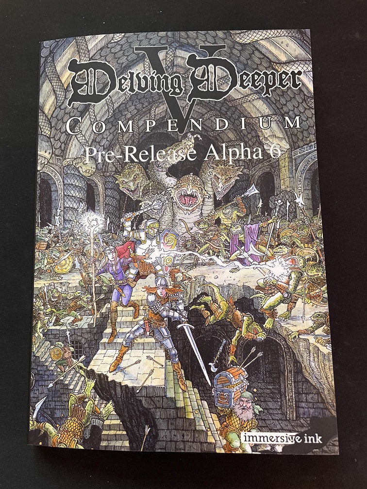
Alpha-6 gets the full colour cover treatment, and the principal issues with alpha-5 are fixed. The image resolution looks sharp, and there's no pixelation of the text (especially the large V). Overall, the image and matt finish look great, I'm really pleased with it.
A couple of minor niggles for the beta are that the title is not quite centered, and the Immersive Ink logo is not quite on page. These are to do with the trim size/edges which will vary slightly book to book, but having seen this, I can position these elements more carefully. There's also an issue with the spine text alignment (not pictured) which I will address in the beta.
Looking at V4 and V5-alpha-6 side by side here... We can really see the improved clarity of the alpha-6 cover art and text (compared to alpha-5) in this image: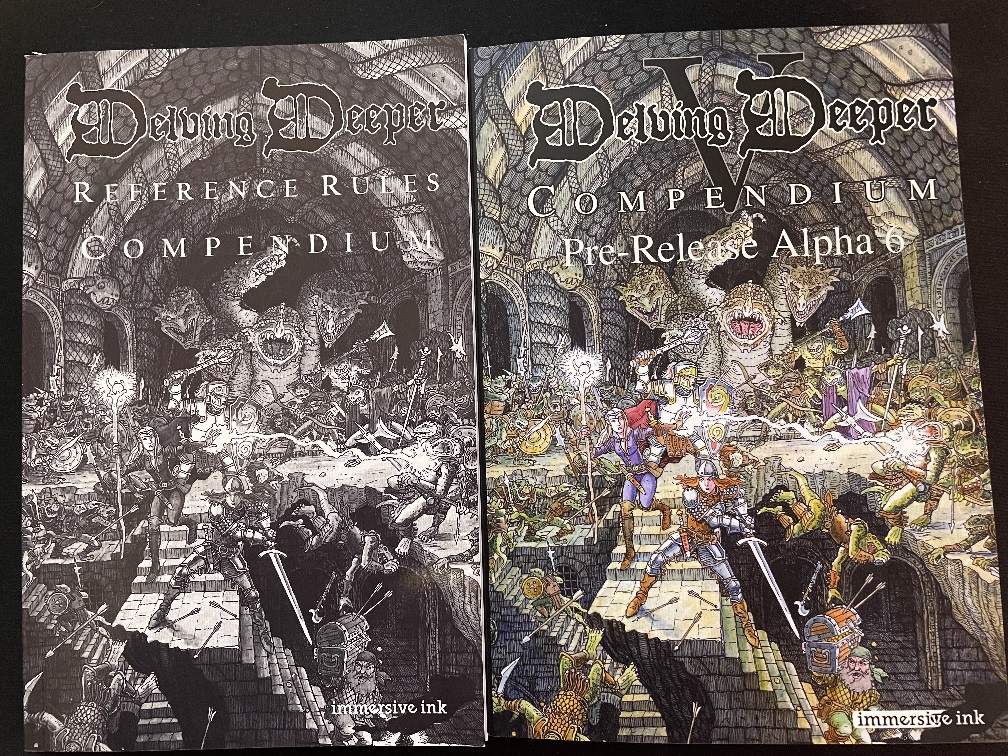
On the Inside...
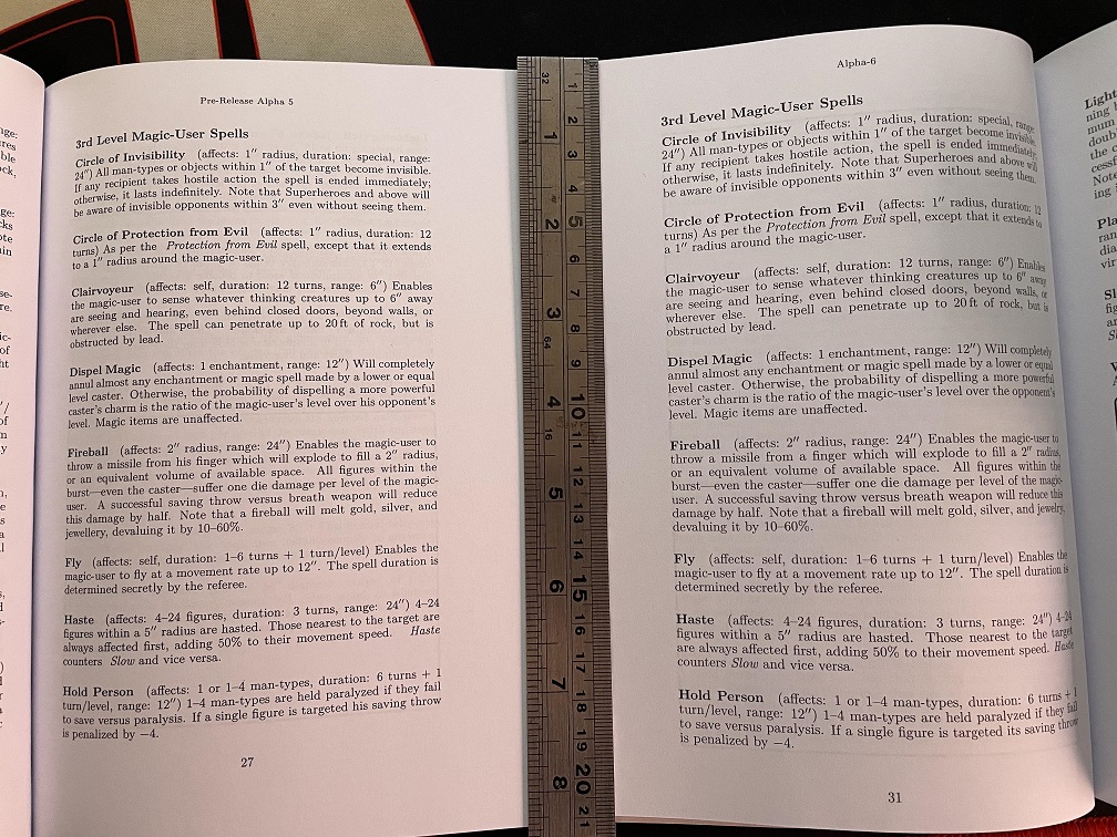
The two other key issues with alpha-5 were 1) the page geometry (the type block was too close to the gutter) and 2) the type itself was too small (9pt).
Alpha-6 is much improved on both counts. It's perhaps not obvious in the image (difficult to hold two booklets open flat and take the photo), but alpha-5's gutter and outer margins were approximately 10 and 30mm, respectively. Whereas, alpha-6's margins are approximately 15 and 20mm. It follows that alpha-6's typeblock is approximately 5mm wider, because the type size has increased from 9pt to 9.5pt. This seemingly minor adjustment really has improved the readability. Not only is the type (and spacing around it) slightly larger, the type is noticeably darker.
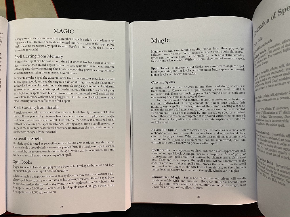
For comparison, here we can see V4 (left) and V5 alpha-6 (right). Alpha-6 clearly has more white space, better line length, and is overall less crowded, resulting in a better reading experience.
Alpha-6 also included a few full-page illustrations to see how these would print:
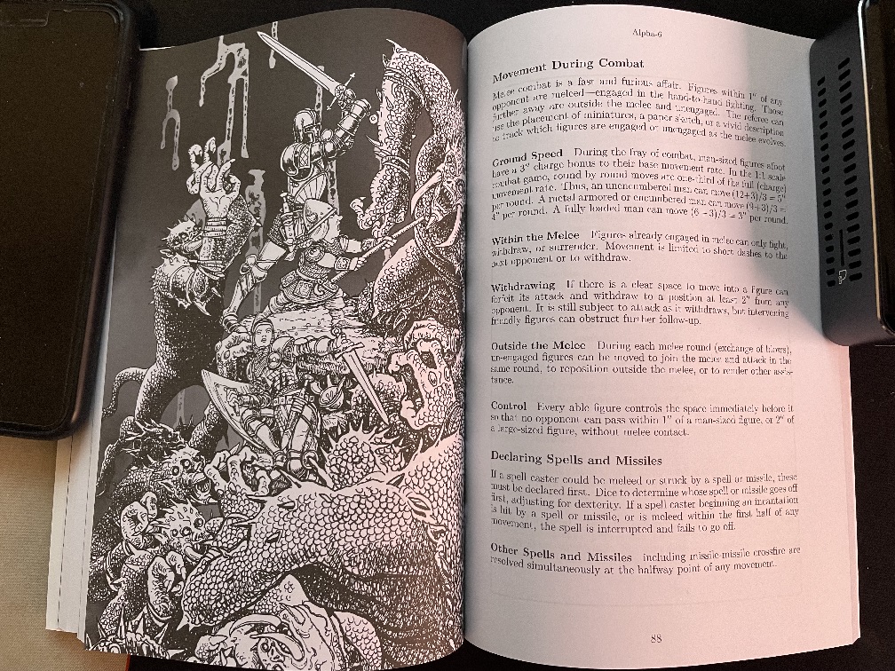 Another one of Tim Ide's crackers (pictured above) with the players in trouble versus a gang of hungry monsters!
The high-contrast, black and white looks great. The only issue is that areas of solid ink tend to bleed through the paper stock. Notice the faint outline of the box on page 89 is visible on page 88. Unfortunately, there are not many good paper options with print on demand, which is ultimately about affordability over quality. For the beta version I will try to moderate the darkest areas to reduce bleed through. At the end of the day, it remains a pretty good outcome for print on demand booklet.
In terms of the content, Kasper C noted that a few important lines relating to rate of fire with bows have been relegated to the appendicies, so I will bring those back.
Next Steps
In all, a few minor nits to pick before we go to public beta! Stay tuned...