

Hello everybody! I've been planning this update for a while, and I finally got around to it with a break from school. This update combines a needed visual change and new player production tiers that are easier to interpret and make projections from. Let's get into all the changes!
Visual Update
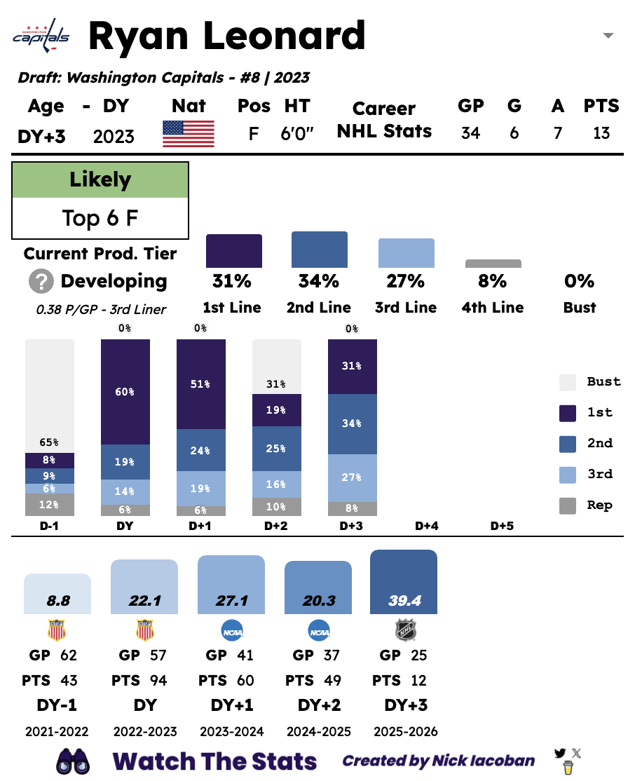 The main goal with the visual update was to create a card that was better and easier to read on mobile. This change was inspired by @hockeystatcards and the update he recently made. I wanted to change mine for the same reason, and with this new vertical design, everything is way easier to read when simply scrolling by. I also wanted to remove redundant elements. In the old version, I had a star odds chart, an NHLer odds chart, and a full odds progression chart, all of which displayed the same information.
The new design features the same player bio section as the old version, right under the player name. Under that, there is now the current projection section. The new projection uses the new tiers to create a meaningful projection instead of something like "possible impact forward". What does that even mean? Next to the projection is the full breakdown of odds. The colors here match up with the rest of the card, so keep that in mind for the section below. Under the projection is the current production tier, current NHL points pace, and the corresponding tier ignoring NHL GP requirements.
Underneath the current projection section, you can find the odds history chart. This is exactly like the old odds progression chart, with the only difference being the colors. As I said before, the colors match the current breakdown at the top. The sections are in the order of Bust, 1st L/P, 2nd L/P, 3rd L/P, and 4th L/P (more on the new tiers below). Think of this like reading a depth chart, 1st line at the top and 4th at the bottom. Having the bust above everything else makes the chart mirror the shape of the old Star and NHLer line plots. The legend is on the right if you ever need reminding of what every section represents.
Finally, you can find the stats section. Bars represent a player's NHLe for that season and the stats from the league with the largest sample size (games) are displayed underneath. Keep in mind, however, that the NHLe bar uses every game played that season from every league. There are cases where a player's junior numbers are displayed, but their WJC and possible NHL stints are factored into the NHLe value and used by the model to make a projection.
You may notice that the statistical comps section is no more. This had to be done to make everything fit. If I had included that in the new design, it would have felt very crammed. It also would have been a waste of space for players with fewer comps, space that I think is better used the way it is being now.
New Production Tiers
New tiers are something that I've wanted to implement for a while. I was getting sick of the old ones and I also believed they were pretty useless in making projections worth something. I believe that the new projections line up way more with how players are viewed and described, better than "average" or "replacement".
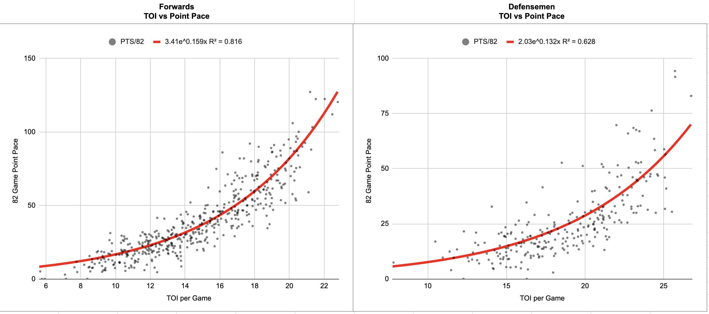
I built the new tiers using a player's TOI in their prime and their career points/game pace. The first step was to figure out the relationship between a player's TOI and their points pace in any given season, not worrying about whether it's their prime or anything like that. Here's what I found, separated by player position.
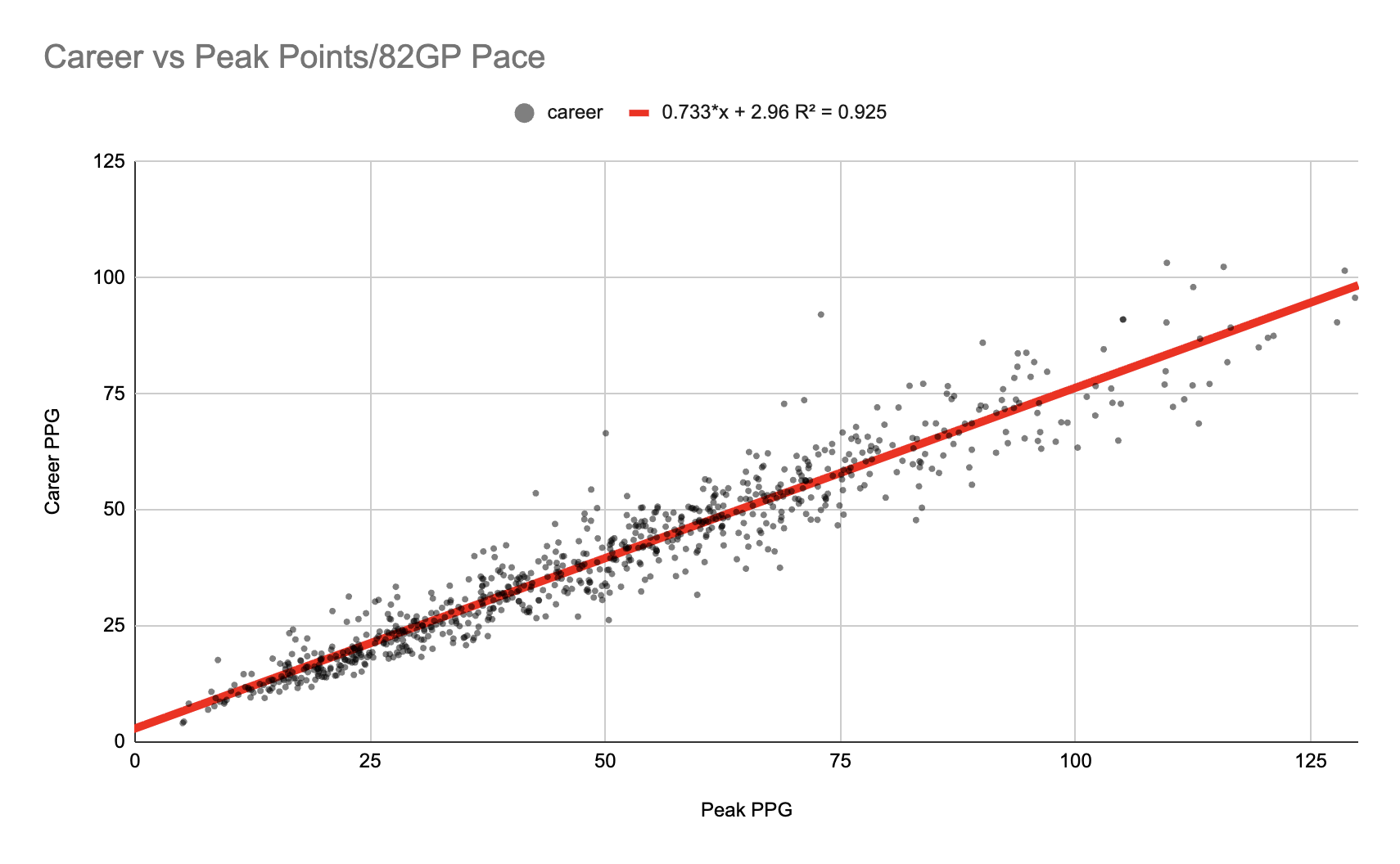
 Next was to find the relationship between peak P/82 and career P/82. I used a player's best three-year stretch as their peak. Here's what that relationship looks like.
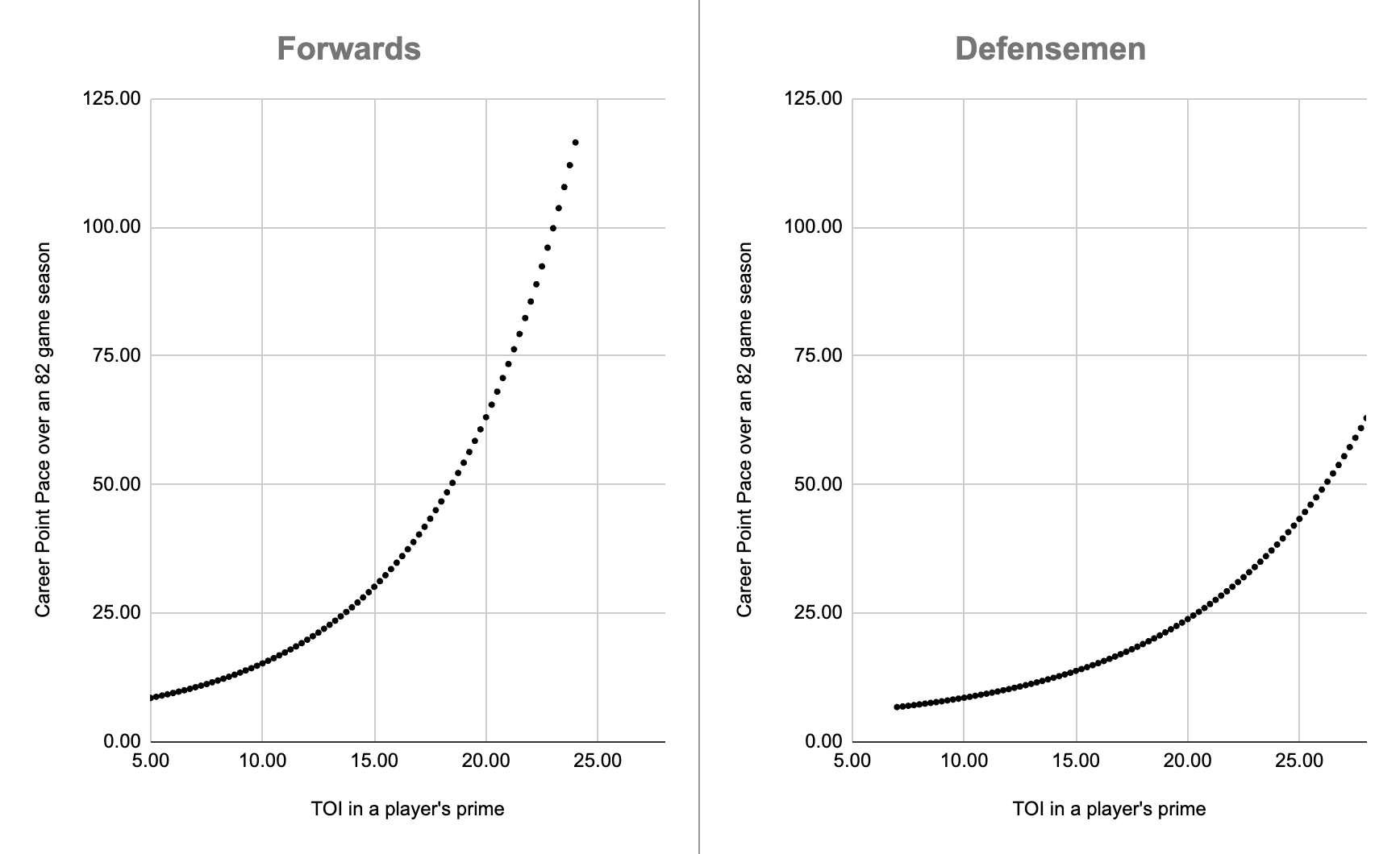
 With these two relationships now found, all I had to do was combine them to create a line between a player's time on ice in their peak and their career points per 82-game pace. Here's what that looks like, again separated by position.
 With all the work done on relating TOI to point production, the next step was actually creating the cutoffs for the new tiers. Here are the new player production tiers with their corresponding career points pace and equivalent peak ice time.
Forwards
Franchise: 0.85+ pts/gp, equivalent to 20.5+ min of ice time
1st Line: 0.64 - 0.85 pts/gp, equivalent to 18.8 - 20.5 min of ice time
2nd Line: 0.46 - 0.64 pts/gp, equivalent to 16.6 - 18.8 min of ice time
3rd Line: 0.3 - 0.46 pts/gp, equivalent to 13.7 - 16.6 min of ice time
4th Line/Replacement: <0.3 pts/gp, equivalent to <13.7 min of ice time
Defensemen
Franchise: 0.57+ pts/gp, equivalent to 25.6+ min of ice time
1st Pair: 0.41 - 0.57 pts/gp, equivalent to 22.8 - 25.6 min of ice time
2nd Pair: 0.28 - 0.41 pts/gp, equivalent to 19.7 - 22.8 min of ice time
3rd Pair: 0.205 - 0.28 pts/gp, equivalent to 16.8 - 19.7 min of ice time
7th D/Replacement: <0.205 pts/gp, equivalent to <16.8 min of ice time
And that's it! I'm really excited for this update to finally be done and published. Over the next week, I'll be updating the in-season player rankings and historical draft boards, so keep an eye out for that if you're a $5 member. Thank you to everybody who supports Watch The Stats, it makes updates like this possible!