
Here are versions one and two of the UI of a PHP weather app I've been working on for an upcoming Twilio tutorial. 😎

The intention is to take a minimalist, less-is-more approach, where the key information presents itself intuitively. That way, the UI doesn't need to be overloaded with labels and other elements.
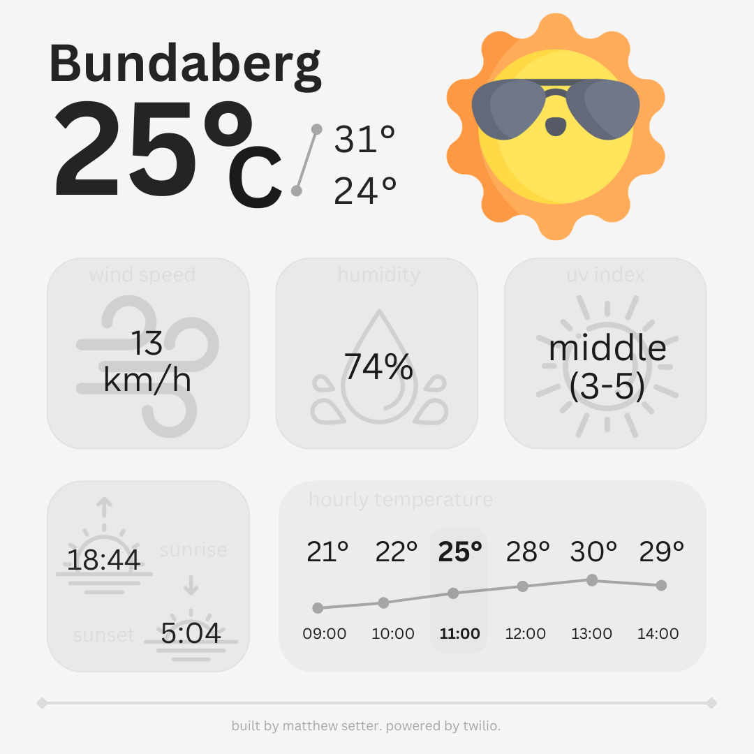
The first version was a good start showing the city, current temperature (rounded up), the day's maximum and minimum temperatures, what the temperature feels like, the current wind speed, humidity, UV index, and times for sunrise and sunset.
The second version takes into account feedback provided by the wonderful Voices team I work with at Twilio.
I've shrunk the icons down a little, to be able to fit in some soft labels for each section. The intention for adding the labels is in case a section isn't as intuitive as I think it is, leaving the user curious as to what a given value represents. They may be a little too feint for those with vision impairments, but I didn't want to overload the UI with too much information.
The daily maximum and minimum temperature font sizes have been increased, and the temperature measurement (celsius/fahrenheit) has been added.
Perhaps, most significantly, hourly temperature data has been added. The current hour and temperature is to the left of center, gently highlighted with the intention of making it intuitive as to what the current temperature is.
It doesn't account for people using the imperial system, but that's more of an implementation detail.
What do you think?