

Covenant Cards Branding Case Study
Date: May 12, 2026
I posted this challenge to my social media accounts.
Let me redesign the branding for your indie game 👇
Drop a link to your indie game below and I'll redesign your:
🎯 Logo
🎨 Visual Direction
💬 MessagingWhich version will grab more attention? Are you up for the challenge?
#gamedev #indiegames #gamemarketing #indiedev #gamedevtips #branding #steamgames
I honestly wasn't expecting anyone to take me up on the offer. But Covenant Cards: Strategy TCG did. A few days later, I noticed their comment and we started chatting in the comment section under the post. Soon after, I got to work. I was excited to have an opportunity to practice my branding skills while demonstrating the value I could bring to indie game developers.
Before this project, I had only rewritten a few game descriptions as a branding exercise for a few indie developers who commented on some previous challenges I posted to my social media platforms. This time was different. I wasn't just rewriting marketing copy. I was developing a new visual direction and even sketching a logo concept. Needless to say, it was a much bigger challenge than I expected. Even though this was a practice project with no client expectations, I still wanted to create something that genuinely improved the game's branding.
The first thing I reviewed was the game's App Store description. The original description contained a lot of information, but it felt lengthy and overwhelming. My goal was to make it easier to scan while getting the viewer excited to play the game.
My Revised Description
The timeline is fractured. History is corrupted. It's up to you to repair history and save the world. Enter a decaying reality as a master tactician. Build powerful card synergies, outsmart your opponents, and reshape the future.
Covenant Cards features:
Deep emotional story
Quick Scan Card Reader
PvP battles
Ranked Draft & Custom Modes
Global Leaderboards
Strategic Duels
Legendary Historical Characters
Over 120 Missions
And much more!
Compared to the original, this version focuses on:
A stronger opening hook
Clearer benefits
Better readability
Easier scanning for potential players
A stronger emphasis on the game's core fantasy
(You can read the original description here: https://apps.apple.com/us/app/ccg-deckbuilder-covenant-cards/id6759227375)
Before redesigning the visuals, I wanted to understand how the game was positioned within the market.
Genre
Deckbuilding Trading Card Game (TCG)
Core Fantasy
Saving history by repairing a fractured timeline
Target Audience
Strategy gamers
Trading card game players
Sci-fi fans
History enthusiasts
Players interested in biblical and historical themes
Main Competitors
Magic: The Gathering
Marvel Snap
Pokémon TCG
Yu-Gi-Oh!
Hearthstone
Legends of Runeterra
Unique Selling Proposition
Unlike many fantasy card games, Covenant Cards combines:
Science fiction
Cyberpunk influences
Historical figures
Biblical characters
Strategic deckbuilding gameplay
Strengths
Interesting core concept
Unique historical setting
Using characters from past historical places and events
Weaknesses
Low review score (1 star at the time of research; later improved to 3.0 before I started writing this case study)
Logo lacked personality and appeared AI-generated
Game description was too long
Overall branding felt generic and didn't communicate what made the game unique
Brand Positioning
Covenant Cards appeared to position itself as a:
Historical and biblical-inspired card game
Strategy-focused TCG/CCG
Deckbuilding PvP experience
Mechanically deep competitive game
Historical alternative to traditional fantasy card games
Competitor Landscape
Rather than only comparing Covenant Cards to other TCGs, I also explored other types of games, including:
Historical strategy games
Mythology-inspired card games
Biblical-themed games
This broader comparison helped identify opportunities for stronger differentiation.
Visual Territory Exploration
To establish a stronger visual identity, I brainstormed themes that reflected both the gameplay and the narrative.
Key visual elements included:
Gold accents
Stone textures
Ancient empires
Monumental architecture
Ancient symbols
Scrolls and relics
Modern esports-inspired UI presentation
To explore these ideas further, I created an extensive Pinterest mood board to gather references and identify recurring visual patterns. As I collected inspiration, two distinct creative directions began to emerge. The first leaned toward a modern sci-fi aesthetic, combining sleek interfaces with fantasy-inspired effects. The second embraced a more historical direction, emphasizing ancient civilizations and timeless mythology. These two directions ultimately became the foundation for the final mood boards I created.
You can check out my Pinterest mood boards here: https://pin.it/6EYtqNdEE
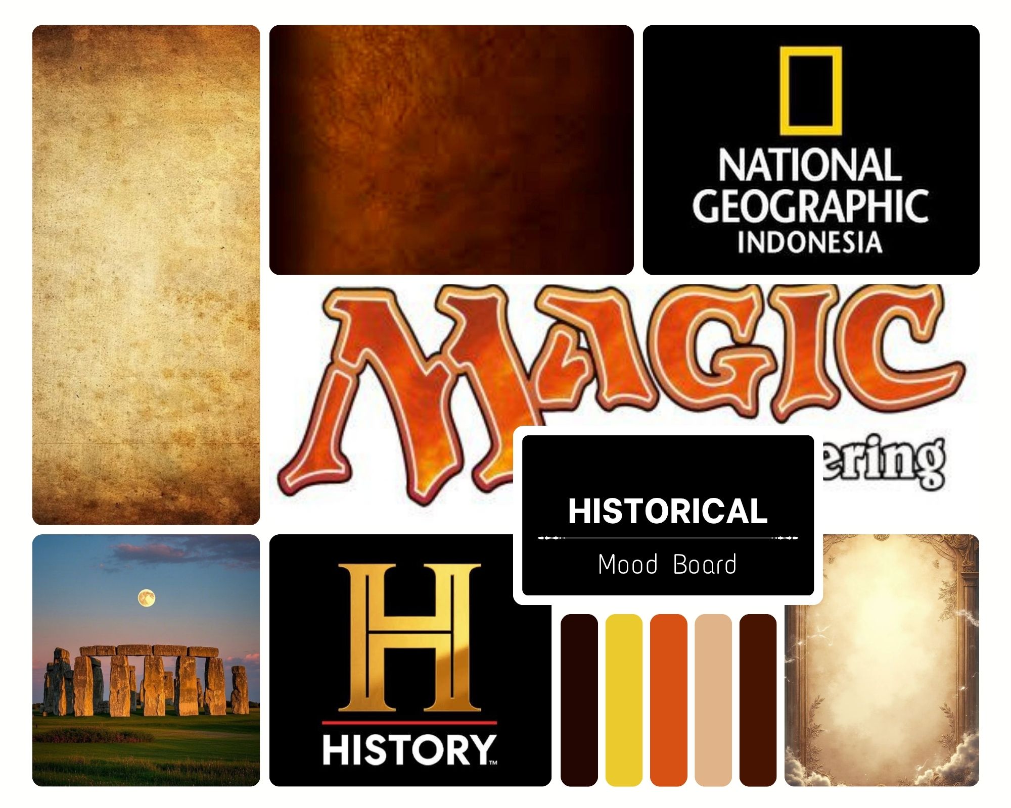
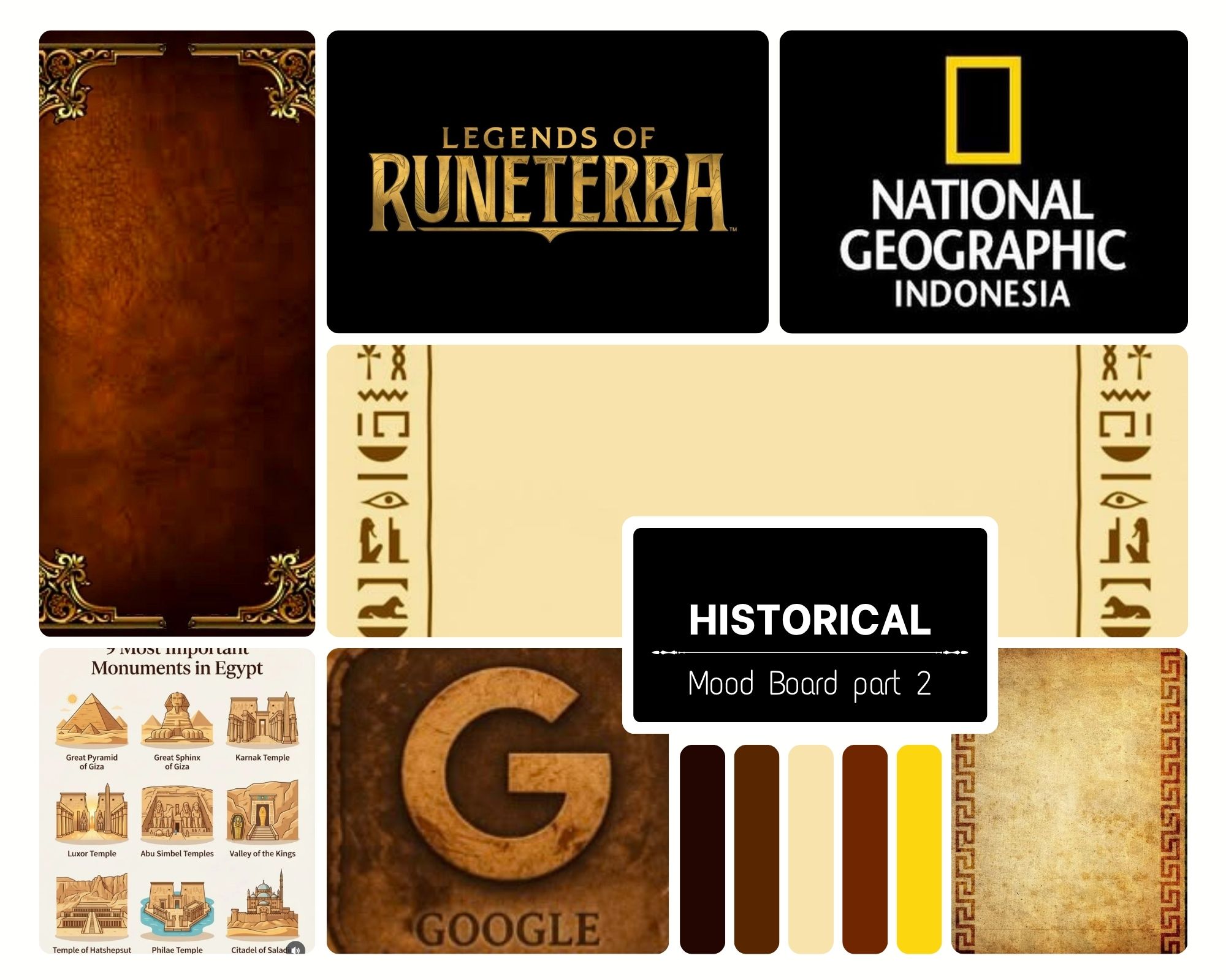
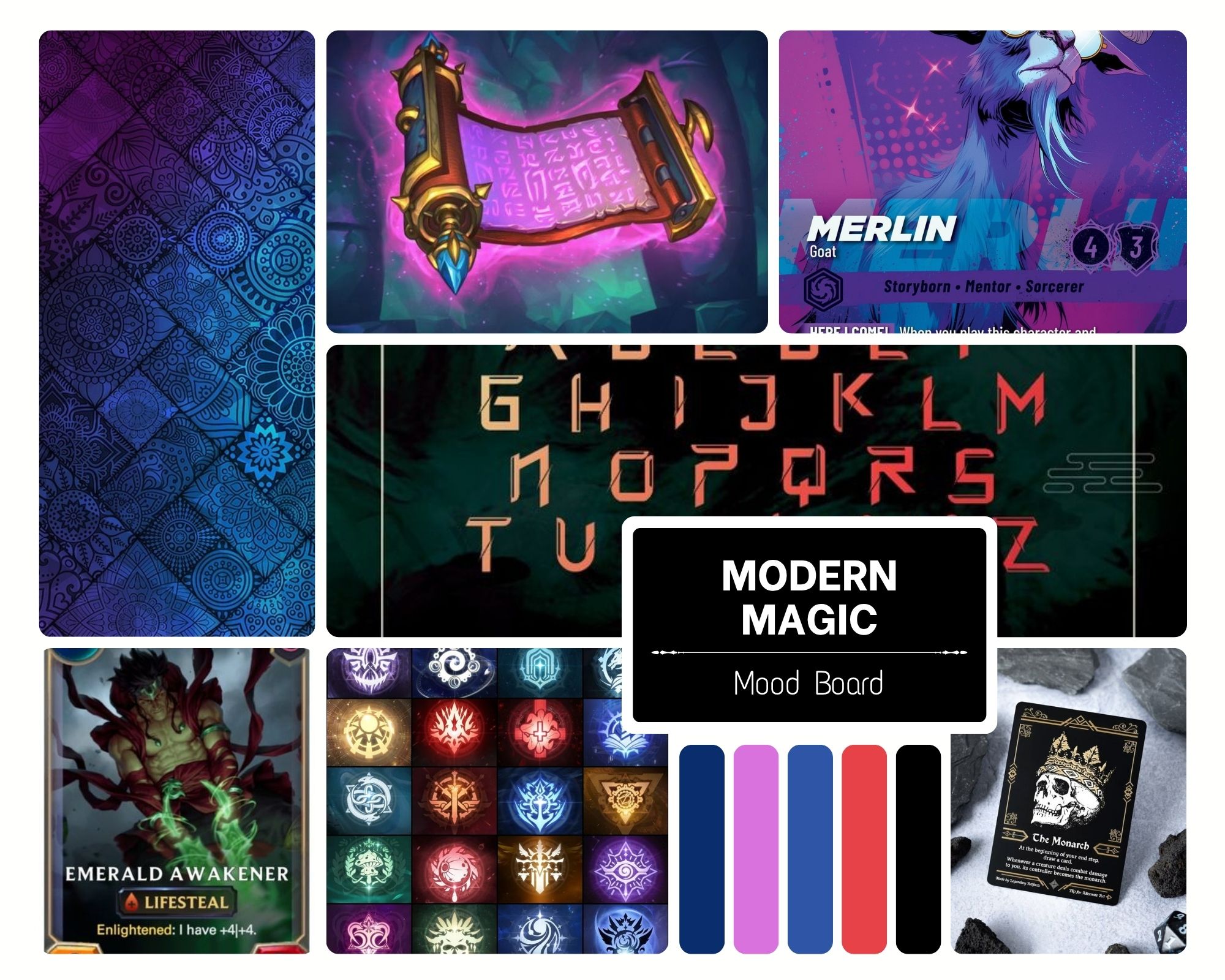
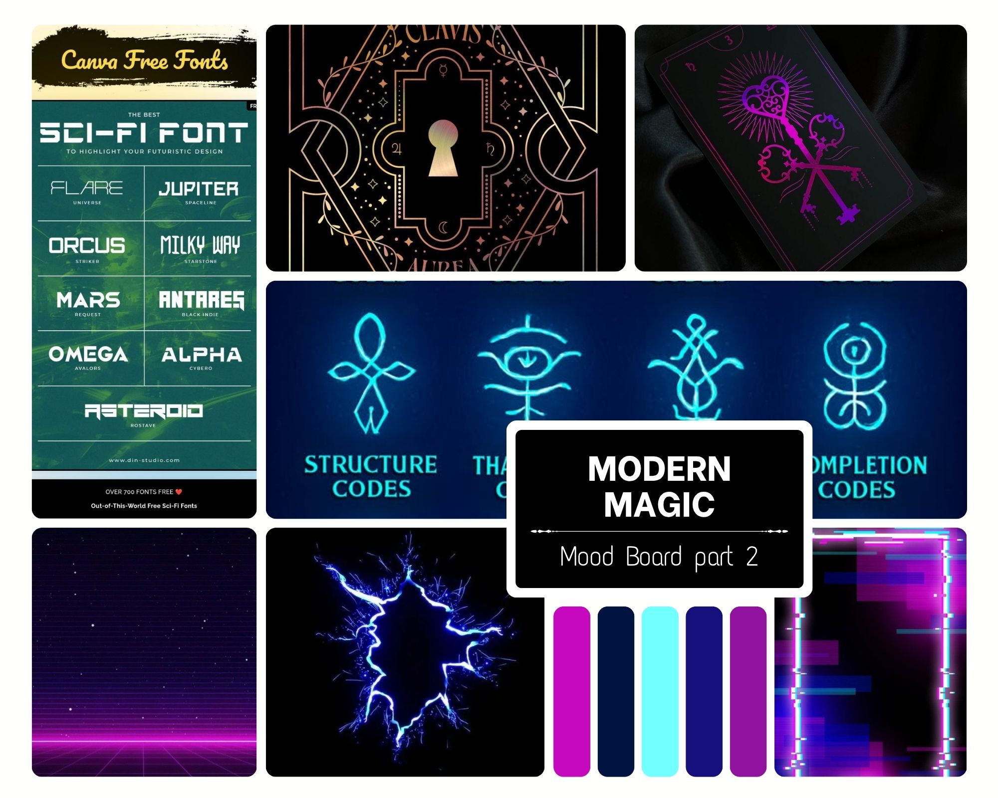
So, which direction would you choose for Covenant Cards? Leave a comment below.
Once I finalized the visual direction, it was time to move on to the final, and arguably the most challenging, part of the project: creating a new logo concept.
Like many logo designers, I grabbed my sketchbook and started exploring ideas. Sketching allows me to quickly test shapes, symbolism, and compositions before committing to a direction.
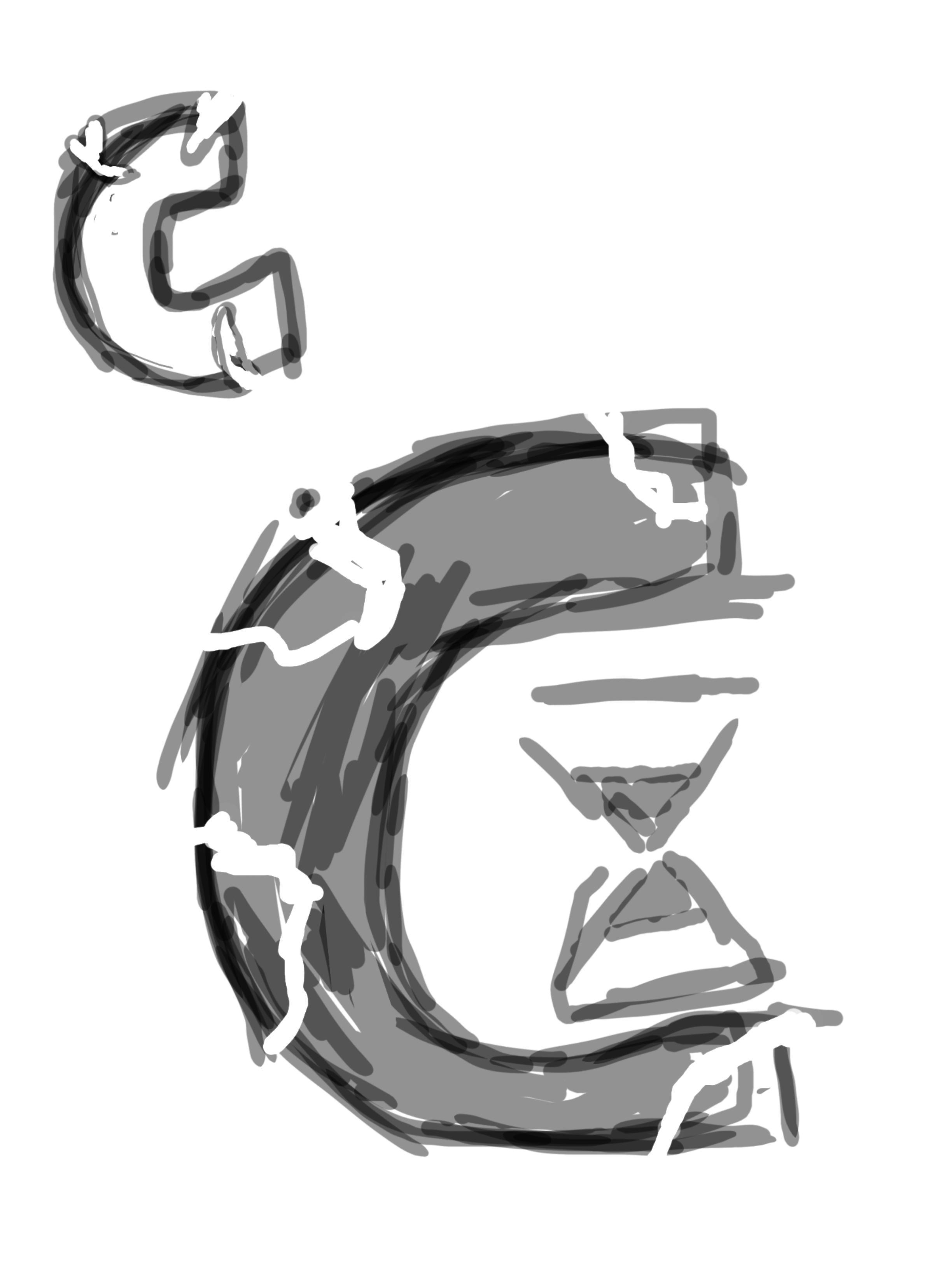
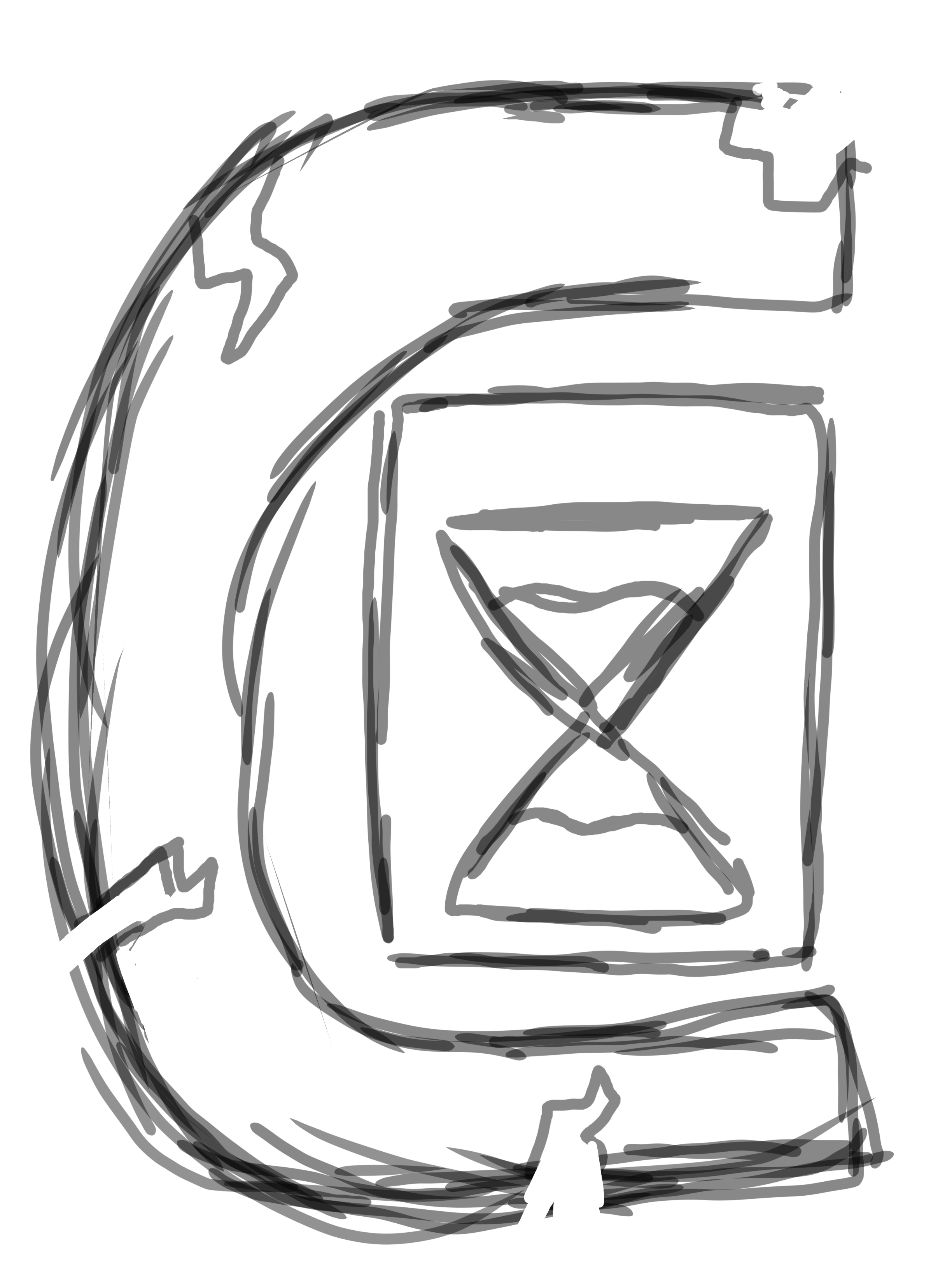
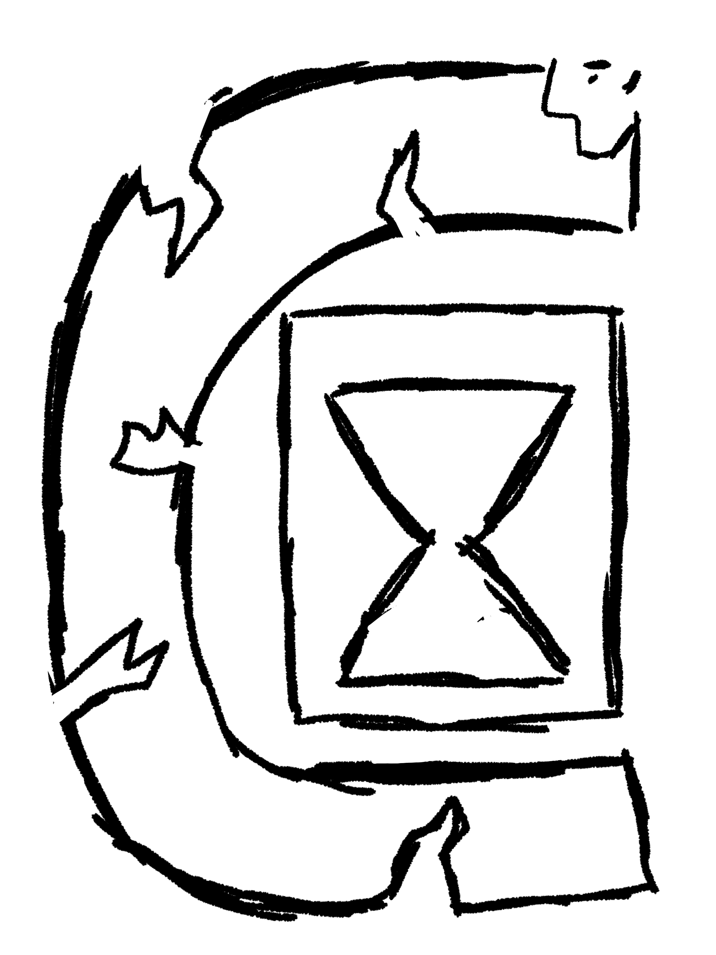
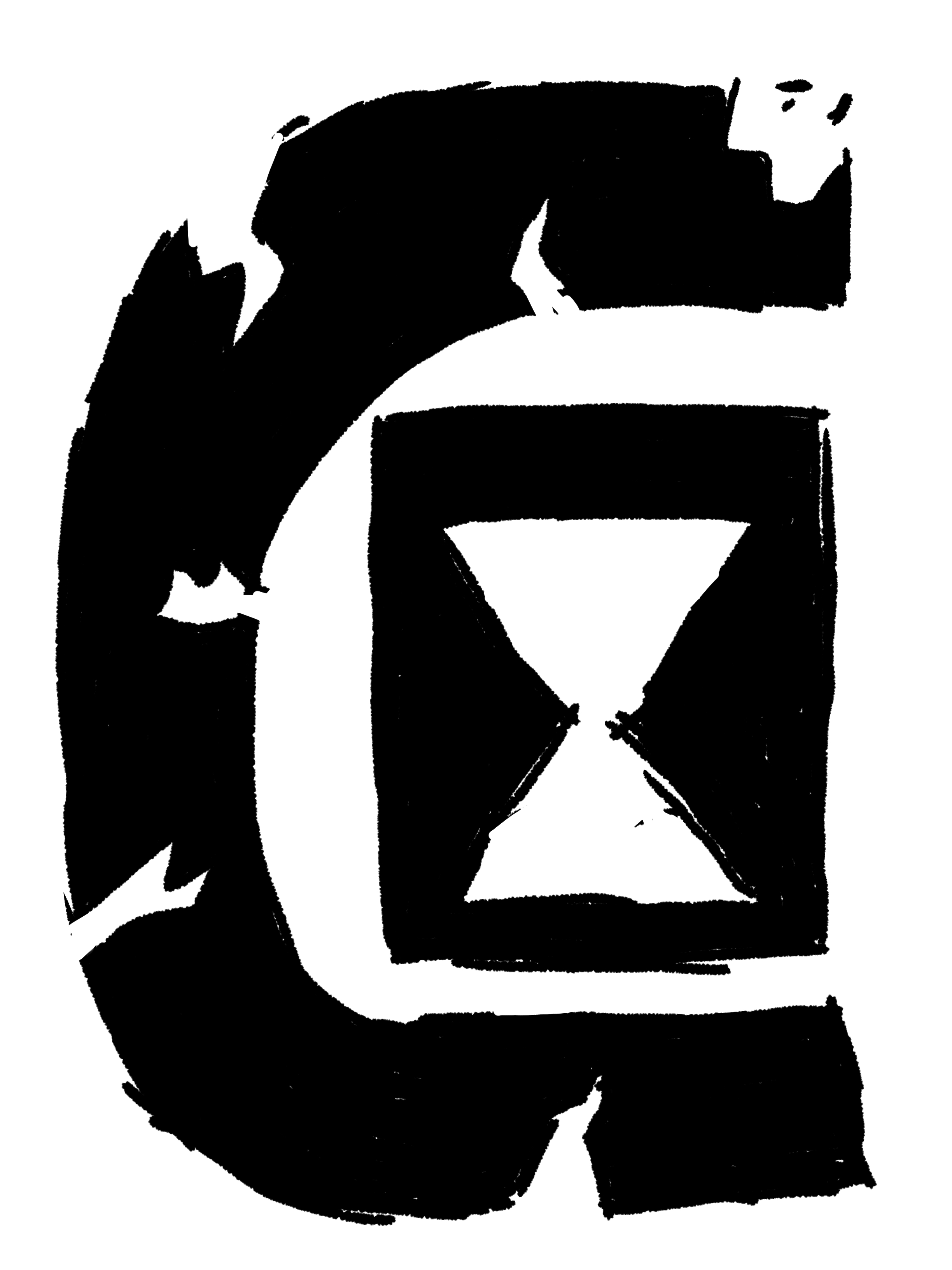
After lots of brainstorming and rough sketches, a concept began to emerge. My goal wasn't simply to make the logo look more polished, but it needed to tell a story and feel distinctive within the trading card game market. Below, you can see the evolution of the logo concept, from the earliest sketches to the final concept drawing. Before diving into the redesign, let's take a look at the original logo.
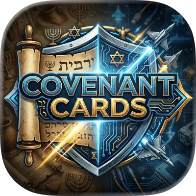 Now for my sketches:
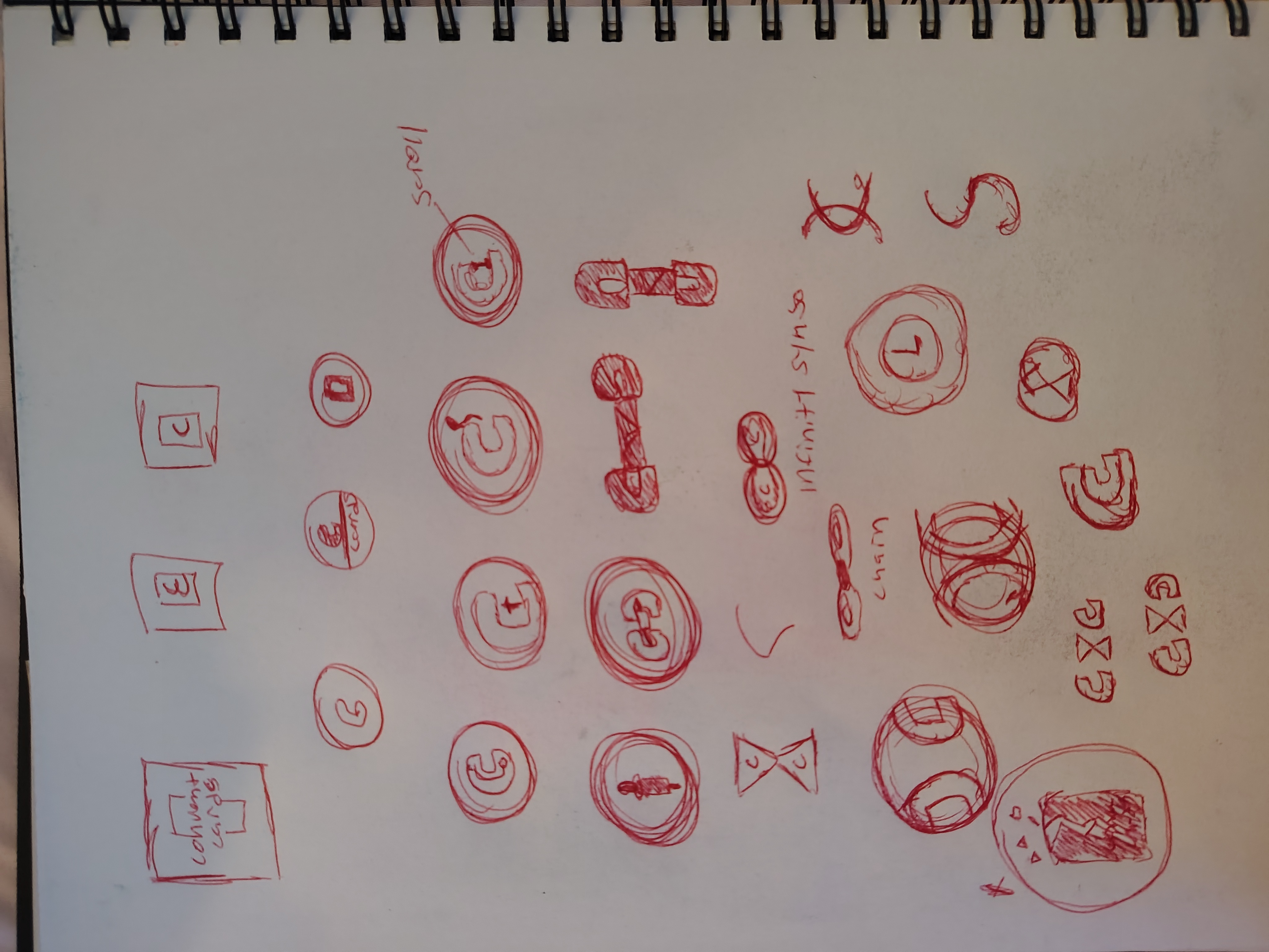
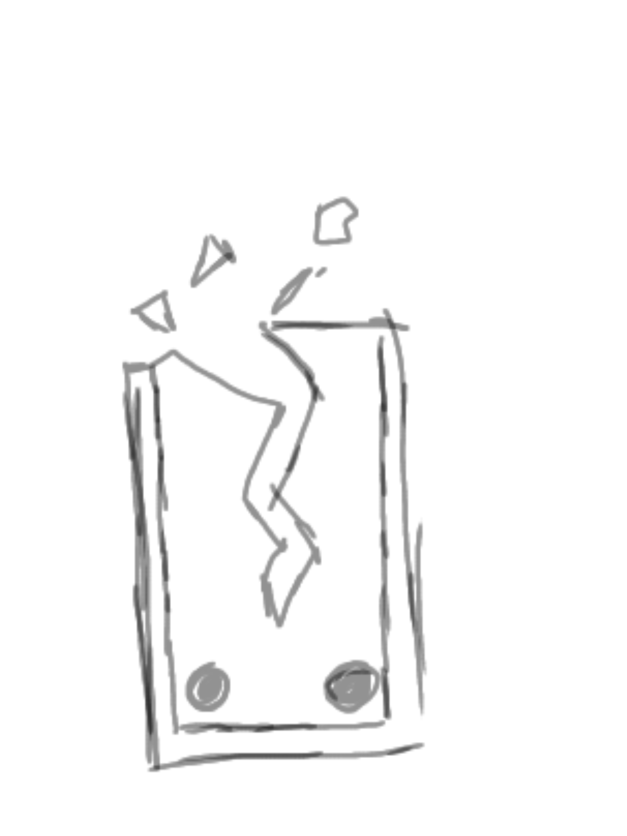 While developing the logo concept, I kept versatility at the forefront of my mind. The logo needed to be recognizable at small sizes, whether it appeared as a mobile app icon, a social media profile picture, or on marketing assets. My goal was to create something that was simple, memorable, and immediately communicated the game's identity.
I started by focusing on the game's two strongest themes: cards and a fractured timeline. My initial concepts featured a playing card with a crack running through it, symbolizing the game's central theme of repairing history.
As I continued sketching, I realized the logo could communicate even more by incorporating the game's name. This led me to make the letter "C" the primary mark. I retained the fractured motif while integrating a playing card and an hourglass into the design.
The "C" represents Covenant Cards, with both words beginning with the same letter. The fractures running through the C symbolize the game's broken timeline, while the playing card reinforces its deckbuilding gameplay. Finally, the hourglass represents history, the passage of time, and the player's mission to restore the timeline itself.
Together, these elements create a logo that is simple enough to remain recognizable at small sizes while telling a visual story that reflects the core themes of Covenant Cards.
So, what do you think? Did this branding concept improve Covenant Cards, or do you think I missed the mark? I'd love to hear your thoughts. Which visual direction did you prefer? How would you have approached the logo? Leave a comment below and let's start a conversation!
If you're an indie game developer looking for a fresh perspective on your game's branding, messaging, or visual identity, I'd love to help. Together, we can create a brand that captures what makes your game unique and gets players excited to click Play.
Ready to get started? Fill out my Project Inquiry Form, and I'll get back to you via email within one week to discuss your project and how we can bring your vision to life.
Fill out my form to work with me: