
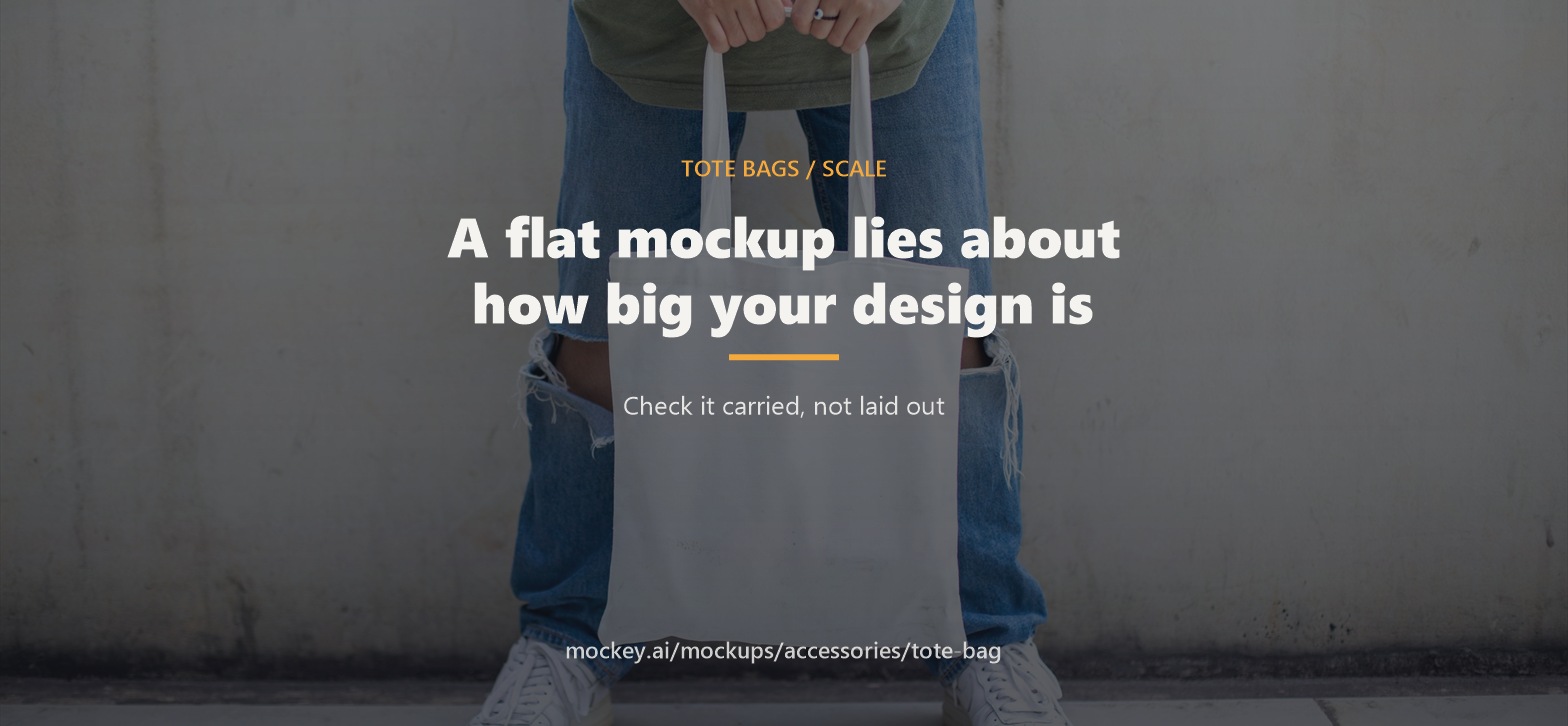
A flat tote mockup shows the bag straight on, fully extended, evenly lit and filling the frame. A carried tote is folded, angled, moving, at hip height, and seen from several metres away. Every one of those differences makes your design smaller and harder to read than the preview suggested.
Totes are not looked at. They are glimpsed — in a queue, on a train, across a street. That is the only viewing condition that matters, and it is the one no flat preview reproduces.
What changes the moment somebody picks it up
Five things, and they compound.
The bag folds. An empty tote hanging from a hand creases vertically under its own weight, usually somewhere near the middle. A design centred on that crease gets broken in half. A design that relies on a symmetrical shape loses its symmetry.
The panel curves away. You see the print at an angle, not flat on. The edges foreshorten, so anything near the sides compresses.
It drops to hip or thigh height. Your design is now below the eyeline of everyone looking at it, which means it is seen at a downward angle and competes with the person's clothing.
The distance goes up. A screen preview is 40cm from your face. A carried tote is two to four metres from the viewer. That is a five- to tenfold reduction in apparent size.
It is moving. Walking pace. Nobody gets to study it.
Put together: a design you have been examining at 100% zoom gets about a second and a half of attention at a tenth of the size, folded, at an angle. That is the actual brief.
What survives that, and what does not
This is not a style question. It is a legibility question with a fairly short answer.
Survives:
High contrast against the bag colour
One idea — a word, a mark, a shape
Thick strokes and solid areas
Short text, large
Silhouettes that read without internal detail
Does not survive:
Fine linework and hairlines
Small text, including taglines and URLs
Detailed illustration
Subtle tonal differences
Anything that needs to be read in a particular order
The practical rule I would use: if you cannot tell what it is from across a room, the design is not finished — no matter how good it looks on the artboard.
And remember you are already working small. The printable panel on a standard tote is roughly a third of the visible face of the bag, which is covered in big tote bag mockup. The carried view shrinks that further.
The fold is a design constraint
Worth its own section because it is so easy to miss and so obvious once seen.
An empty or lightly loaded tote does not hang flat. It collapses inward, and the crease usually runs vertically, near the centre. A full tote is the opposite — it bulges, and the design stretches across the curve.
So the centre of a tote panel is the least reliable place to put something that must read cleanly. Which is unfortunate, because it is where everyone puts the logo.
Three ways to work with it:
Design something that tolerates a crease. Type and simple marks survive a fold far better than a detailed image does.
Avoid fine detail dead-centre. Keep the middle for the bold element, not the intricate one.
Do not rely on perfect symmetry. It will not be symmetrical in use.
Scale needs a human in the frame
Here is why the hand-holding view matters more than it looks like it should.
A tote photographed alone has no scale reference at all. A 13 inch small tote and a 20 inch extra-large tote produce identical images when shot flat on a white background. So does your design at 6 inches wide and at 10 inches wide.
Add a hand, an arm, a person, and the whole thing resolves instantly. Your eye knows how big a hand is, so it now knows how big the bag is, and therefore how big your design is on it.
This is the only reliable way to answer the question that actually matters — is my design the right size? — without ordering a sample.
How to run the check
1. Build it at the real proportions first. Put the artwork on a tote bag mockup and confirm the design sits correctly on the panel rather than on the bag.
2. Then view it carried. Switch to a hand holding tote bag mockup, because that view gives you the scale reference, the fold and the angle in one image. This is the view to make the final call on, not the flat one.
3. Shrink it. Reduce the preview until the bag is about the size it would appear from four metres away — on most screens that is a bag roughly as tall as your thumb. Look at it. Can you tell what it is?
4. Squint. Genuinely. Squinting collapses detail and leaves contrast and shape, which is approximately what a passer-by gets. If it holds up squinting, it holds up in the street.
5. Show it to somebody for two seconds. Then take it away and ask what they saw. Whatever they say is what your tote communicates. If the answer is "a bag", the design is not working hard enough.
What the preview still cannot tell you
Be clear about the limits, because a mockup is a layout tool and nothing more.
It will not show you how the ink sits on a textured canvas weave, how the colours shift on dark fabric, how stiff the bag is, or how the print survives a wash. Those need a sample, and on a dark bag they need more attention than usual — that is a separate problem, covered in black tote bag mockup.
What it does settle is the thing people most often get wrong: size and legibility in use. That is worth two minutes before any run.
Checklist
Design built to the confirmed print panel, not the bag
Checked in a carried view, not only flat
Nothing fine or intricate dead-centre, where the fold lands
Symmetry not load-bearing
High contrast against the actual bag colour
Readable shrunk to thumb height
Survives the squint test
Two-second recall test passed on a real person
Sample ordered for anything beyond a small run
If you are still choosing the bag, canvas bag mockup covers which weight stands up and which sags, and what each one can be printed with.