

Case Study: Cape Cod Traffic (SISOSIG)
Cape Cod has a simple physical reality that most software ignores: there are only a few ways on and off the peninsula. Two bridges carry nearly all vehicle traffic. When they fail, stall, or saturate, nothing downstream matters. No rerouting trick, no optimization, no push notification can change that geometry.
Most traffic technology assumes mobility is flexible. Cape Cod traffic is not. It is binary: moving or not.
The system that emerged from this reality is called SISOSIG — Should I Stay or Should I Go? The name isn’t branding. It’s literal. That is the only question that actually matters at decision time, and it’s the one most traffic apps are worst at answering.
The original problem wasn’t a lack of data. Traffic data already existed — speeds, delays, incident reports, historical averages. The failure was how people encountered it. Visitors checked phones too late. Locals checked too often. Everyone reacted instead of orienting.
Phones are excellent at delivering alerts, but terrible at providing calm context. They demand interaction and attention. In a traffic environment, that turns information into anxiety. People don’t want constant updates; they want to know whether the situation is fundamentally changing or fundamentally stuck.
SISOSIG was designed around a single constraint: reduce the decision to its essence.
Instead of asking “How do I show everything?”, the system asked:
What information actually changes the stay vs go decision?
What can be removed without loss?
What should be visible without being engaged?
The answer wasn’t route-by-route navigation or incident feeds. It was directionality and time. Are you leaving the Cape or entering it? Is traffic degrading, stable, or improving? Are we talking minutes, or hours?
SISOSIG emphasizes trends over immediacy. Travel times are contextualized against typical conditions rather than treated as isolated numbers. A 45-minute delay means nothing without knowing whether that’s normal for a summer Friday or an anomaly worth reacting to.
Usage patterns confirmed something counterintuitive: the most valued feature wasn’t precision, but predictability. Users didn’t need perfect accuracy; they needed confidence that the situation wasn’t about to surprise them.
Locals and visitors interacted with the system differently. Visitors wanted reassurance. Locals wanted confirmation of instincts they already had. Designing for both meant avoiding prescriptive language (“avoid,” “take,” “reroute”) and sticking to descriptive truth. SISOSIG doesn’t tell you what to do. It tells you what is.
That distinction matters. Prescriptive systems take responsibility for outcomes they can’t control. Descriptive systems respect the user’s agency and constraints.
Another key realization was that traffic is not an event — it’s a condition. Treating it like breaking news leads to alert fatigue and compulsive checking. Treating it like weather leads to calmer decisions. You glance, internalize, and move on.
From Screen to Space
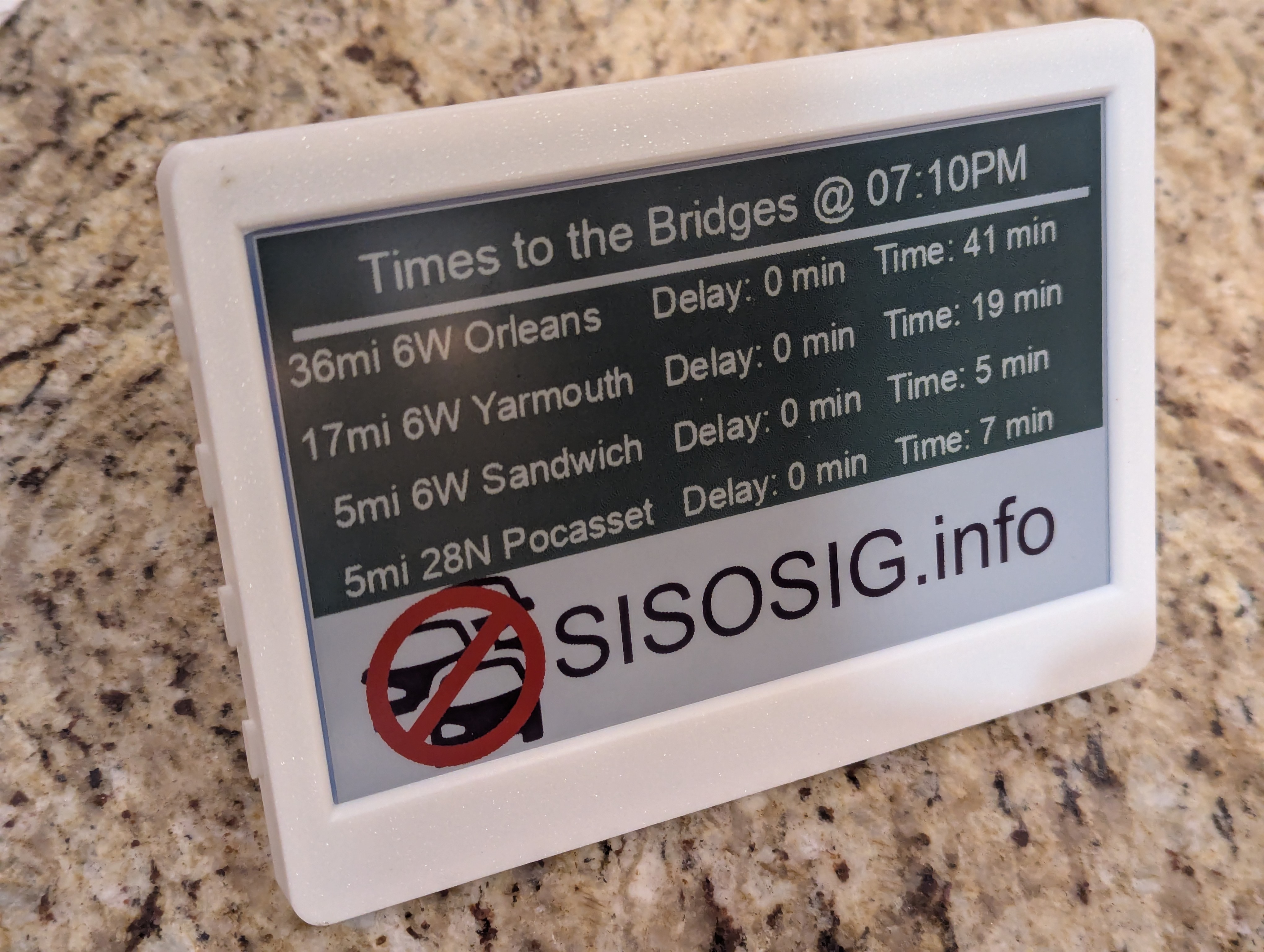 That insight led directly to the next evolution of SISOSIG: e-ink displays placed in physical space.
If the most important traffic information is slow-changing, contextual, and binary, then it doesn’t belong behind a login screen or an app icon. It belongs where decisions are made — in visitor centers, lobbies, cafés, and other liminal spaces where people are still deciding whether to stay or go.
E-ink was chosen deliberately. It’s readable at a distance, visible in bright light, and stable without constant refresh. More importantly, it behaves like infrastructure, not media. It doesn’t scroll or demand interaction. It simply exists, quietly presenting the same question SISOSIG has always asked.
The display doesn’t update to prove it’s alive. It updates only when the answer meaningfully changes.
This shift removed the final layer of friction. People no longer had to remember to check traffic. The information was already there, ambient and unavoidable in the best way. SISOSIG stopped competing for attention and started occupying space.
SISOSIG works not because it is smarter than existing tools, but because it asks less of the user. No onboarding. No interaction. No explanation. Just a truthful snapshot of a constrained reality.
The technical achievement wasn’t data aggregation or visualization. It was knowing what not to surface — and trusting that clarity beats cleverness when real people are stuck on a bridge, late, frustrated, and out of patience.
Traffic didn’t need to be solved. It needed to be understood.
And once people could answer Should I Stay or Should I Go? at a glance, they made better decisions on their own.