

Also known as the isolation effect, the Von Restorff effect makes use of the isolation paradigm. The Von Restorff effects states that in the event where multiple similar elements are presented, the reader will recall the element that most stands out.
This is because the isolated element acts as an independent variable. This leads to the working brain registering isolated facts for a longer time. Creating an element of surprise, therefore, goes a long way in helping with active recall. This becomes more important in the digitally noisy world we are currently a part of.
The Von Restorff effect is an exercise in creating salience. The Mindspace framework also makes use of the Salience effect. However, for this to work, the isolated element must not lose context in relation to the other elements. Absolute isolation does not help with active recall. Relative isolation does.
This relative isolation can created by altering the size, shape, color and formatting, amoing others.
Let us see how you can use the Von Restorff effect in your own marketing campaigns and increase conversions, sign-ups, and general brand awareness.
Choose a contrasting button on your CTA
Your CTA can contain any thing you want it to contain. You can use it to increase signups, book demo calls, free calls, etc. Since it is the most actionable and most valuable button, try experimenting with choosing a contrasting button on your CTA. This will make it stand out. Add to that a powerful copy that prompts the user to take action, chances are he/she might actually sign up.
Texts does it really well.

Choose a contrasting color on your default pricing and place it in the middle
Think of your default pricing as having the best value for your customers. If you have a subscription based business, place this default pricing in the middle. Why the middle? That way, we are making use of the anchoring effect. This is the benchmark upon which your customers will judge the other pricing tiers. And make sure to add a contrasting color here as well.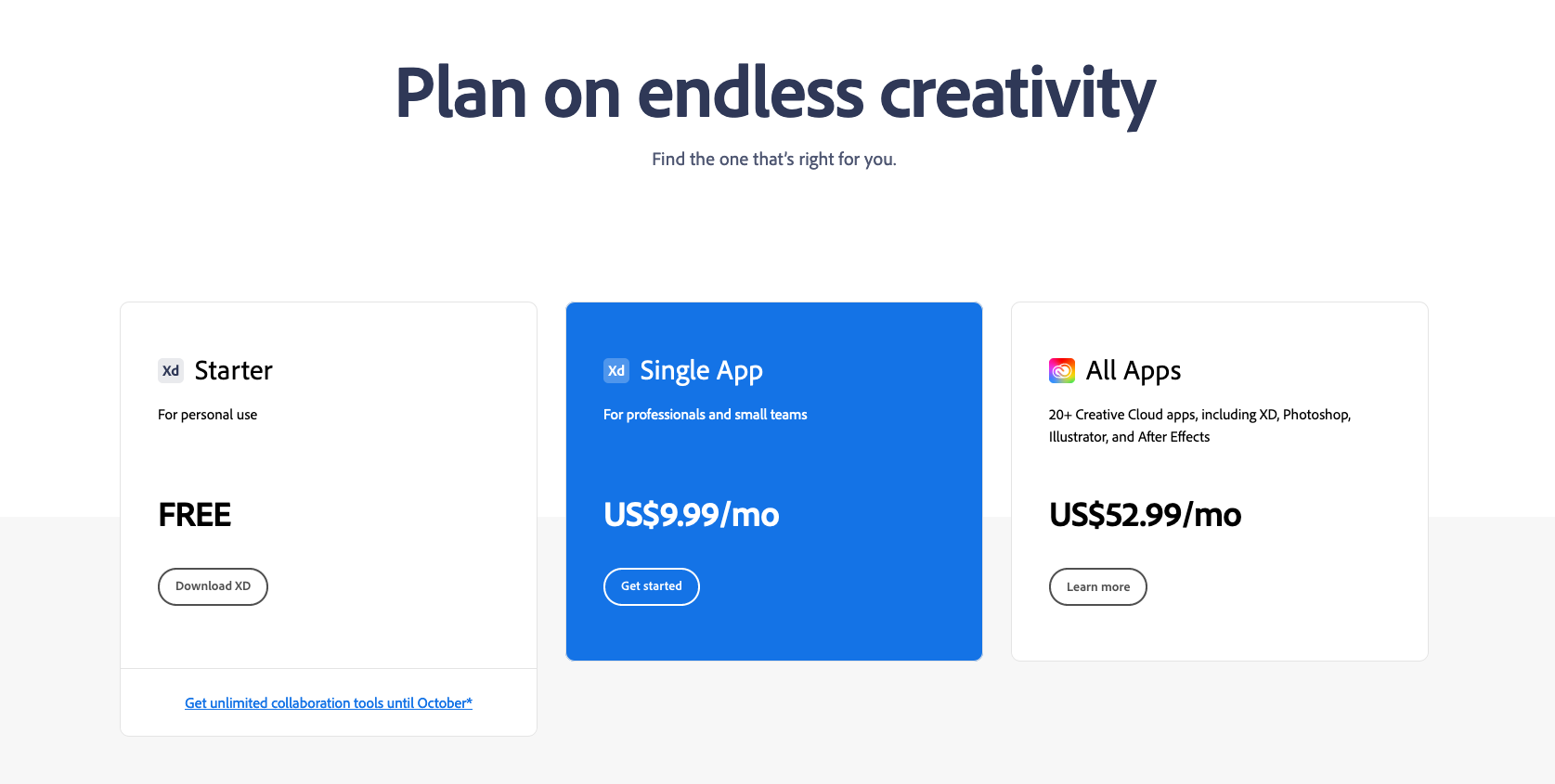
Add white space around the CTA
Adding white space affors breathing space to your CTA button. It's important that it does not seem crowded with other text. This trick makes use of not only the Von Restorff effect but also reduces cognitive load on the user. Any interface or user experience that makes him/her feel special has a higher probability of conversions.
Docker is a good example.
Use your product vidoes to focus attention on your CTA
Using your product videos not only lends you more credibility but also gives users a chance to see your product in action. Better yet if the product demo is adjacent to the CTA. The sum total of the copy and the product demo should be enough to warrant enough conversions to your CTA.
Traverse does a good job of this. PS: the copy is written by yours truly.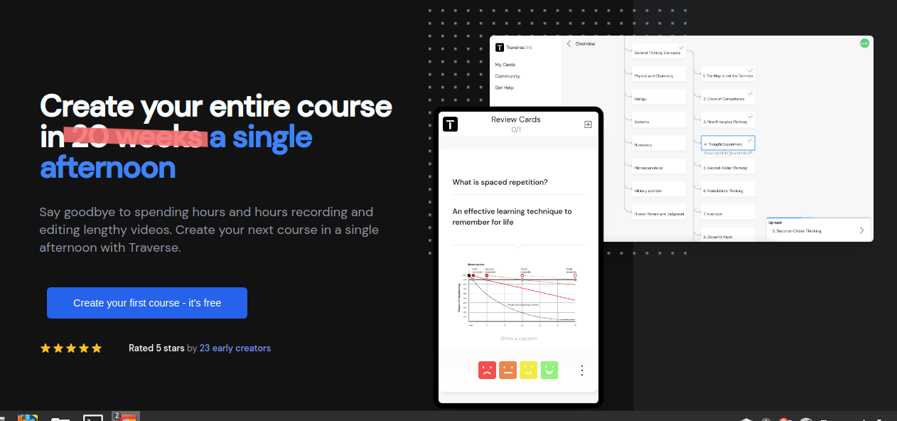
Visually distinguish important sections with color and formatting.
Some sections are more important than the rest. If you look at your website analytics, you'll find that some areas of your website are visited more frequently than the others. Use this data to highlight the areas that are most frequented by your users. If it's important enough to them, it's important enough for you.
Substack's danger zone on the user dashboard is a good example of this.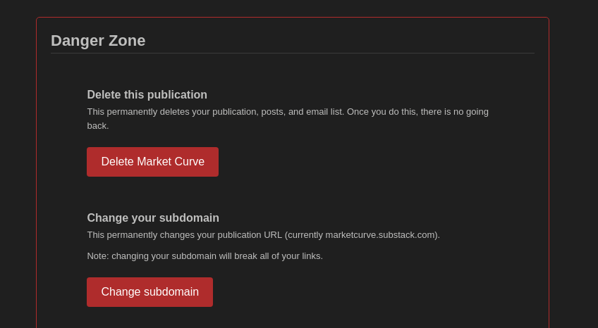
The Von Restorff is a powerful and low-time consumiing tweak you can make today. If you're too enthusiastic, you can do it right after you finish reading. Just a couple HTML + CSS tweaks and you're set. Wouldn't hurt to try.
And if you do find it is working, don't say thanks to me. Say thanks to Professor Von Restorff who stood her ground against Nazi Germany in 1935.
What the hell! You can say thanks to me also :))
Just buy me a cup of coffee ;)
Also you can subscribe to http://marketcurve.substack.com/ if you liked this essay.