
It’s September!
Which means the birds are back for Spring in the South, and the weather is going through an identity crisis trying to figure out whether to be warm or wet. It also means the Fistbump the Sky worldbuilding project has been out in the world for a year and nine months.
I can’t remember a time when I wasn’t drawing and creating stories, so although I’m a broke artist right now, I also feel incredibly blessed. I’ve also come to realise that it’s pointless to over-prepare. My poor mind was moving like a rollercoaster, trying to create an exact calendar that I could follow… For the next two years. But dates change and events get cancelled. Fistbump the Sky is also too big of a project to fit into my ideal, long-term schedule. The only thing we can be certain of is that a new year is around the corner, and with it, new events.
As mentioned in the previous email, I have decided to take a short break from posting the new Fistbump the Sky series, “The Map Maker,” so that I may bring it into physical reality. I will also have my very first book launch at the beginning of 2027, which would be the perfect time to see what people think of the physical version of the series.
With that in mind, the planning began.
THE PLAN
You might have realised that “The Map Maker” is completely different from “The Fantastical Encyclopedia of Fistbump the Sky” series. Time-wise, “The Map Maker” does not use memories and gossip to decipher the past. Instead, it goes from the present to the future, not the present to the past. It’s also not a series of art books, but a series of letters, diary entries, and visual breaks. Think of it as an epistolary series in the style of a comic book.
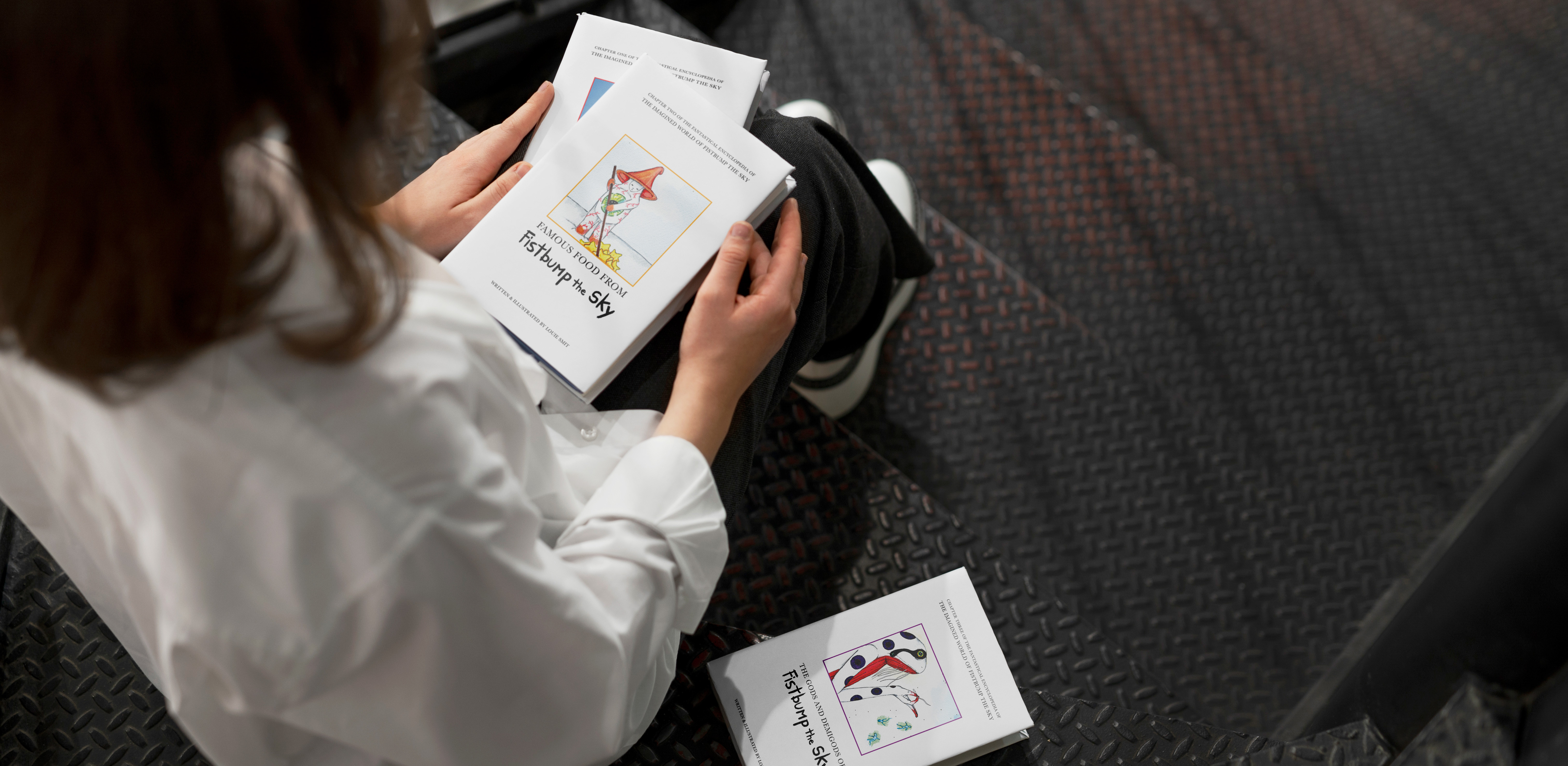
Naturally, there are a few similarities, namely overlapping timelines and characters. However, the biggest similarity is that both series aim to create an experience through sensory and visual input by using techniques such as different paper textures and art mediums. That's why the online version of “The Map Maker” looks the way it does. Producing it was going to be a leisurely task of printing out the documents that I already have.
Have I mentioned that I’m glad I took that break?
MY MIND IS A SNAIL, AND I AM DUMB
Turns out it wasn’t quite as simple as I thought.
The plan was to produce each piece of “The Map Maker” as a mini zine inside a cassette case. I even knew what the design would be. However, as it turns out, the small case size meant the booklets would have to be cut to fit. Having each booklet cut at a professional printer was out of the budget, and my motor skills, or more specifically “Bilateral Integration”, aren’t nearly good enough to pull it off alone.
That’s fine.
It doesn’t have to be a zine. It can be individual parts instead.
It would translate better as pieces anyway.
However, after finding only one (very expensive) source for cassette cases without those pointy, triangular things, and breaking a case after not being able to open it, the idea was quickly brought to a halt.
Fine.
Then let’s go big.
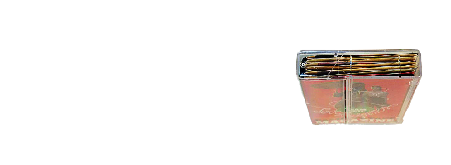
There’s nothing quite like the annoyance of an aesthetic being out of reach. As “The Map Maker” is divided into planets, readers could have bought boxes of cases, like a modern version of a parcel of letters. Sadly, the dream could not be. The objective was still the same: Find a way of grouping the hundreds of story pieces into planetary groups. I wanted the aesthetic to be vintage, or at least mysterious. Above all else, I wanted the reader to have the experience of solving a mystery. Boxes weren’t an option, as there’s nothing vintage about a regular box. They’re also inconvenient to take to conventions. That only left one other option.
You can probably see where this is going.
THE LOOK

That’s right– case files.
Not only did they meet the aesthetic and organisational requirements, but I could get them anywhere without resorting to online shopping.
With the container out of the way, it was time for my favourite thing– categorisation. As I mentioned, “The Map Maker” series consists of multiple pieces in the form of a visual break, a diary entry, or a letter. Each of these pieces are made up of smaller elements.
The VISUAL BREAKS can change form, such as from a news article to a moment, but remain a single element. The DIARY ENTRIES, on the other hand, consist of three elements– the “written” entry, an accompanying visual clue or moment, and a copy of the entry’s content in a legible font. Just in case. The tricky part was the LETTERS. You see, each one consists of four parts– a “written”, a legible “written”, a visual moment, and a delivery pet.
The delivery pets were probably what I was most excited about. I didn’t want everything in “The Map Maker” case files to be flat and printed. I would, of course, tear the letters that appear torn in the online version of the series, but it wasn’t enough. I wanted something more real, and the delivery pets were just the thing. I also happened to have moulds and other objects that would work perfectly for the delivery pets. But more on that next time.
As the name suggests, these are personal pets used to deliver messages and gifts. Often adorable, delivery pets are extremely rare, as the creature of one’s choice must willingly agree to take on the role. They are also one of Fistbump the Sky’s few, if not the only, untraceable means of communication. As such, delivery pets usually belong to affluent Ingredient-Borns who can promise a lifetime of comfort in exchange for their services.
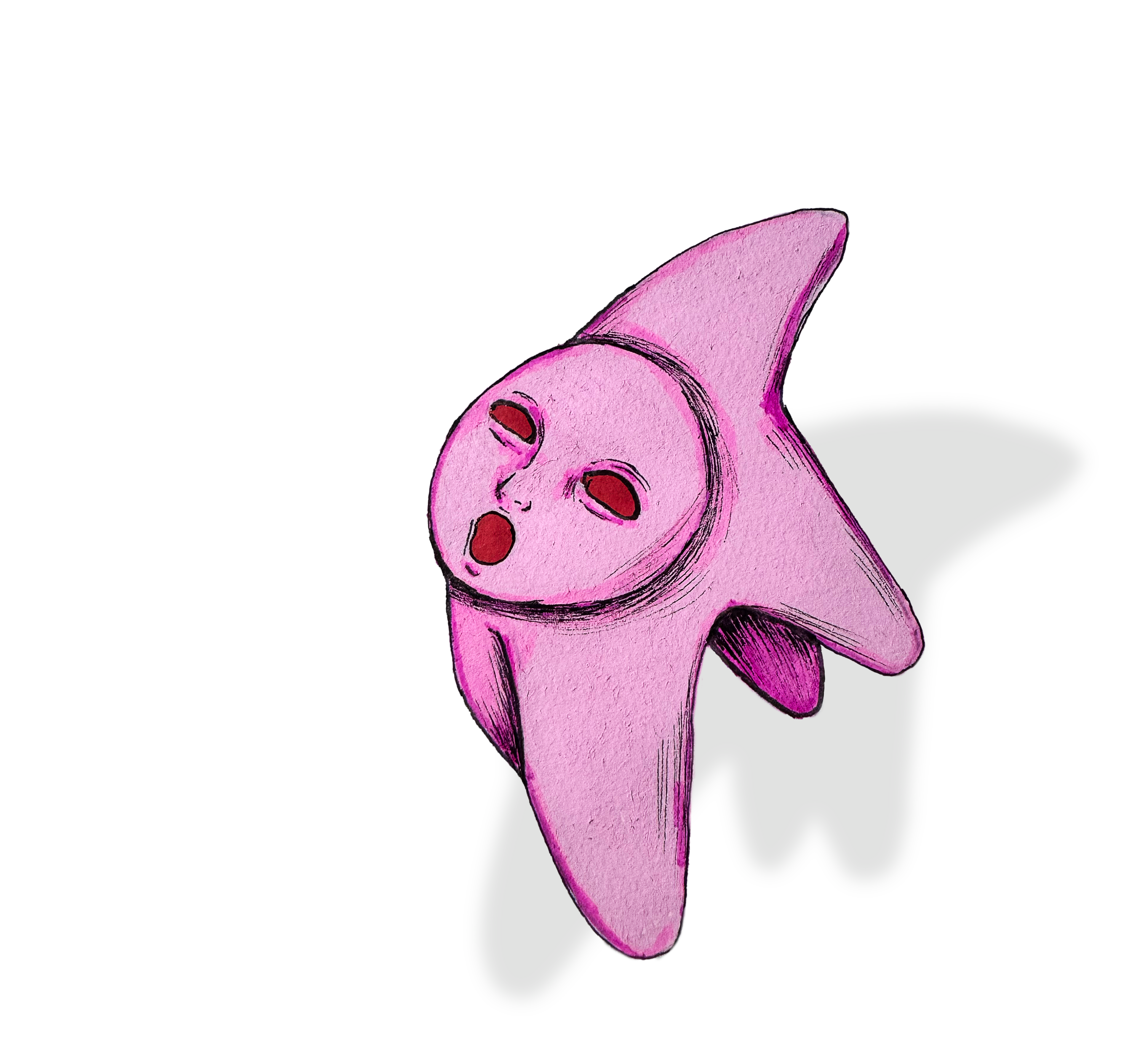
Printing was a breeze for the most part, since I already had everything that needed printing. I also avoided cutting as much as possible by working with the bleed frame that appears on printed paper, rather than against it. That just left the “final touch”.
I wanted to make it clear to the reader that the diary entries, letters, and even the visual breaks in “The Map Maker” come from different characters and territories, without breaking the case file effect. Using colour as a signifier was too obvious and might take the fun away from the reader. Besides, I had already decided to stick to the planet colours, such as blue and white for planet Dudh. No, the final touch was not the colour scheme, but the packaging.
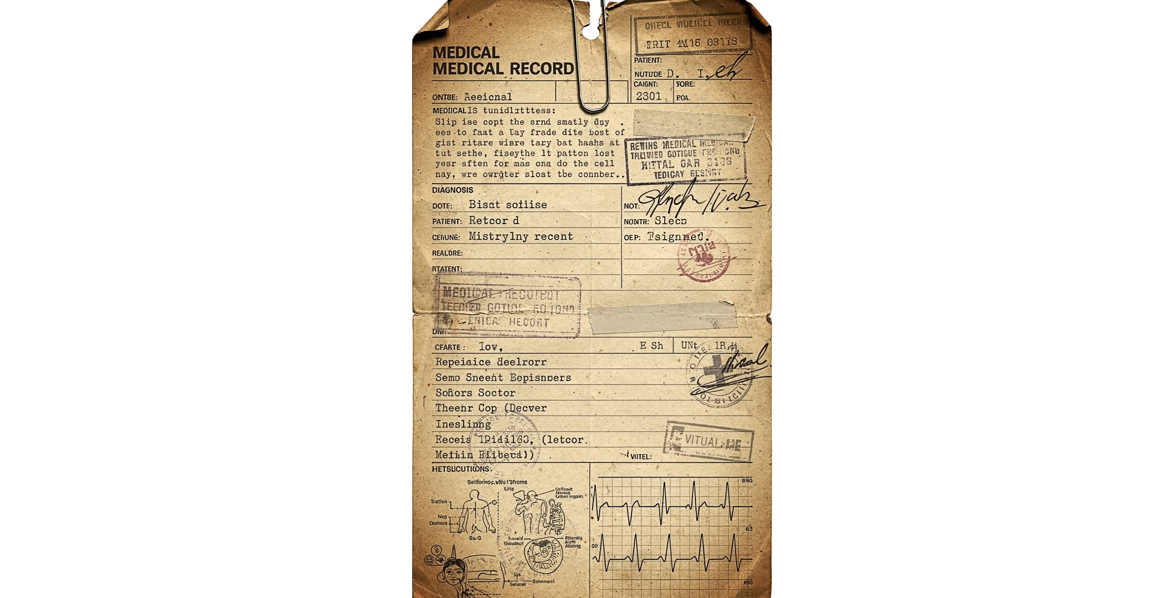
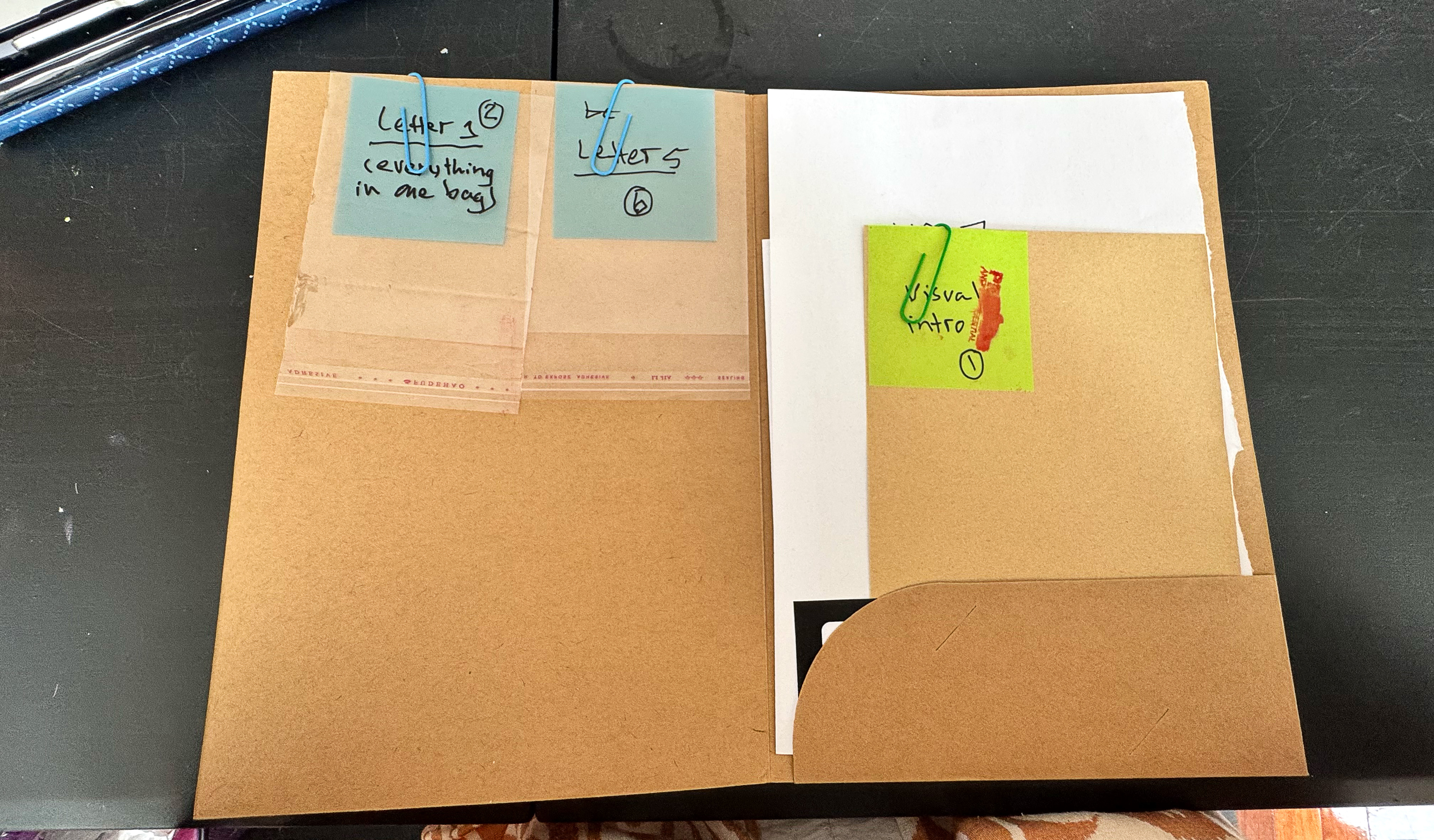
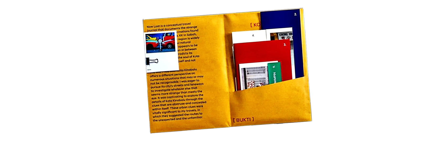 Placing every piece in an envelope made sense, but what’s the point if everything looks the same? Dividing everything so that all visual breaks were presented in the same way, and so, too, the letter and visual breaks, was a momentary consideration. However, expecting readers to piece together a story is far different from expecting them to piece together letter elements. It became clear that a combination would be the best approach moving forward.
Without revealing too much, this was the result. For now.
Fistbump the Sky is a full-time worldbuilding project shared through independently published short stories and handmade art. If you would like to learn more or support the work, consider subscribing to our newsletter and following us on socials, or buying the creator a coffee.