

Hello, dear aspiring F1-Analysts,
We're at the last act of this season, and for the first time since 2010, we have 3 drivers fighting for the title! All sessions will be crucial for the overall outcome: the FPs to ace the setup, qualifying to start in front of your opponents, and the race to capitalise on everything built up to that point. PIA starts the weekend at a disadvantage, as he was replaced for FP1. On the contrary, NOR has a crucial point advantage, providing him with the luxury of not having to win the race to be crowned champion. Let's take a look at the data so far!
Track Characteristics
How to read: The track map shows its layout divided into three sectors (S1 in Red, S2 in Blue, and S3 in Yellow). The zones in which the DRS can be used are highlighted in green. In the race, a driver who crosses the DRS Detection Zone within 1s of the preceding driver can use the DRS in all zones up to the next DRS Detection Zone.
The track is medium-speed, and different aero setup options are feasible: in fact, McL and RBR tested two different rear wing specs. Overtaking is doable unless you're stuck behind a DRS train, and certainly more feasible than in Qatar: that's why LEC has a good chance at a recovery (but the one for the WCC is much slimmer).
It features 2 pretty long DRS zones, where most overtakes happen (Although the 2021 title-decider overtake happened into T5), especially the second one, as the first one is often used to prepare the attack. The track is very complete and allows no specific weaknesses.
Characteristics of each sector:
Sector 1 (red): The one which includes the fastest corners: T1, in particular, is tricky, as the driver must judge the right braking point and then approach the corner correctly so as not to lose speed on the exit (or go wide)
Sector 2 (blue): The fastest segment, basically 2 straight connected by a chicane (and a hairpin leads to the first one)
Sector 3 (yellow): The slowest one. Its many slow corners make it very similar to Monaco (downforce, mechanical grip, and agility are king here)
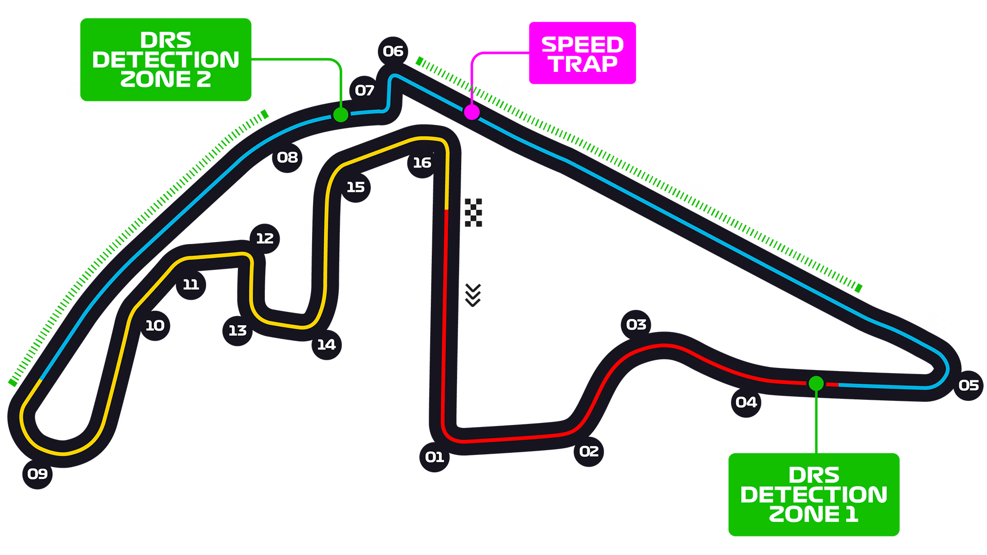 So, good downforce is needed for Sector 1, low drag for Sector 2, and good downforce/mechanical grip/agility for Sector 3: that's why it's a complete track.
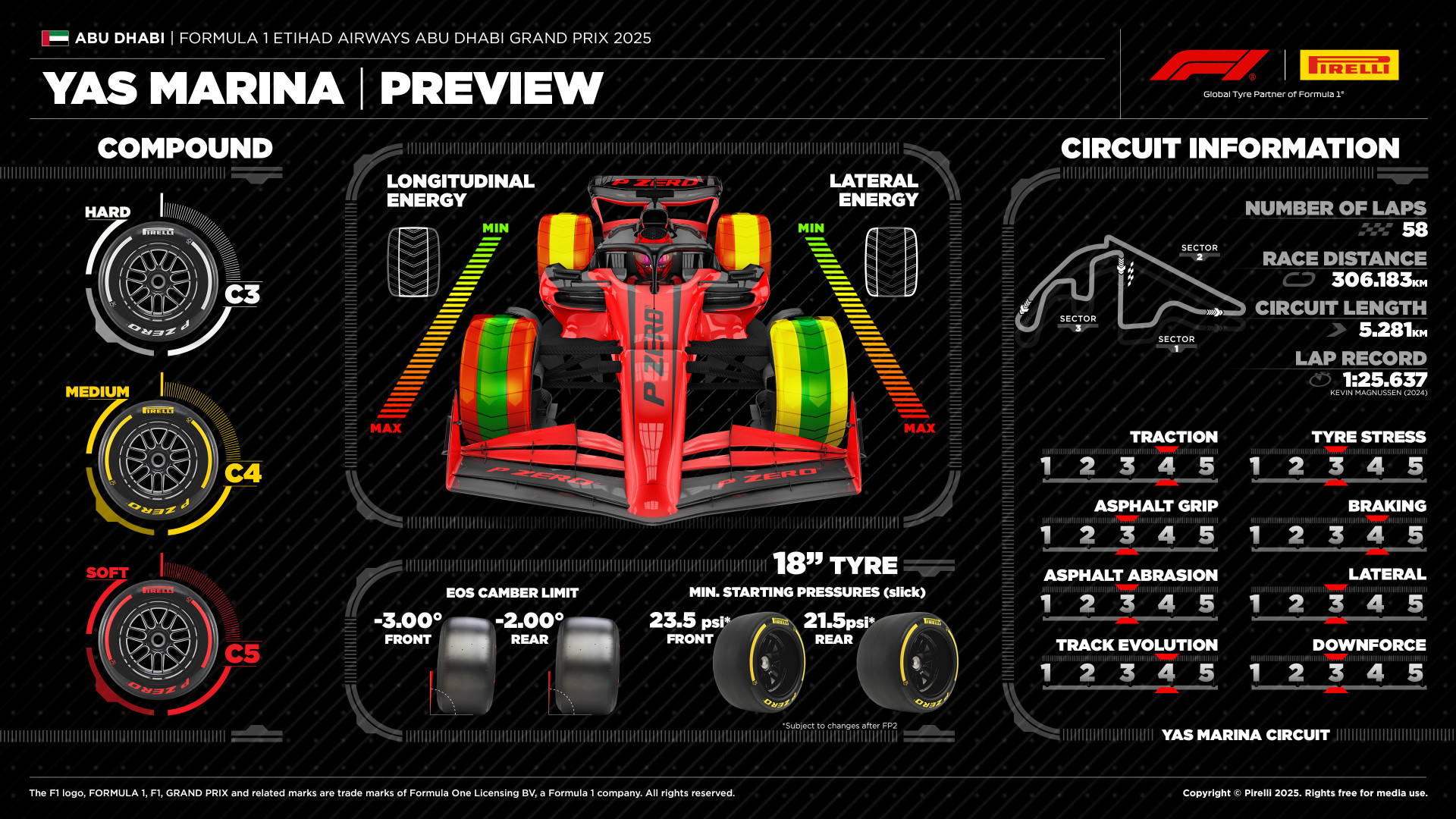
Pirelli’s Track Preview:
Pretty soft compounds (C3 to C5) despite moderate (3/5) tyre stress: only the Hards can be expected to have little degradation. Traction and braking are crucial for laptime, but cornering is pretty important too. Overall, as I said, track characteristics are pretty balanced, as is the downforce level required.
 Weather Forecasts (by F1)
Constant weather conditions throughout the weekend, in terms of temperatures. No rain expected.
FRIDAY, NOVEMBER 28 – FP1 AND SPRINT QUALIFYING
Conditions: Sunny and dry all day. Light-to-moderate northerly wind. FP1: 26-25°C // Sprint Qualifying: 22°C
Maximum temperature expected: 28 Celsius
Minimum temperature expected: 20 Celsius
Chance of rain: 0%
SATURDAY, NOVEMBER 29 – THE SPRINT AND QUALIFYING
Conditions: Sunny and dry all day. Light northerly wind. Sprint: 25°C // Qualifying: 21°C
Maximum temperature expected: 28 Celsius
Minimum temperature expected: 20 Celsius
Chance of rain: 0%
SUNDAY, NOVEMBER 30 – RACE
Conditions: Sunny and dry all day. Light north-to-north easterly wind. Race: 22-21°C
Maximum temperature expected: 28 Celsius
Minimum temperature expected: 19 Celsius
Chance of rain: 0%
Wing Levels
What it means: Teams can use different rear wings. A more loaded rear wing will produce more downforce at the expense of more drag: the car will have slightly better traction, cornering, and much better braking, but also lower high-speed acceleration and top speed. Generally, it will have less tyre wear, but it will also empty its battery more quickly. A more loaded wing plane is a plane with more camber (more curvature) and a higher angle of attack (the angle of the wing relative to the airflow). The wing load can be increased independently through the lower and upper planes: the DRS only acts on the upper plane, so running a more loaded upper plane and a less loaded lower plane will generally make that car's DRS more effective.
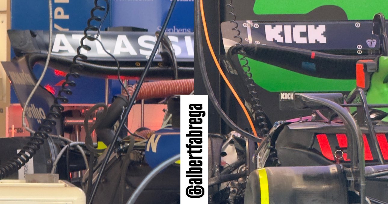
Medium wing levels overall. Ferrari and McL have an almost identical wing design; RBR and Mercedes are running slightly less drag and downforce. The main differences in wing load are obtained through a different design of the lower plane: RBR and Mercedes are expected to have less drag with DRS off AND on.
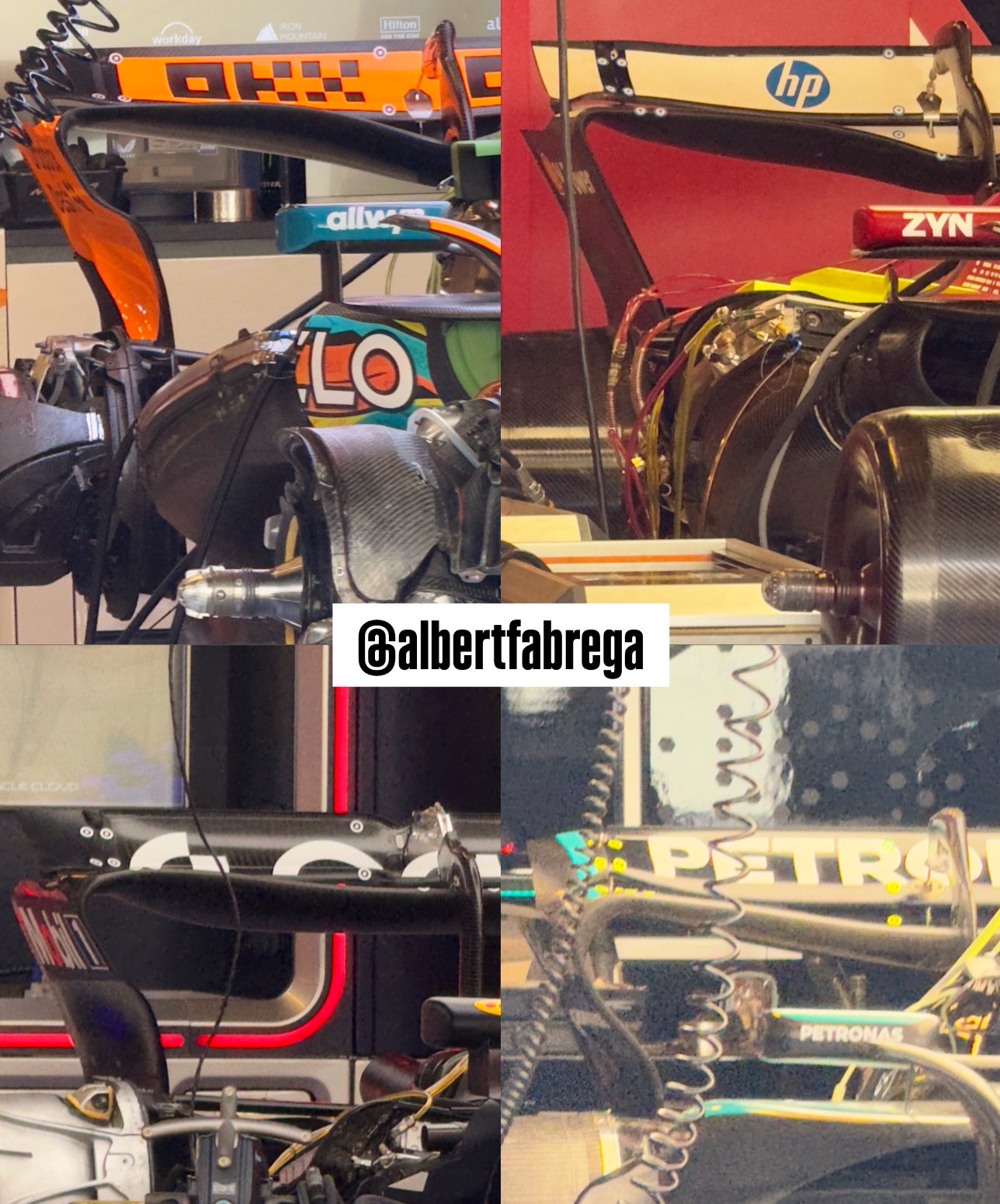 RBs have a less loaded lower wing, as is often the case with them.
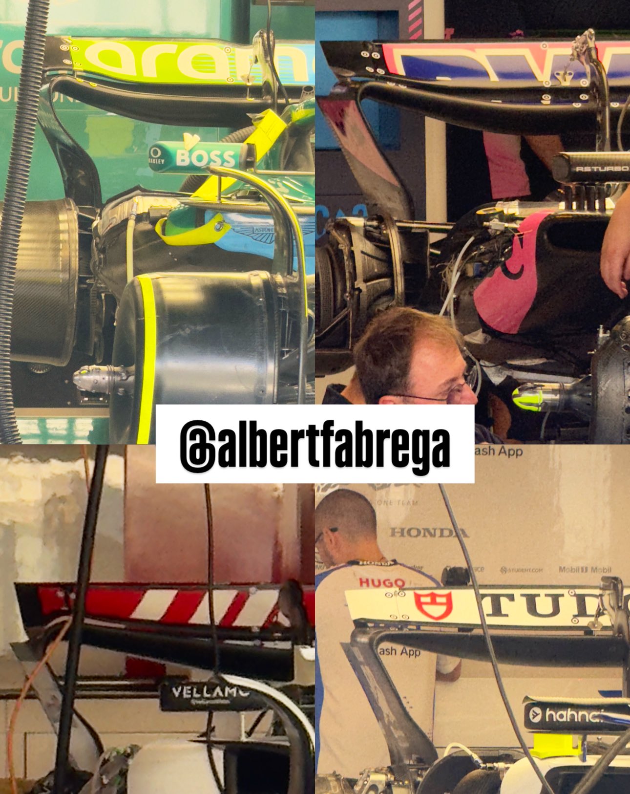 Notice the huge difference in the lower plane load between Williams and Sauber! Sauber's upper plane is more loaded, too: a significant 'drag' on the straights!
 Single Lap Pace
Best Laptime per Driver
How to read: The graph shows the difference between each driver's fastest lap in the session. The letter to the right of each driver indicates the compound used.
NOR was quickest - by far - in FP2. He distanced VER by 0.363s, as no driver separated the two. Behind VER, the pack was tight: just ~1 tenth between P2 and P6. The top 16 drivers finished FP2 within 9 tenths of P1, and ~5 tenths away from P2.
Everyone used Softs in their best attempt, making it easier to compare their performance.
 Aero Map
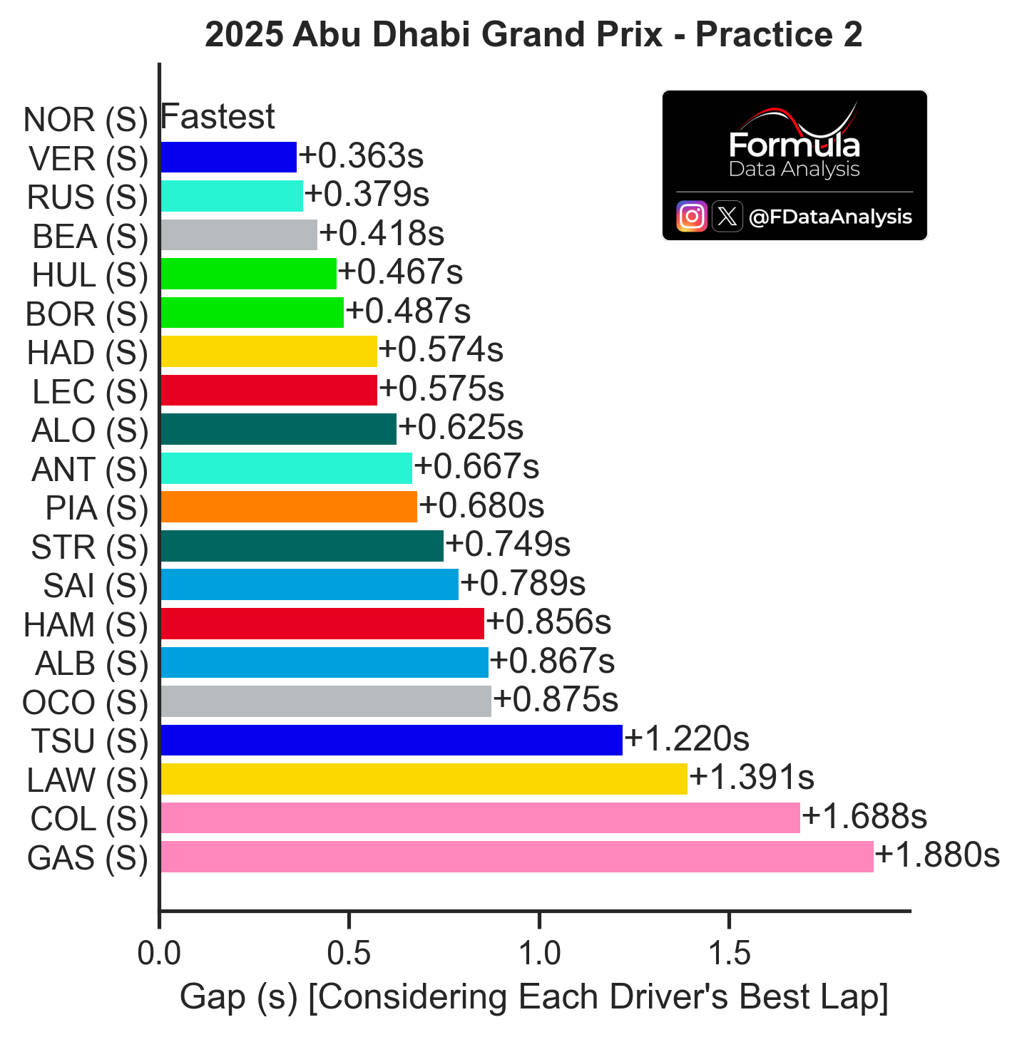
How to read: Average speed on the horizontal axis: the further to the right a team is, the better its performance (the lower the lap time). Top speed on the vertical axis: the higher a team is, the lower that car's drag or the higher that team's engine mode. Therefore, this plot not only shows who was the fastest (those on the right) but also why! (due to very low drag, if they are in the upper portion, or despite that, if they are in the lower portion).
McL, Mercedes, Aston, and Williams opted for very loaded setups for FP2, often changing the wing previously used in FP1. The result was high drag, but also good downforce in the case of Mercedes and excellent in the case of McL. RBR's setup couldn't be any more different: lowest drag, yet some lack of downforce. Ferrari chose an intermediate solution, but it was slower than all of them. Alpine had high drag and yet no downforce to make up for it.
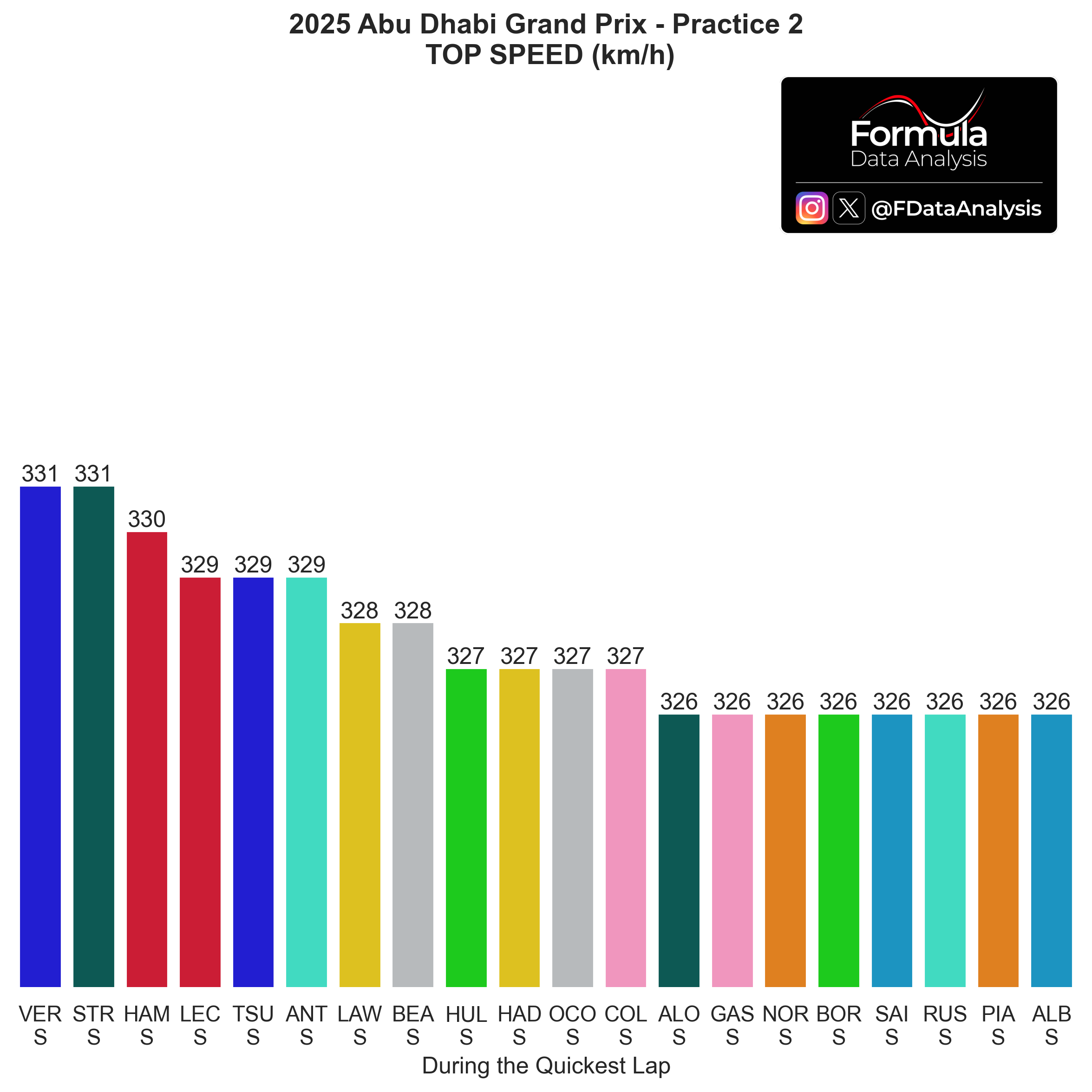
 Top Speeds
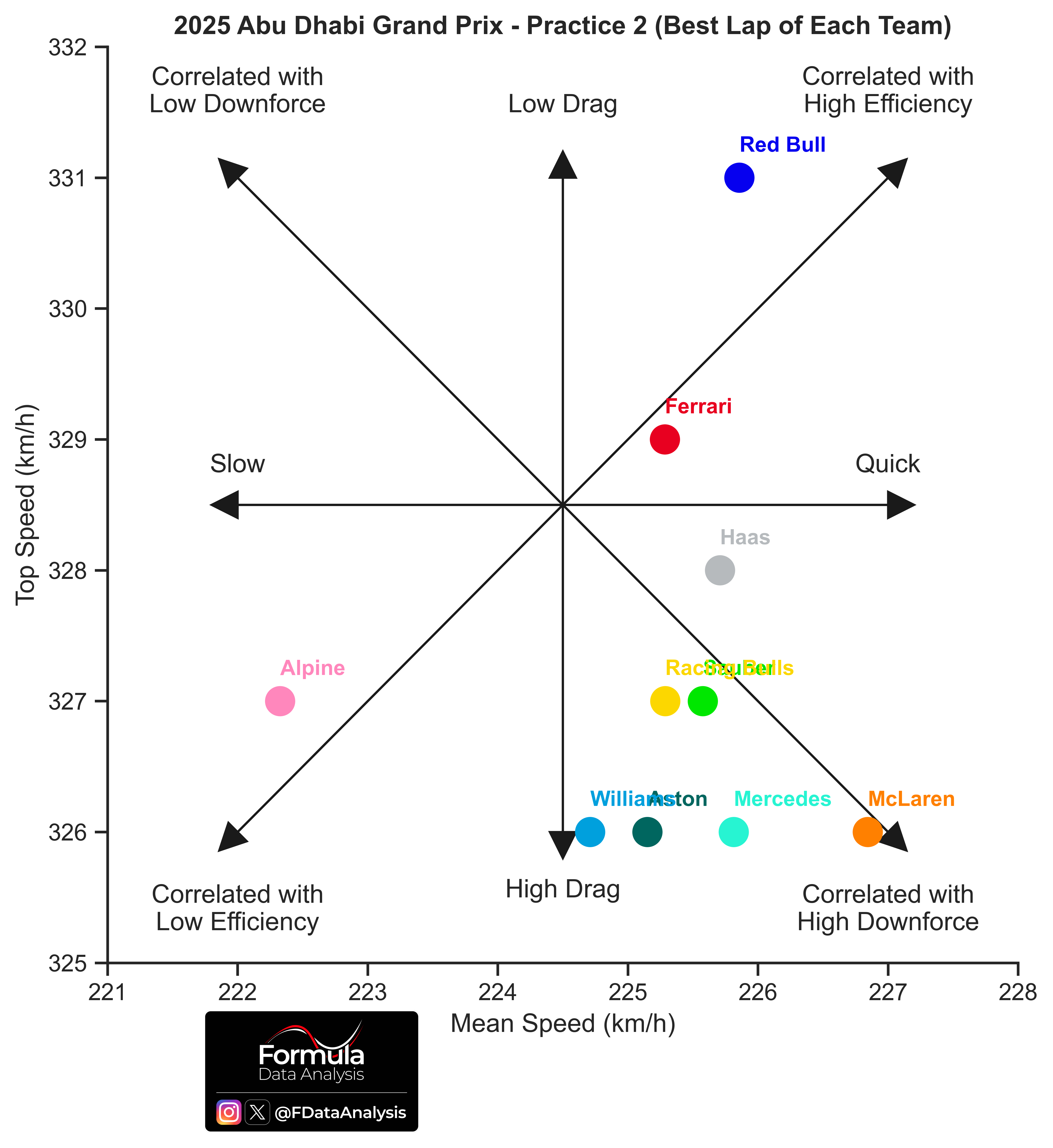
How to read: The higher a team's top speed, the lower that car's drag or the higher that team's engine mode.
As I mentioned, one of the three championship contenders had a setup which was diametrically opposite to that of the other two: the quali and race will be spicy unless there is some convergence!
 Same chart, per driver:
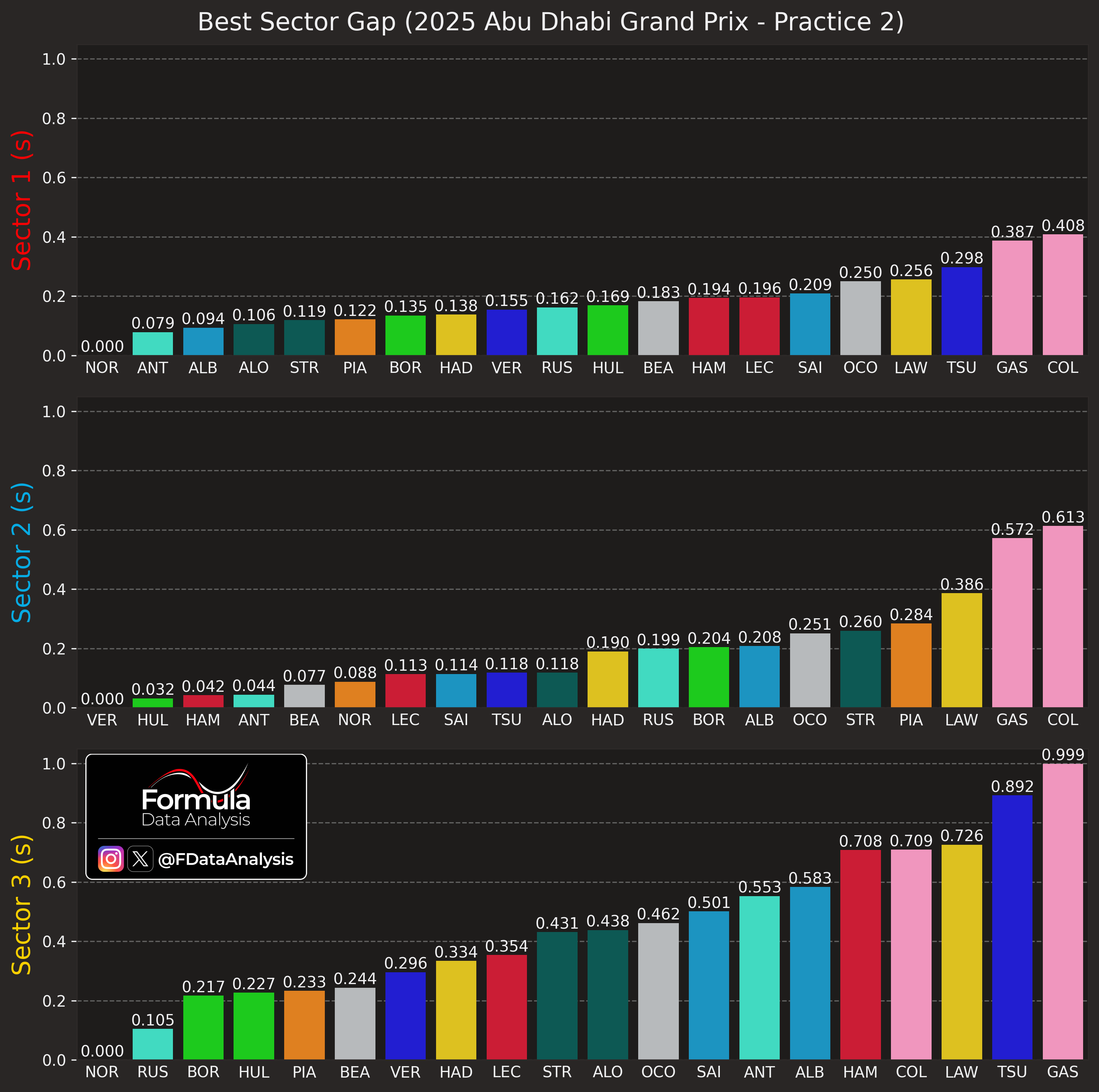
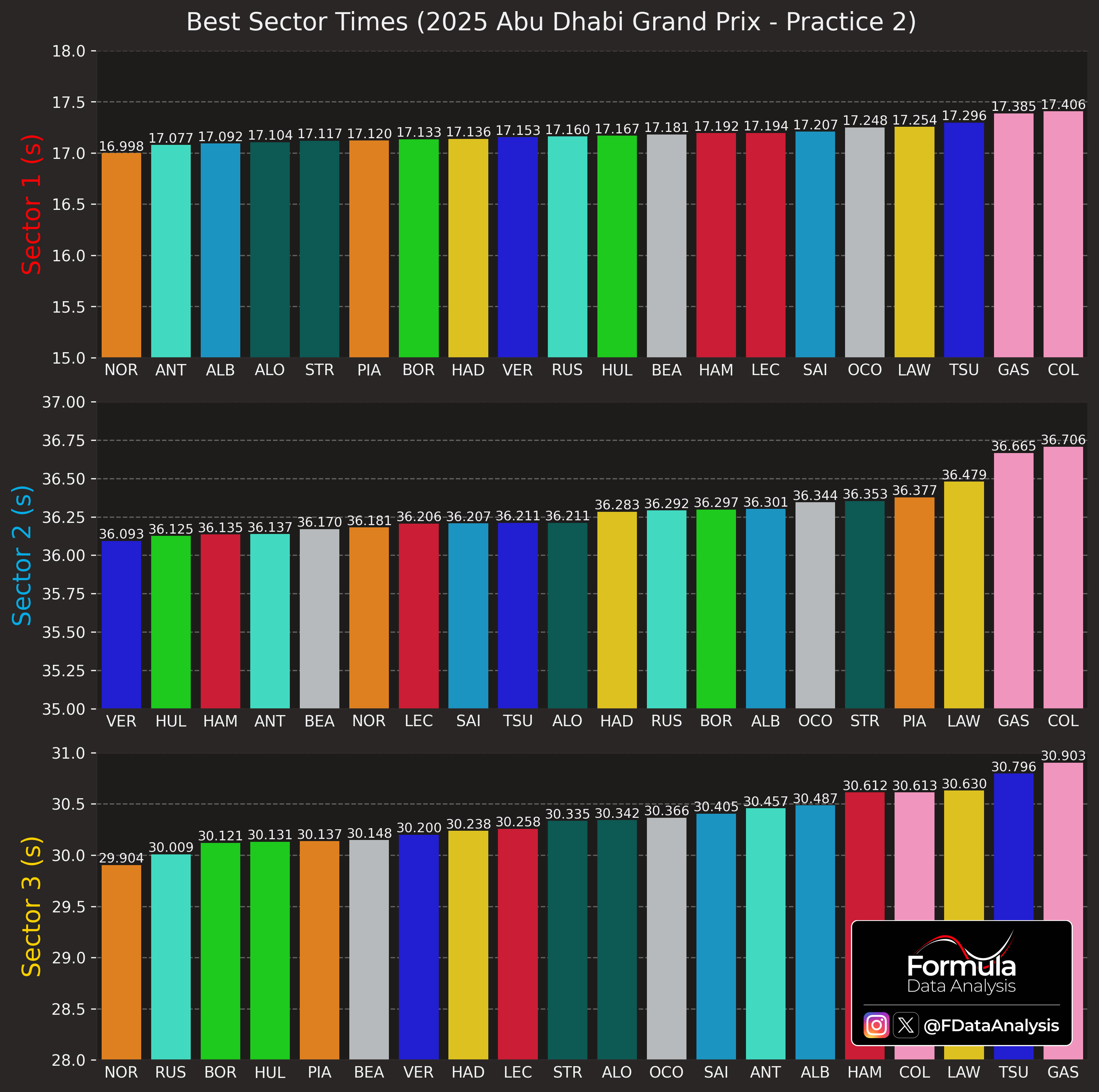
 Best Sectors
A summary to remind you of the properties of each one:
Sector 1 (red): The one which includes the fastest corners: T1, in particular, is tricky, as the driver must judge the right braking point and then approach the corner correctly so as not to lose speed on the exit (or go wide)
Sector 2 (blue): The fastest segment, basically 2 straight connected by a chicane (and a hairpin leads to the first one)
Sector 3 (yellow): The slowest one. Its many slow corners make it very similar to Monaco (downforce, mechanical grip, and agility are king here)
NOR was quickest in sectors 1 and 3 (those that require the most downforce). Conversely, VER (having the best top speed) was quickest in S2, which contains the two longest straights. Notice that NOR was way closer to VER in S2 than the latter was to the current WDC leader in the other two sectors: VER lost almost 3 tenths in S3 alone!
HAM's low drag setup made him quick in S2, yet painfully slow in S3.
 Best vs Ideal Lap
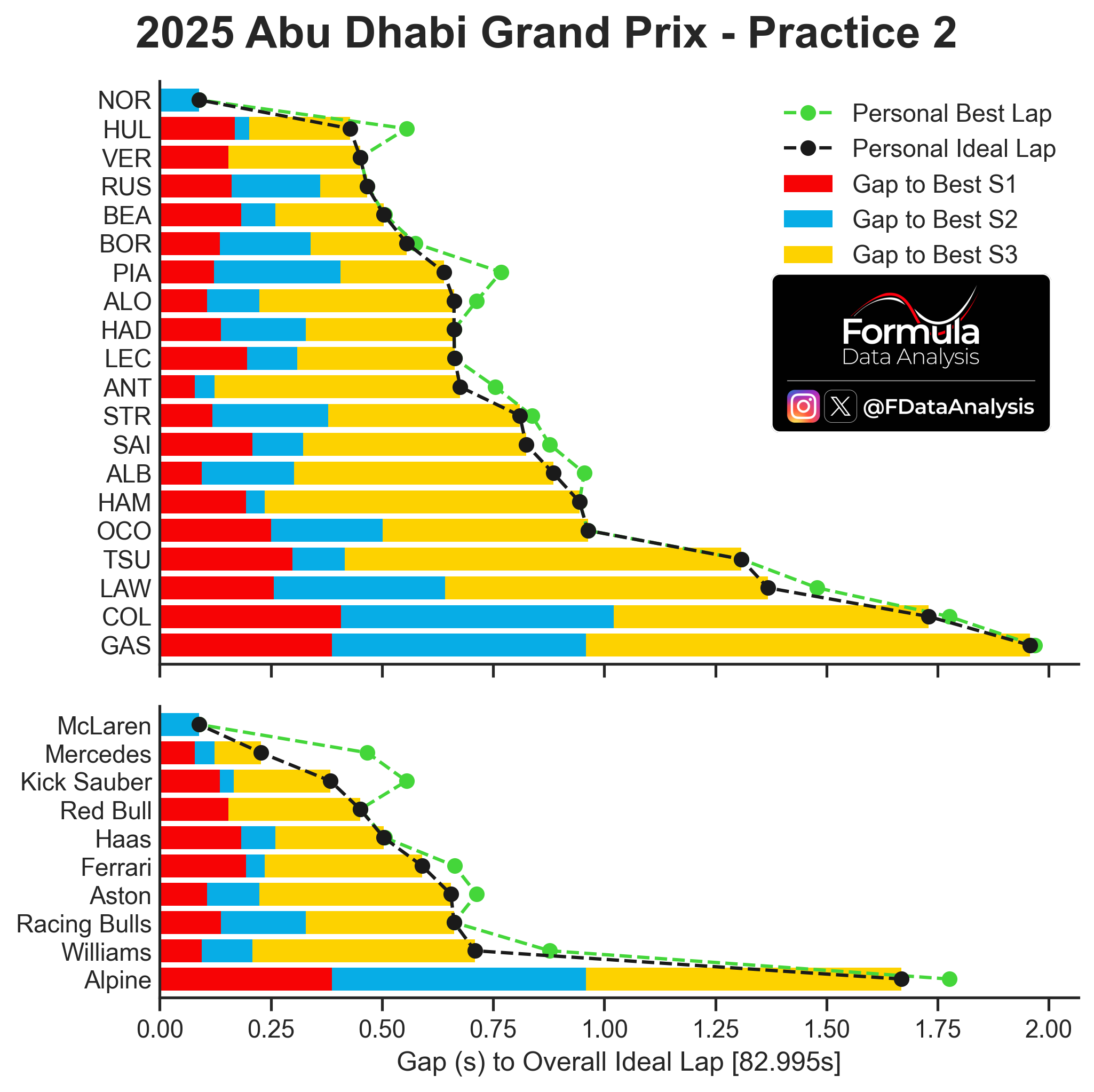
How to read: The graph shows, for each driver and each car, the ‘Personal Ideal Lap’ (the lap time obtained by the sum of that driver’s or team’s best 3 sectors, which might have been achieved in different laps) in black, and the ‘Personal Best Lap’ (the best lap time that the driver or team has effectively achieved in the session) in green. Consequently, the Personal Ideal Laptime is always equal to or lower than the Personal Best Laptime. If the two coincide, it means that the driver or team has produced its best sector times all on the same lap. The farther the Personal Best Laptime is from the Personal Ideal Laptime, the more potential lap time that one driver or team has left on the table. The coloured bars indicate the gap to the absolute best sector time. The ‘Overall Ideal Lap’ is shown at the bottom of the figure, and is the sum of the lap times of the overall best sectors, independent of which driver or car achieved them.
Combining each car's fastest sectors, the single-lap order in FP2 was:
McL
Mercedes
Sauber
RBR
Haas
Ferrari
Aston, RBs
Williams
Alpine (very far)
Obviously, the correct context must be taken into account while evaluating these data. Moreover, Sauber's and Mercedes' excellent ideal laptimes were because their drivers performed well in different sectors (e.g. HUL in S2 and BOR in S1 and S3). Still, Sauber's strong form is clear, even assuming they were running with less fuel in the tank.
 Throttle Use
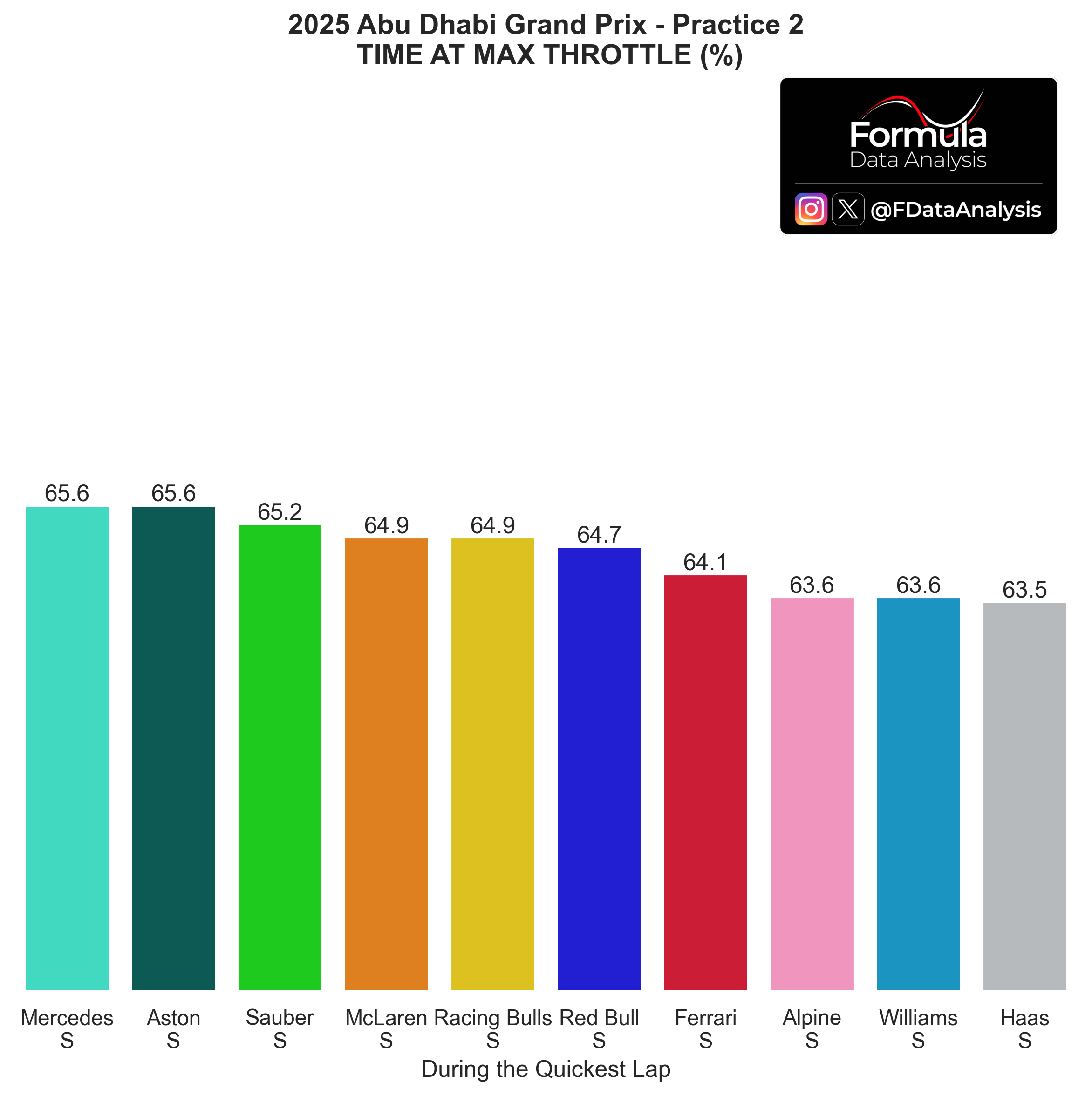
How to read: The graph shows the percentage of the time the driver spent at full throttle. Spending more time at full throttle is correlated with a weaker Power Unit mode, more drag, less fuel, and better grip (especially concerning traction out of the corners). This analysis is used together with the lap time produced by each driver and the corresponding top speed achieved to pinpoint which teams could be on a lower engine mode. For example, if a team produced a lap time worse than usual but they are topping the charts concerning throttle usage, it's pretty likely that they were running a more conservative engine mode. Looking at the top speed achieved could confirm it.
Very tight field, at least when each team's quickest driver is considered: just ~2% difference between highest and lowest throttle usage.
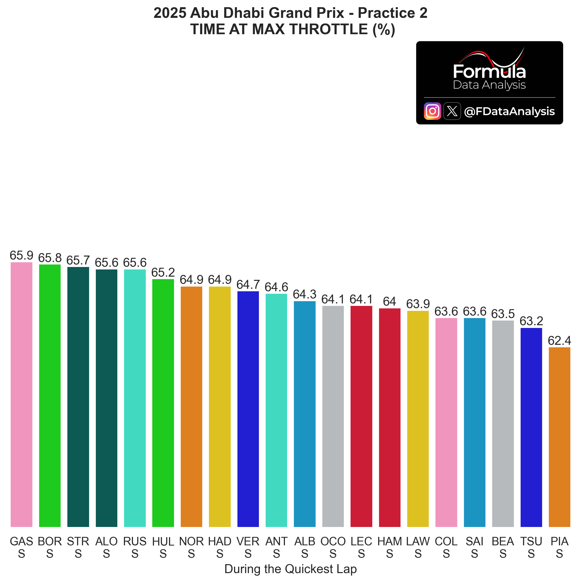
 Same chart, per driver:
The overall picture remains tight except for PIA, who could remain full throttle for less time than anyone else. He was struggling to put the power down in FP2, despite the car's high downforce. He must find the grip and on-throttle confidence to fight for the championship on Sunday.
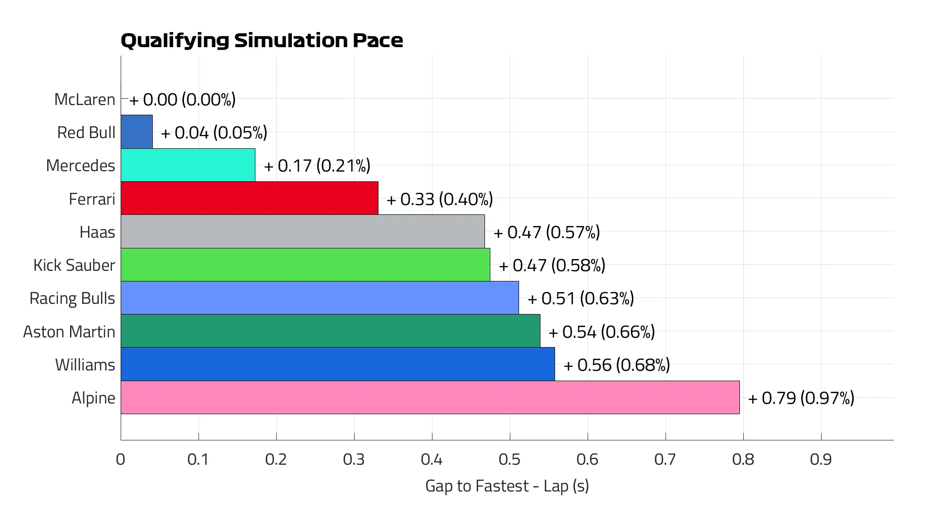
 Quali Simulation by F1:
F1 expects McL to be quickest, narrowly in front of RBR. Mercedes should be a more distant third, followed by Ferrari as 4th quickest. Then, most of the field, except for Alpine. I agree with this pecking order, but I do, with the exception that the gap between the fastest McL driver and the fastest RBR driver should be larger than a tiny 0.04s/lap. Based on what we've seen so far, I think that Sauber and Haas could be closer to Ferrari than this graph shows...
 Race Pace
Long Runs

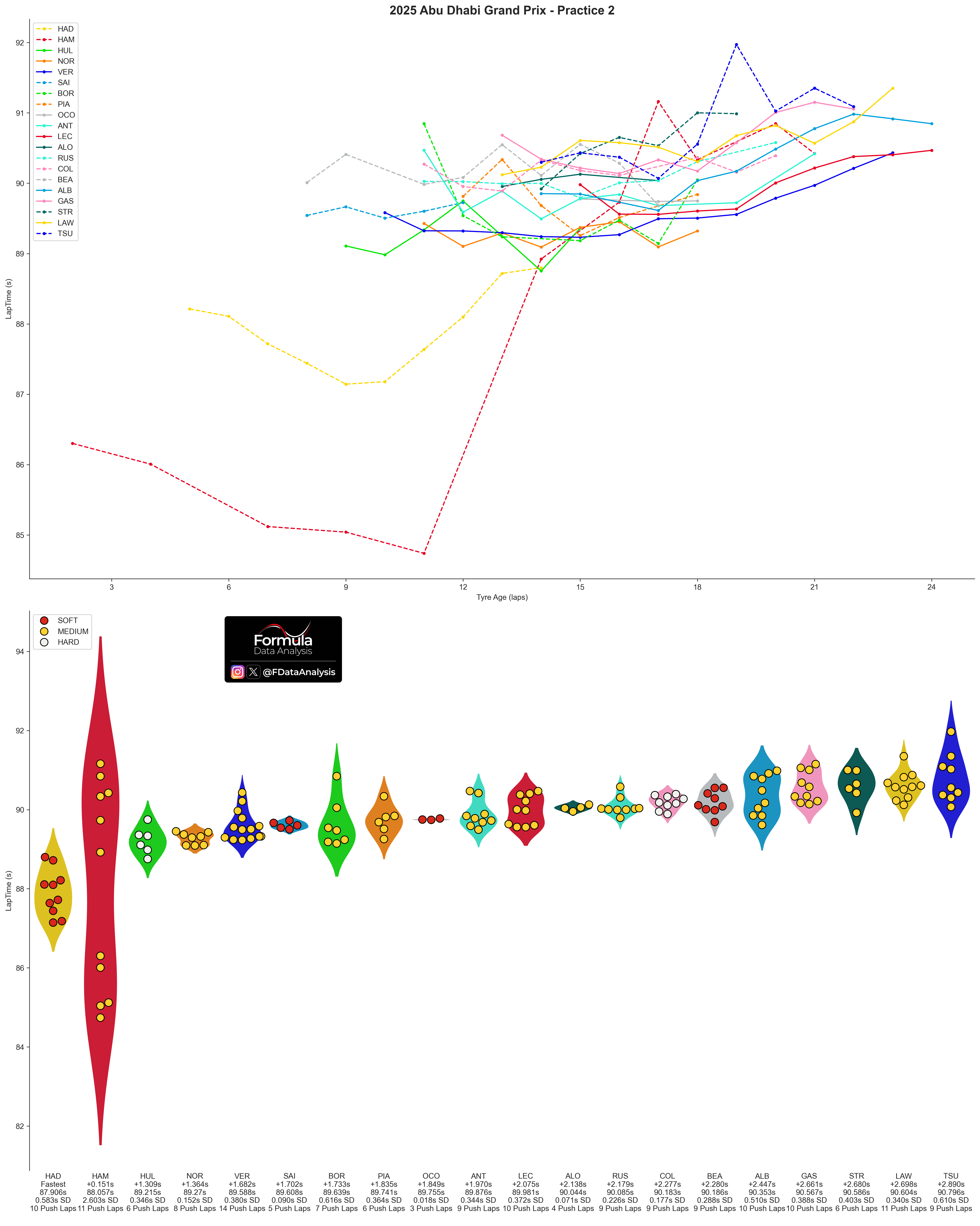
How to read: The chart shows the distribution of lap times during each team's long runs. A long run only includes segments of at least 5 consecutive laps run on the same compound without pitting or slowing down.
Top 5 Teams based on WCC (You will find all the data at the bottom of the plot)
HAM was the only driver to perform several (5) consecutive fast laps before starting his 'proper' long run (no tyre change or fuel addition). If only the proper long-run is considered, then NOR was quickest, a bit over 3 tenths quicker than VER on average. VER produced extremely consistent laptimes in the first part of the stint, but had some degradation after having done 16 laps on the tyre set. NOR quickest, VER 3 tenths behind, then PIA 5 tenths behind NOR: advantage NOR.

 Bottom 5 teams, based on WCC:
HAD was very quick on softs, but he did suffer from severe degradation after 10 laps already: notice his upward laptimes trend. HUL was the next quickest driver, and did so on Hards! BOR was next.
 Overview of all teams:
 Pace Last Year
How to read: The upper plot shows the synthesis of each driver's pace during the race. The lower plot shows the (smoothed) evolution through the laps. Each bar contains the central 50% of the distribution: the shorter it is, the more consistent the pace. Inside it, the solid line indicates the MEDIAN (how quick was the TYPICAL lap), while the dashed line indicates the MEAN (how quick was a lap ON AVERAGE). The whiskers include all the laps from a driver which are not uncharacteristically slow for that driver: the lower whisker, in particular, shows that driver's quickest lap. The mean lap time is indicated below each driver's name, and below that is the gap to the quickest driver. The bottom line indicates the tyres used.
NOR was quickest: his advantage over SAI was 0.11s/lap: nothing huge, all things considered. The gap grew in the second part of the race, as SAI could not keep up with his pace on worn Hards.
LEC was the 3rd quickest, which is impressive considering that he overtook more drivers than anybody else! He could do little in the last 20 laps to make up for the worn state of his Hards.
HAM had a very high variance in lap times: his slow laps were slower than LEC's, but his fastest ones were better than NOR's! That is the effect of driving in traffic in the first part, and then having fresh and softer tyres in the end to push 100% in free air. He was 0.14s/lap quicker than his teammate. PIA and VER had a pace similar to his. By using one additional tyre set compared to GAS and HUL, ALO and ZHO were quicker than them on average. Still, they finished behind them, due to the additional time lost in the pits. On his debut, DOO was 0.5s/lap slower than GAS (who drove excellently) in his very first F1 race
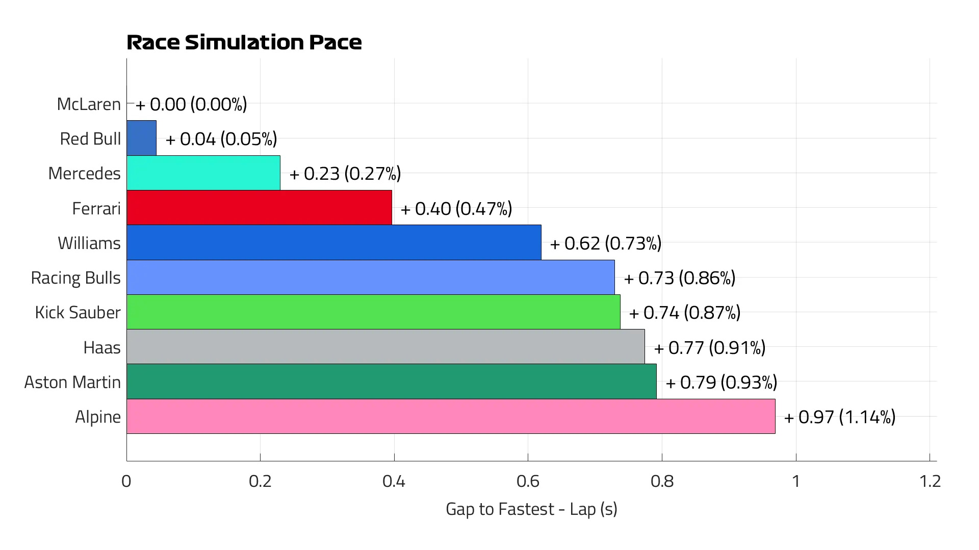
 Race Pace Simulation by F1:
F1's race pace simulation follows that on quali pace concerning the top 4 and Alpine, but differs for the other 5 teams: they expect Williams to perform way better in the race than in quali; the opposite for Haas
 My prediction
Quali
Overall, this is my expected running order concerning quali (considering the placement of the best driver of each team, so the ultimate car’s potential). Teams on the same line are too close to call:
McL
RBR / VER (But still quicker than McL's second driver)
Mercedes
Ferrari
Haas, Sauber
RBs, Aston, Williams
Alpine
Race Pace
My prediction is:
McL
RBR / VER (But still quicker than McL's second driver)
Mercedes
Ferrari, Williams
RBs, Sauber, Haas, Aston
Alpine
Will this prediction be confirmed? And what is yours?
Enjoy the content, and thank you SO MUCH for your support! And check the data repository for more!
Mirco/Formula Data Analysis