

Hello, dear aspiring F1-Analysts,
The second race weekend of the 2025 season is already there, and what a big shakeup it's looking to be! A sprint weekend, meaning that also the structure of this preview article will be slightly different, as we already have access to some relevant (e.g. 'no sandbagging') data: the results and telemetry information from the Sprint Qualifying. Ferrari is looking for a comeback, McL were at least as quick as them but couldn't capitalise on their performance, VER is in the mix as always, and Mercedes is once again a solid car behind the very top ones. Let's take a look at the data!
Track Characteristics
How to read: the track map shows its layout divided into three sectors (S1 in Red, S2 in Blue, and S3 in Yellow). The zones in which the DRS can be used are highlighted in green. In the race, a driver who crosses the DRS Detection Zone within 1s of the preceding driver can use the DRS in all zones up to the next DRS Detection Zone.
This track is more representative than Albert Park. It includes a good diversity of corners (low, medium, and high-speed ones), two long DRS-assisted straights, and a very intense braking point (into T14). The T1-T2 complex is also one of the longest-lasting corners on the track.
Characteristics of each sector:
Sector 1: The end of the start/finish straight, the very long T1-T2 right-hand side complex, then a left-hand side corner slingshotting into sector 2
Sector 2: Another slow sector, which has no proper straight. It features the fastest non-full-throttle corner (T7, over 270km/h in quali!)
Sector 3: The fastest one. Having a good exit out of T12 is crucial not to lose time on the very long straight. It also includes the first part of the start/finish straight.
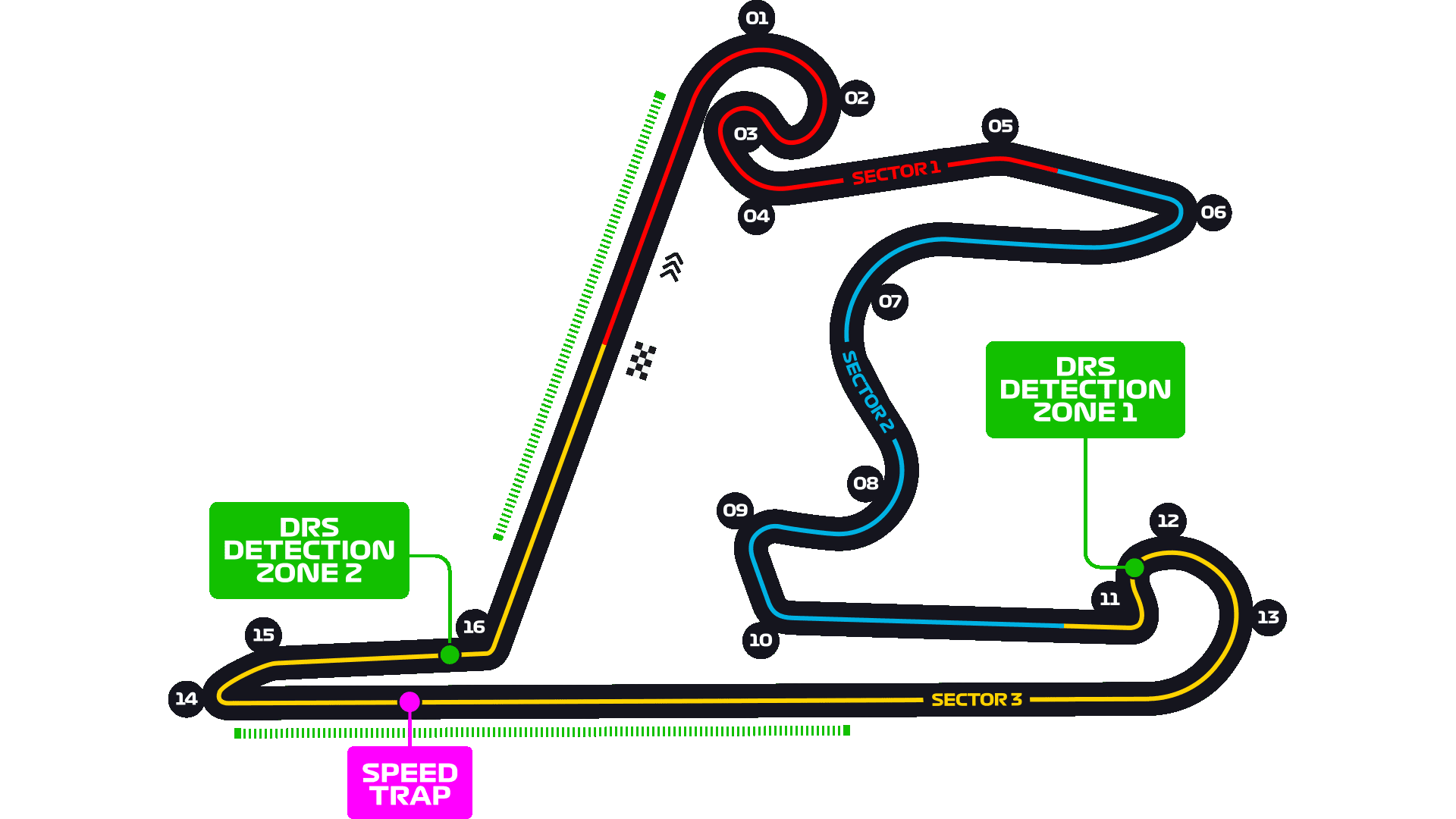
The rear-left tyre will be the most stressed, due to a combination of traction forces and high vertical load on average as the track runs clockwise. Tyre stress will be higher than on average; Pirelli is bringing one-step harder tyres compared to Australia. Braking and lateral grip are important for performance, as is aero efficiency (high downforce with modest drag)

Wing Levels
What it means: Teams can use different rear wings. A more loaded rear wing will produce more downforce at the expense of more drag: the car will have slightly better traction, better cornering, and much better braking, but also a lower high-speed acceleration and top speed. Generally, it will have less tyre wear, but it will also empty its battery more quickly. A more loaded wing plane is a plane with more camber (more curvature) and a higher angle of attack (the angle of the wing relative to the airflow). The wing load can be increased through the lower and upper plane independently: the DRS only acts on the upper plane, so running a more loaded upper plane and a less loaded lower plane will generally make that car's DRS more effective.
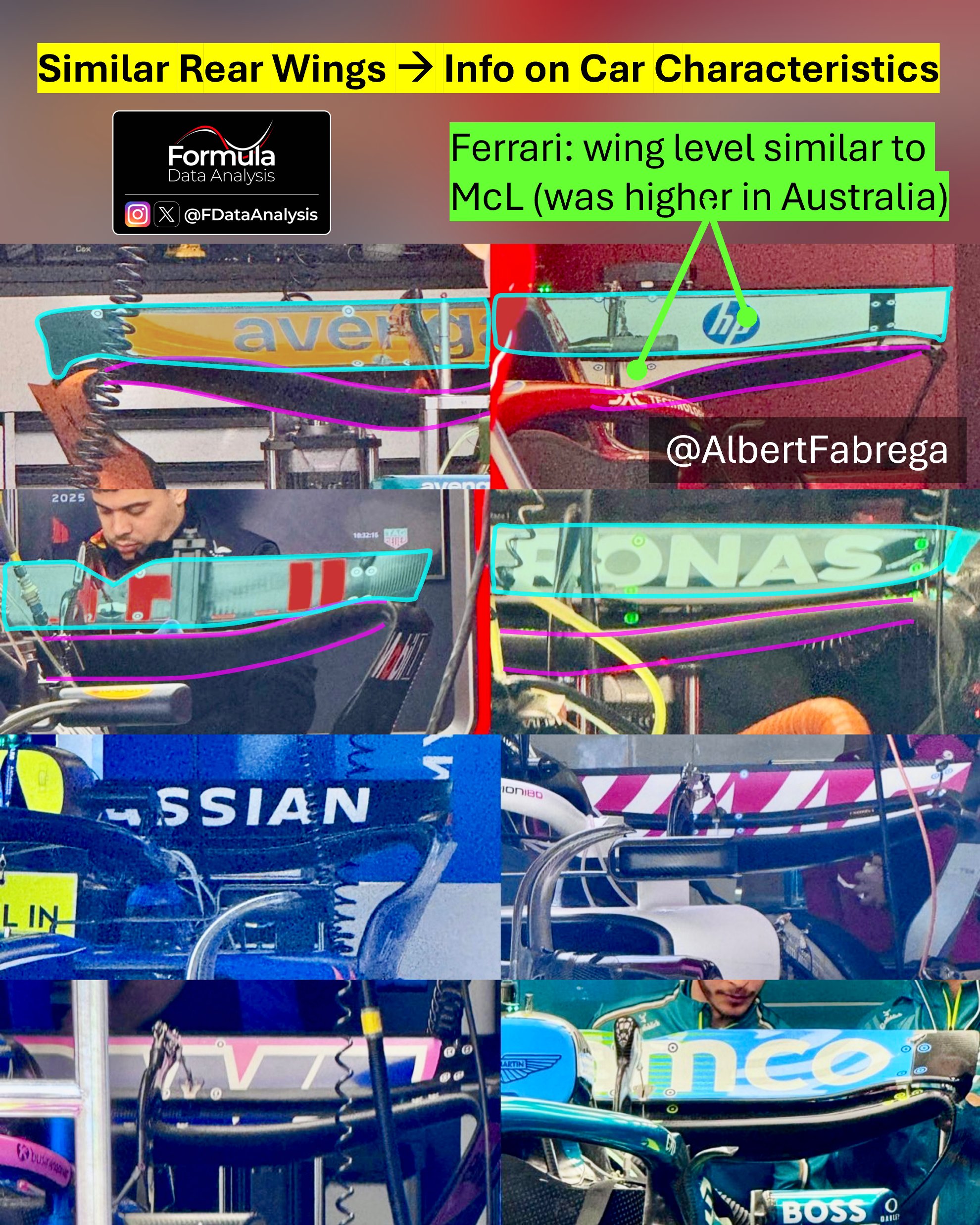
As Pirelli correctly expected, most teams opted for medium-load wings.
The difference in wing levels is much smaller than in Australia: this could be due to the additional information that the teams have about their cars (meaning that extreme settings can be identified and excluded). The fact that rain was expected for just one (the most important) session in Albert Park contributed to this variance. As teams have similar wings in Shangai we'll be able to more easily identify the characteristics of each car!
Single Lap Pace
Best Laptime per Driver
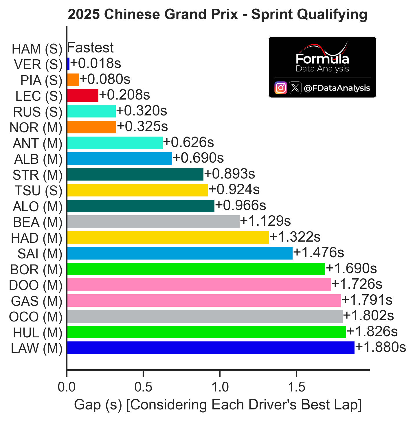
How to read: The graph shows the difference between each driver's fastest lap in the session. The letter to the right of each driver indicates the compound used.
For the following analyses, keep in mind that only HAM, VER, PIA, LEC, RUS, and TSU used softs on their best lap: this makes their pace look better than it was compared to the others. Very close front row (less than 2-hundredths of a second difference), and PIA was within 1 tenth too. This is looking like one hell of a season!
LEC was farther back, and even more so RUS and NOR. ALB was very quick again, and BEA had his first solid season of the year (he closely missed SQ3)
Aero Map
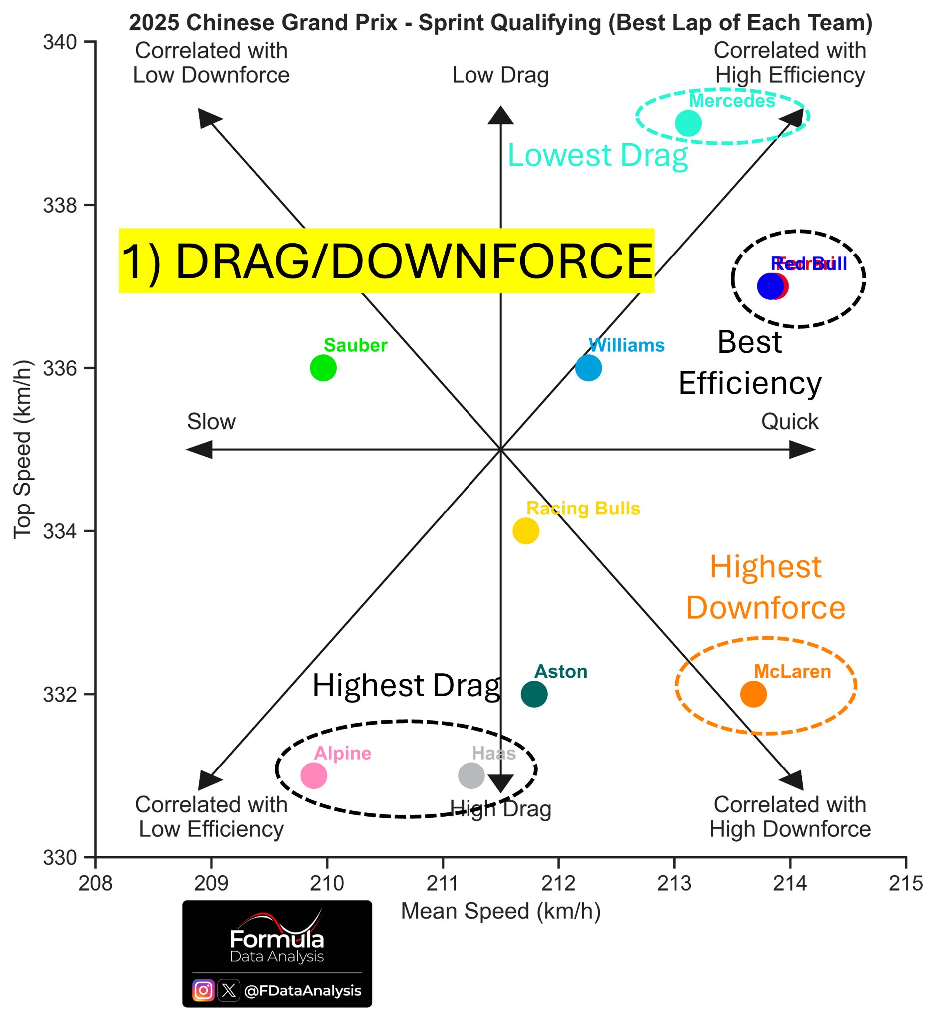
How to read: Average speed on the horizontal axis: the further to the right a team is, the better its performance (the lower the lap time). Top speed on the vertical axis: the upper a team is, the lower that car's drag or the higher that team's engine mode. Therefore, this plot not only shows who was the fastest (those on the right) but also why! (due to very low drag, if they are in the upper portion, or despite that, if they are in the lower portion).
Once again, keep in mind the difference in tyres used (which can impact the perceived downforce, but certainly not the drag!). Mercedes had the best top speed, and therefore lowest drag: 2km/h advantage vs anyone else, which should help them attack and defend. Red Bull and Ferrari traded some of that drag advantage for more downforce and were ultimately quicker. McL could have gotten the pole despite a very low top speed, thanks to their excellent downforce: they were quickest in the high-speed corners!
Top Speeds
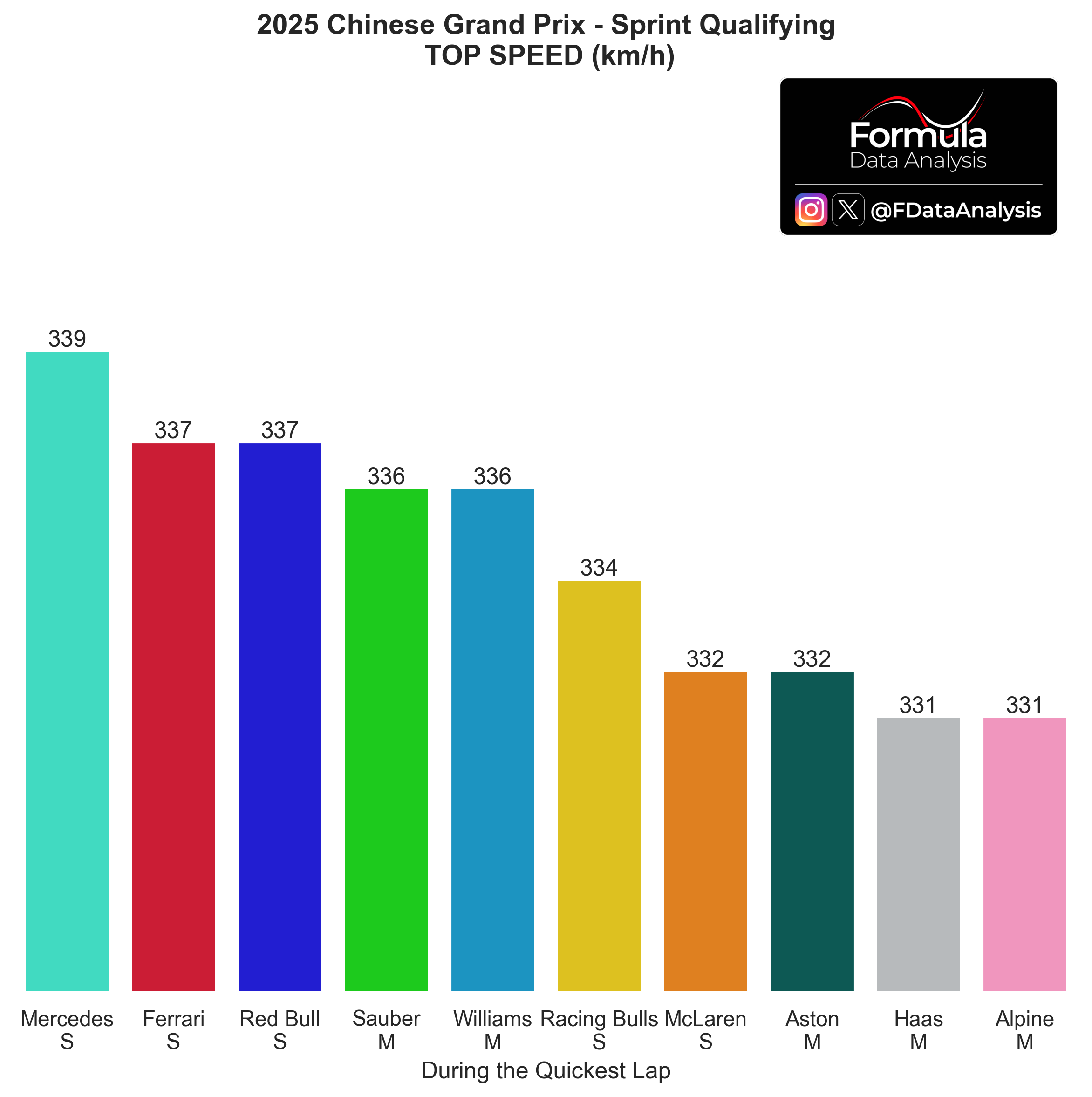
How to read: The higher a team's top speed, the lower that car's drag or the higher that team's engine mode.
Teams are sorted by descending top speed. The top speed delta across the field (8km/h, Mercedes vs Haas/Alpine) was around the same as in Australia (9km/h). Alpine went from fastest to slowest, Mercedes from 2nd slowest to fastest! Huge swings in top speeds.
Same chart, per driver: clear differences in aero setup between the two Mercedes and Williams drivers.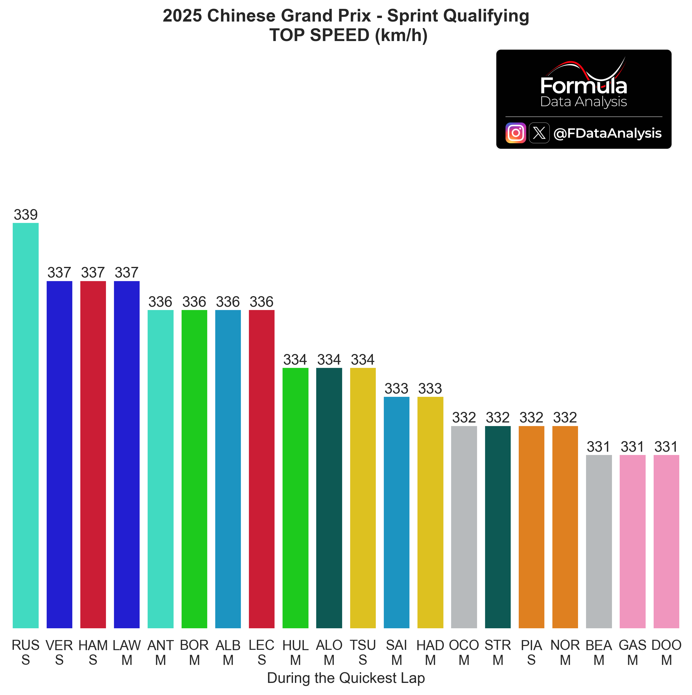
Best Sectors
A summary to remind you of the properties of each one:
Sector 1: The end of the start/finish straight, the very long T1-T2 right-hand side complex, then a left-hand side corner slingshotting into sector 2
Sector 2: Another slow sector, which has no proper straight. It features the fastest non-full-throttle corner (T7, over 270km/h in quali!)
Sector 3: The fastest one. Having a good exit out of T12 is crucial not to lose time on the very long straight. It also includes the first part of the start/finish straight
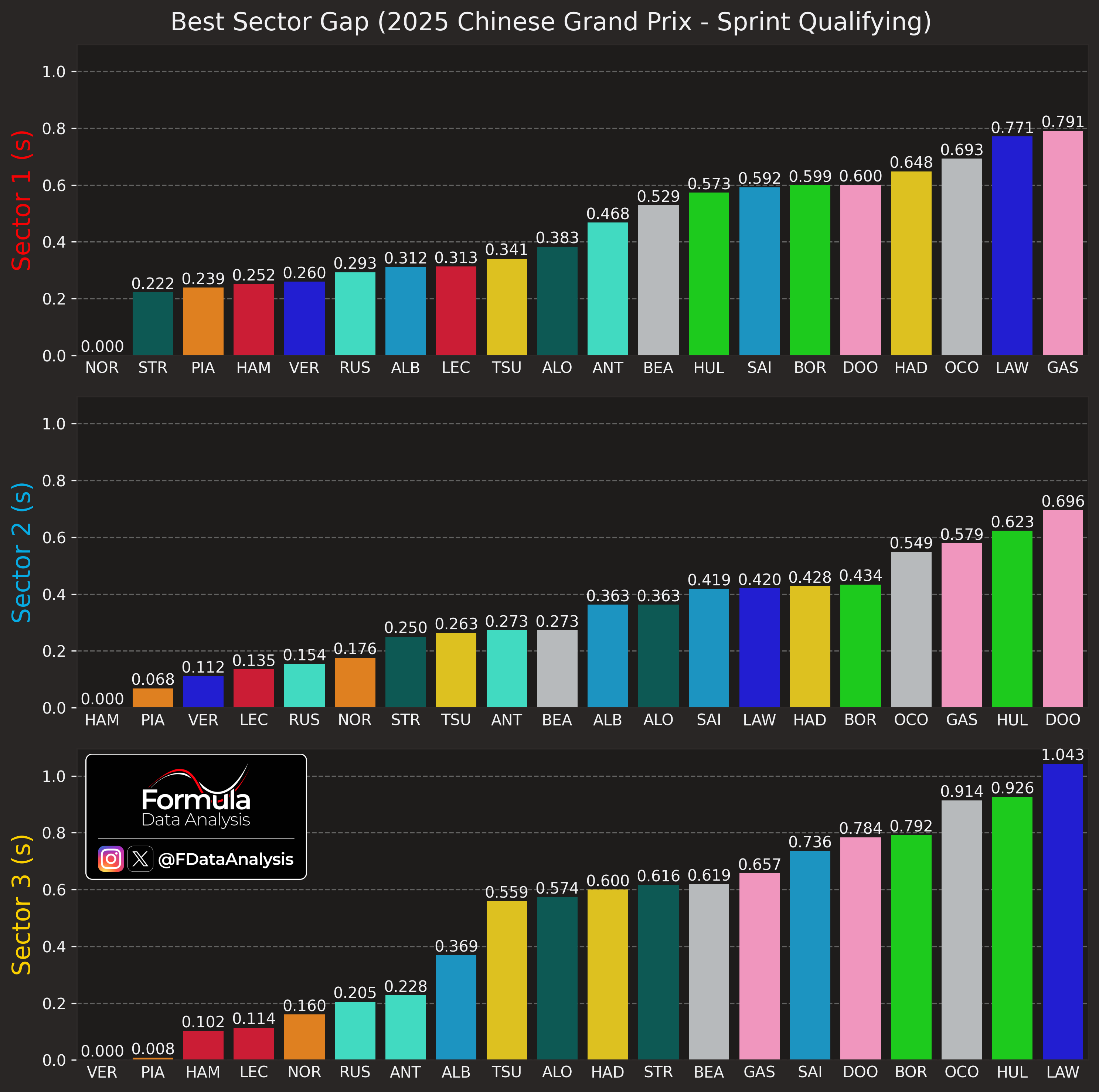
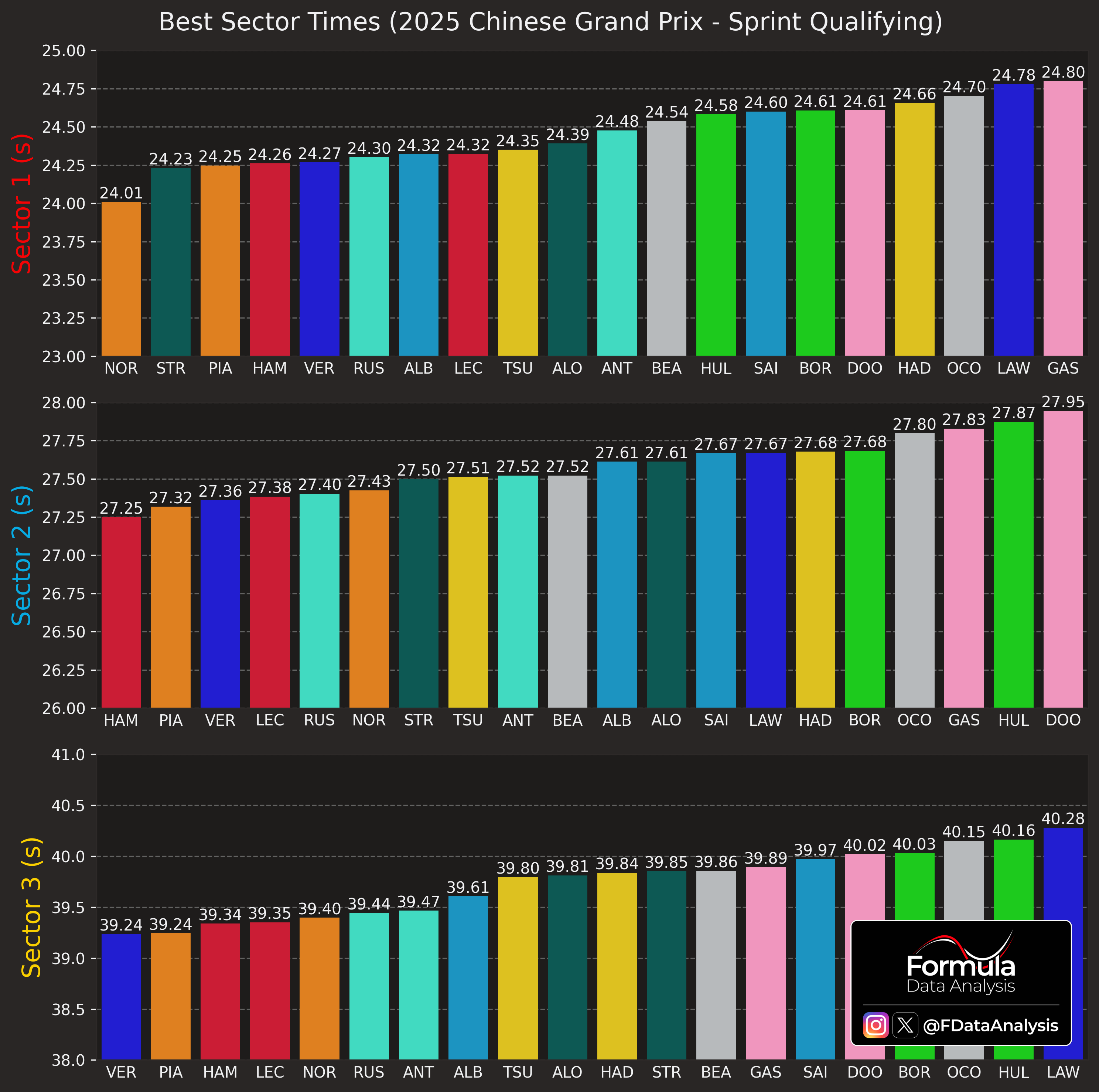
NOR was quickest in the twisty S1; HAM in S2. Even though RUS had the highest top speed, he was not the quickest in S3: VER, PIA, and the two Ferrari drivers beat him to that due to better braking and corner exit. Worthy of note:
STR's excellent S1
LAW's very slow S1 and S3
LEC's slow S1
Best vs Ideal Lap
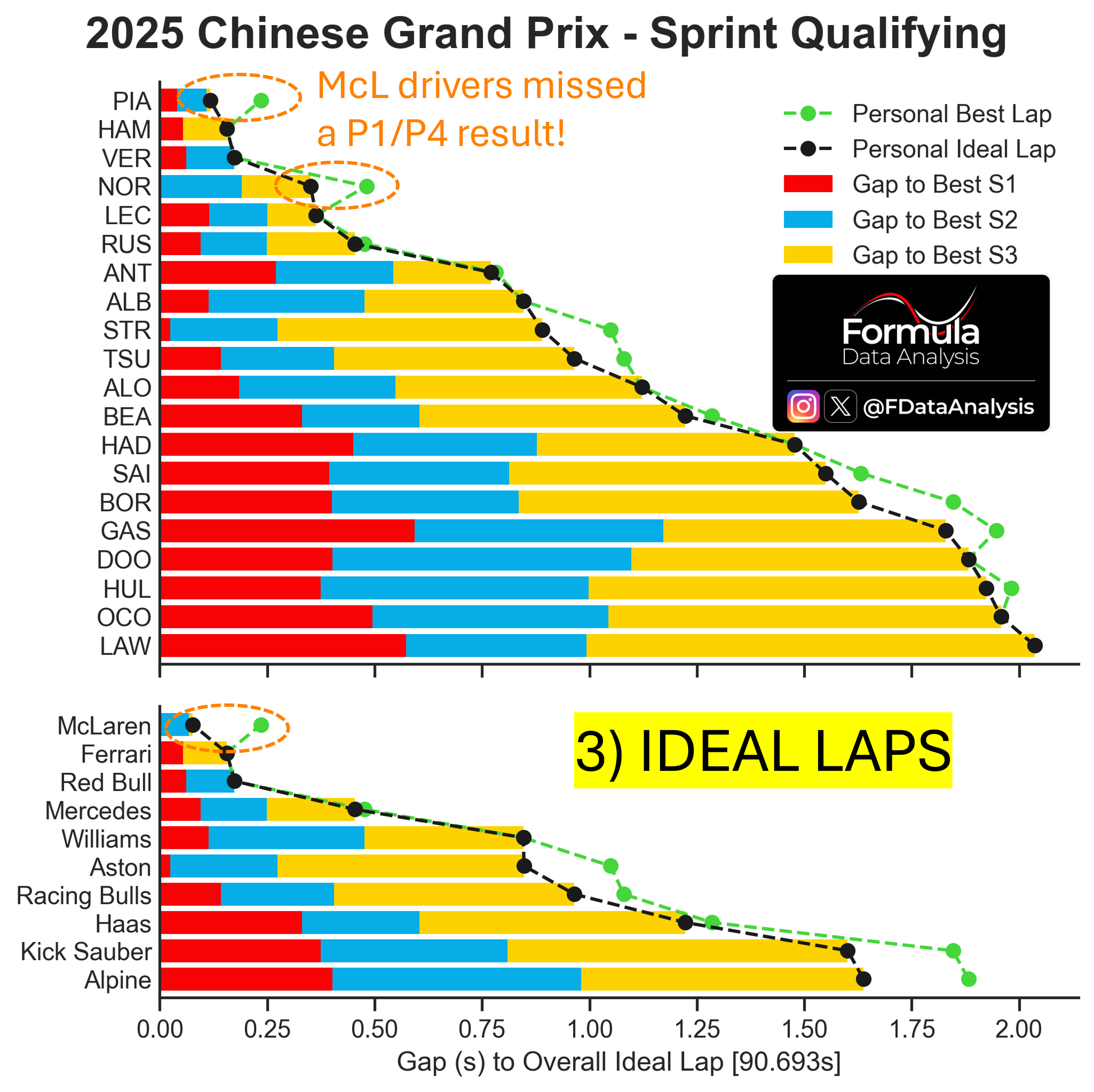
How to read: The graph shows, for each driver and each car, the ‘Personal Ideal Lap’ (the lap time obtained by the sum of that driver’s or team’s best 3 sectors, which might have been achieved in different laps) in black, and the ‘Personal Best Lap’ (the best lap time that the driver or team has effectively achieved in the session) in green. Consequently, the Personal Ideal Laptime is always equal to or lower than the Personal Best Laptime. If the two coincide, it means that the driver or team has produced its best sector times all on the same lap. The farther the Personal Best Laptime is from the Personal Ideal Laptime, the more potential lap time that one driver or team has left on the table. The coloured bars indicate the gap to the absolute best sector time. The ‘Overall Ideal Lap’ is shown at the bottom of the figure and is the sum of the lap times of the overall best sectors, independent of which driver or car achieved them.
Drivers who left the most time on the table: PIA, NOR, STR, TSU, BOR. In terms of teams, McL, Aston, Racing Bulls, Sauber, and Alpine have the most time to gain by combining their respective best sectors.
Teams sorted by ideal laptime:
McL
Ferrari, RedBull
Mercedes
Williams, Aston
Racing Bulls
Haas
Sauber, Alpine
Start/End Lap Speed Difference
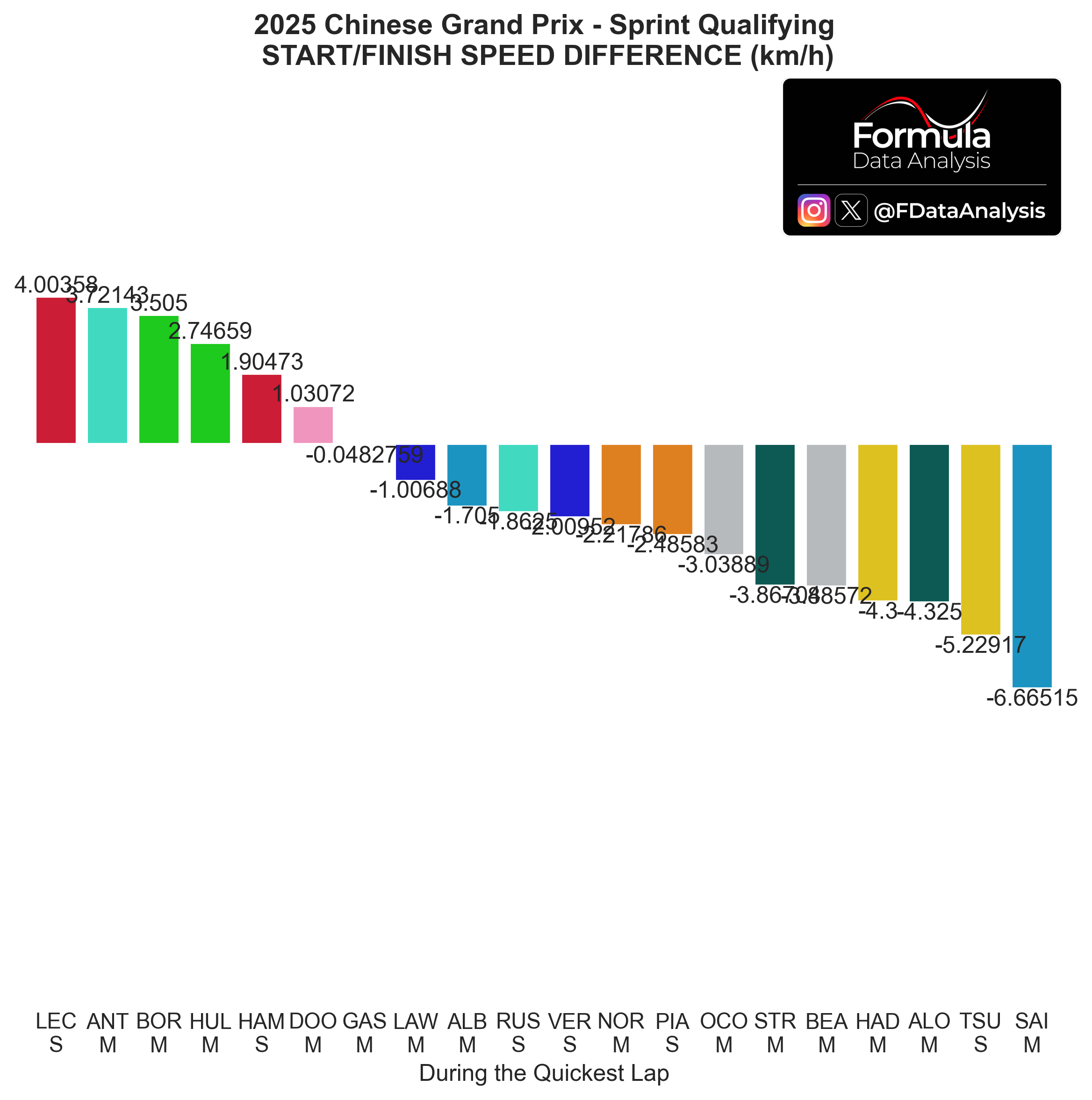
An interesting graph, which shows the difference between the speed on the finish line at the start vs at the end of the lap. A positive value means that the speed was higher at the lap end.
Ferrari and Sauber seem to have saved battery towards the end of the lap; the opposite for McL, Haas, Aston, and Racing Bulls (who were slower at the end of the lap than at the start of it)
Race Pace
Long Runs
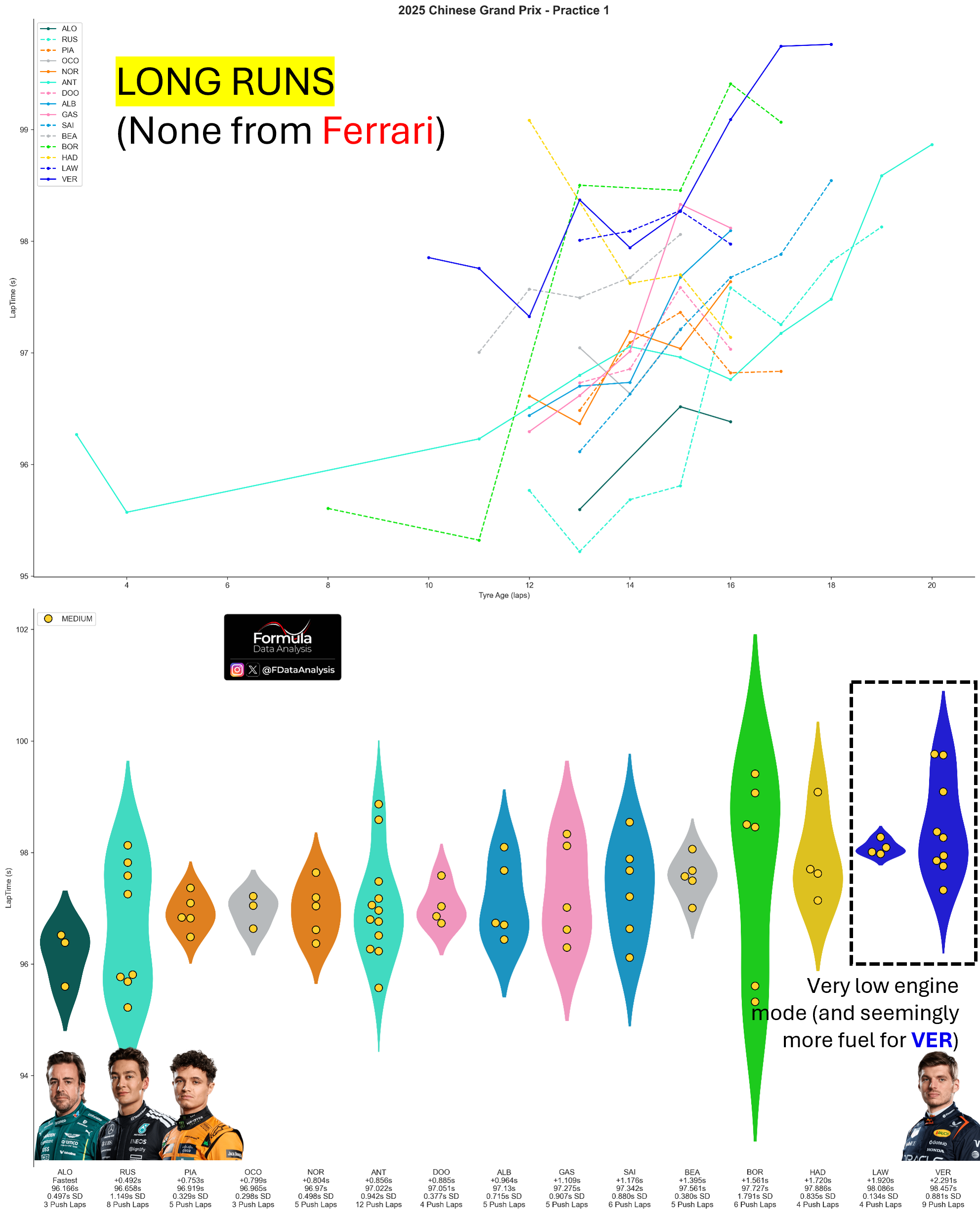
How to read: The chart shows the distribution of lap times during each team's long runs. A long run only includes segments of at least 5 consecutive laps run on the same compound without pitting or slowing down.
Ferrari didn't run any long runs. Their focus on single-lap performance seems to have paid dividends in the Sprint Quali, but the lack of information could hurt them in the Sprint.
Excluding the two drivers who only did 3 valid laps (after excluding push laps and abnormally slow laps), Mercedes and McL seem to have a very solid pace. Behind them are Alpine, Williams, Haas, Sauber, and Racing Bulls. Don't make VER's slow pace deceive you: he was running a very detuned engine mode (LAW even more so!), starting to lose speed (clipping) very early on the straight. His fuel load looked very high, as well (as usual for RBR): he lost significant time in the fast corners (where fuel load impacts the most) compared to the other drivers.
Pace Last Year
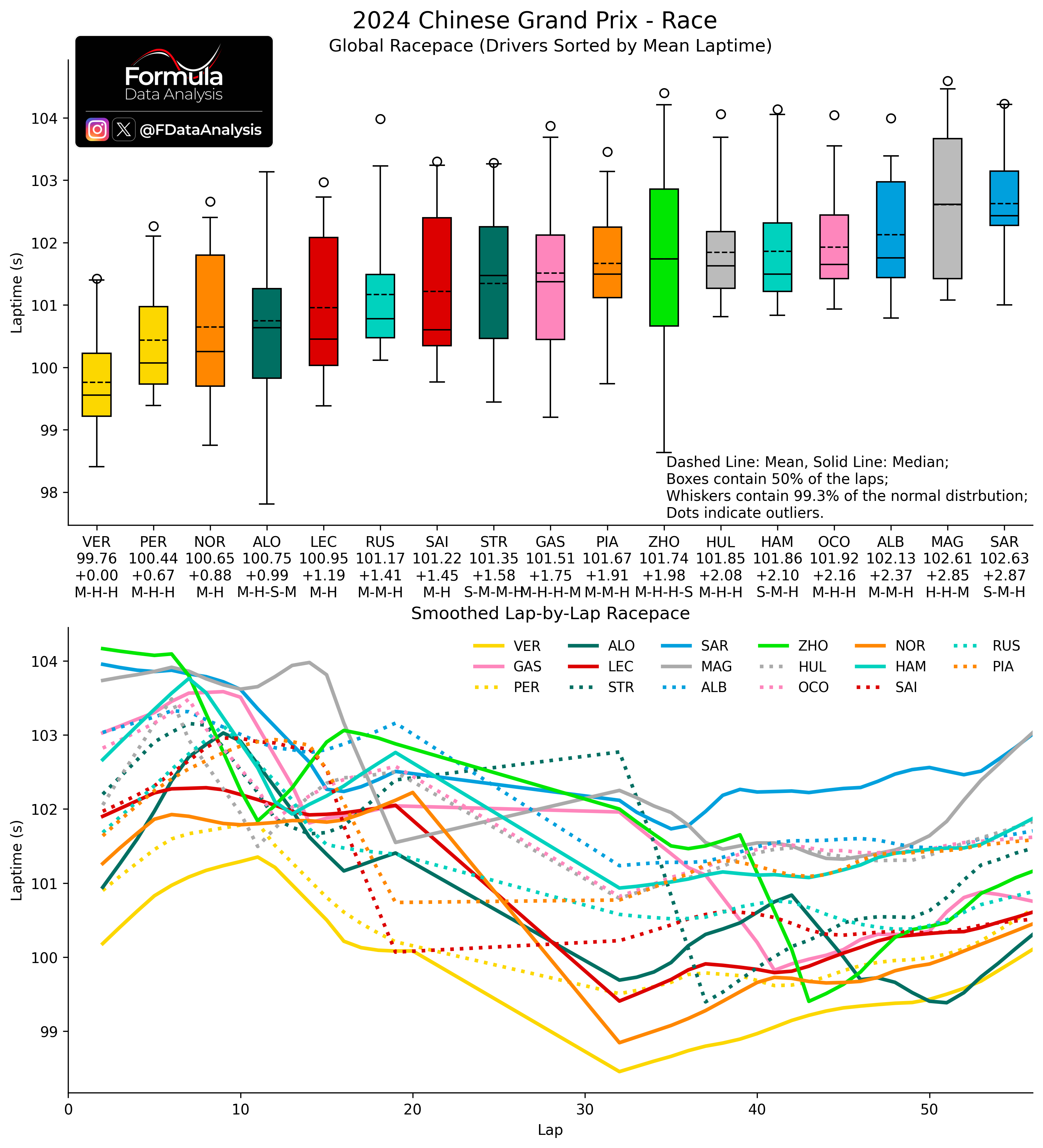
How to read: The upper plot shows the synthesis of each driver's pace during the race. The lower plot shows the (smoothed) evolution through the laps. Each bar contains the central 50% of the distribution: the shorter it is, the more consistent the pace. Inside it, the solid line indicates the MEDIAN (how quick was the TYPICAL lap), while the dashed line indicates the MEAN (how quick was a lap ON AVERAGE). The whiskers include all the laps from a driver which are not uncharacteristically slow for that driver: the lower whisker, in particular, shows that driver's quickest lap. The mean lap time is indicated below each driver's name, and below that is the gap to the quickest driver. The bottom line indicates the tyres used.
Ferrari couldn't heat their tyres and suffered massively in the race. VER was out of reach for anyone else, but he pitted one time more than NOR, LEC, and SAI. Behind him, NOR was quick considering that he ran the whole race on 2 sets of tyres.
My prediction (Still too early to predict the race outcome)
Sprint
Here is my prediction, which takes into account the starting grid and the long runs performed Qualifying Teams on the same line are too close to call:
Ferrari
McL, RBR (VER) [Very close to Ferrari]
Mercedes
Racing Bulls (TSU), Williams (ALB)
Aston
Haas (BEA)
Sauber (BOR)
Alpine
Quali
Overall, this is my expected running order concerning quali (considering the placement of the best driver of each team, so the ultimate car’s potential). It considers the ideal lap from each team based on the Sprint. Qualifying Teams on the same line are too close to call:
McL
Ferrari, RedBull
Mercedes
Williams, Aston
Racing Bulls
Haas
Sauber, Alpine
Will this prediction be confirmed? And what is yours?
Enjoy the content, and thank you SO MUCH for your support! Check the data repository for more analyses.
Mirco/Formula Data Analysis