
The psychological and emotional impact of color can never be ignored. Color is connected directly to your emotions, from energizing yellows to calming blues. Different colors in the home have distinct effects on mood and behavior, rooted in the psychology of color and its influence on emotions and physiological responses.
Do not underestimate your childhood memories. I had a client who would never allow me to use orange in any decor. I made a trip to her family home to assist her mother and discovered her bedroom had bright orange curtains. There was a direct association with that color for some reason. She loved her bedroom and made no mention of the drapery. Perhaps a memory or association of her beginnings, I do not know. I honor when my clients express clearly their dislike for a specific color.
A painting teacher would never allow us to utilize the color purple. A bizarre request indeed, as that tone was the sign of royalty and the highest vibrational color in the chakras. There is not a good amount of logic in these dogmatic preferences. Everyone has their own reasons for what they prefer.
Cool Colors like blue, green, and purple generally promote calmness, relaxation, and focus. Blue lowers blood pressure and heart rate, enhancing tranquility and productivity, making it excellent for bedrooms and offices. Green symbolizes balance and renewal, supports stress reduction and better health, and is suitable for bedrooms and workspaces. Purple can evoke luxury and creativity, and it is often used in bedrooms or creative areas. Lighter shades of these colors tend to feel more serene and open, while darker shades add depth and intimacy
Prioritize cool and nature-inspired tones. Blue literally lowers your heart rate and blood pressure. Green evokes a sense of balance and reduces anxiety. Remember how you feel when surrounded by nature. It could be the sea, a mountain, or a field of flowers.
Neutral Colors such as gray, white, and beige provide calm, versatile backdrops that can make spaces feel larger and brighter. They promote balance without strong emotional stimulation, neutralize reactions, and invite a sense of peace. Thus, the interior often feels more spacious. The addition of a soft pink, coral tone in a muted colorway adds just a touch of color. I recommend this for the bedding or small accents.
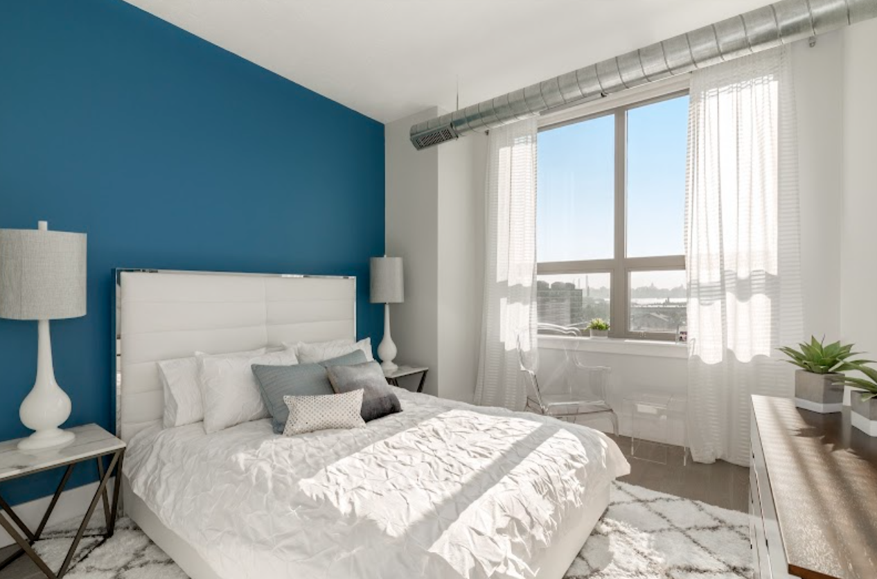 Selecting colors aligned with each room's function can enhance well-being and behavior: Use cool, calming hues like blue or green in bedrooms for restful sleep and neutrals to maintain balance and openness. Understanding these psychological impacts allows one to create environments that support one's desired mood. By aligning your bedroom’s color palette with these principles, you can create a sleep-conducive environment that supports deeper rest.