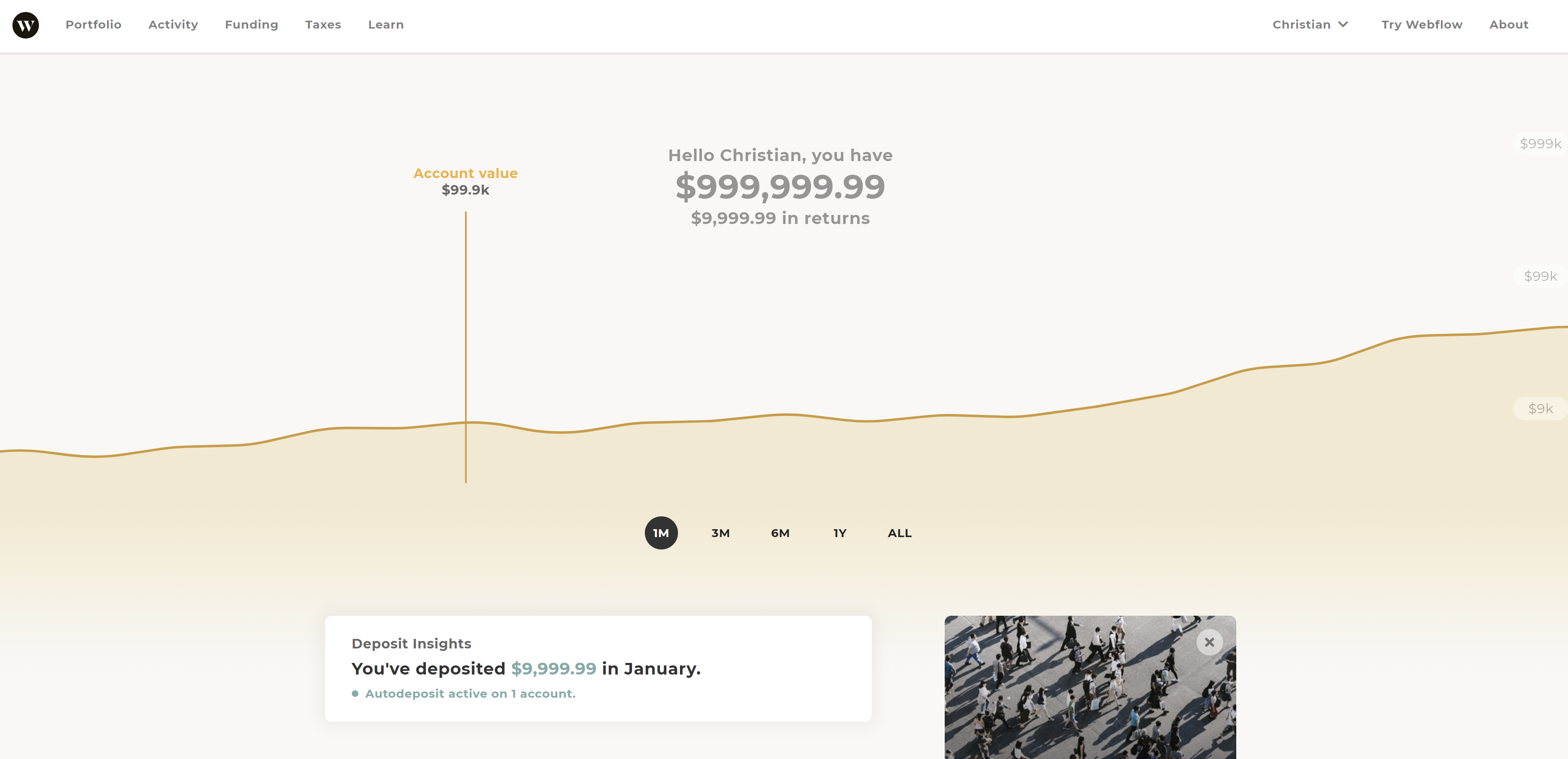
https://webflow.com/website/Prototype-Wealthsimple-Dashboard
Wealthsimple's design system used in their marketing and across their products is definitely on the top of my list of good design both visually and user experience.
Considering how they are in the financial industry which tends to suffer from dry and bland. Most of their competitors are willing to sacrifice modern design practices in order to appear 'safe' and 'trustworthy'. But in recent years, I've seen other banks/investment platforms are starting to catch up, so hooray for design!
