

Trying to make linux-insides not just useful to read, but pleasant.
It is surprisingly satisfying to go back to something you wrote years ago and ask: can I improve the explanation and make it clearer?
One of the obvious answers is diagrams.
I have been spending some time improving the diagrams in linux-insides. Hope they make some of the harder parts a little easier and more pleasant to follow.
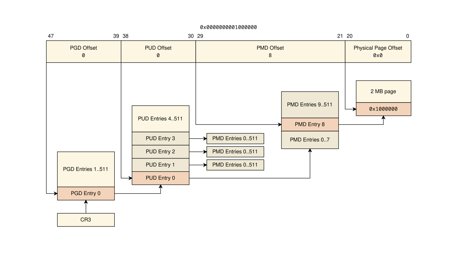 The sources as usual you can find on GitHub and the web version here.
And yes, new chapters are coming soon!