

Hello DD5 supporters, members, and fans.
My V5 alpha hardcopy from Lulu print-on-demand has arrived, and has delivered a few important lessons.
For those interested, exactly ten copies of the alpha were printed in total--my own copy, plus nine copies shipped to enthusiastic coffee club supporters and members. They will be a niche piece of DD history, so hold onto those :)
Let's take a look at it:
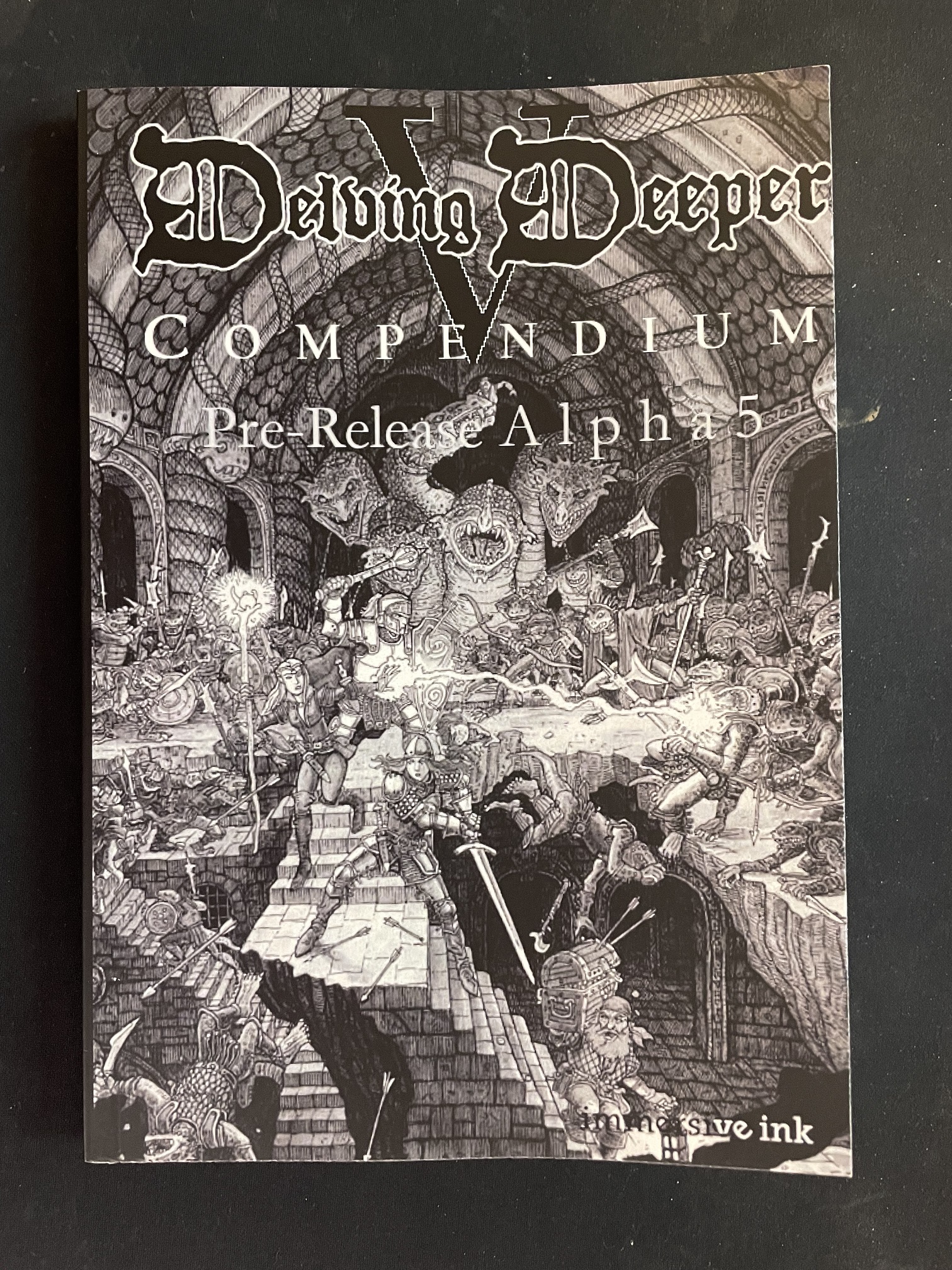
Right off the bat, I am pleased with the matt cover finish compared to the V4 compendium's gloss finish. Pretty sure I'll be going with that.
However, the cover image (which will ultimately be full colour) didn't have the same sharpness as the V4 cover, immediately notable if you look closely at the creatures' eyes, for example. Moreover, the giant V behind the title appears quite pixelated.
Comparing V4 and V5 side by side, we can see that V5 is slightly wider and shorter than V4: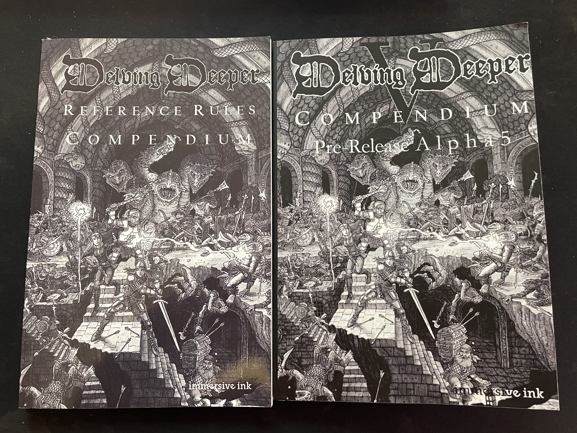 And it turns out V5 was printed at A5 size (210x148 mm) whereas V4 was printed at digest size (215x140 mm). I suspect the cover image was stretched or scaled to fit the new width, which caused the loss of sharpness. Something to fix, for sure.
Inside, there were two immediately notable layout issues:
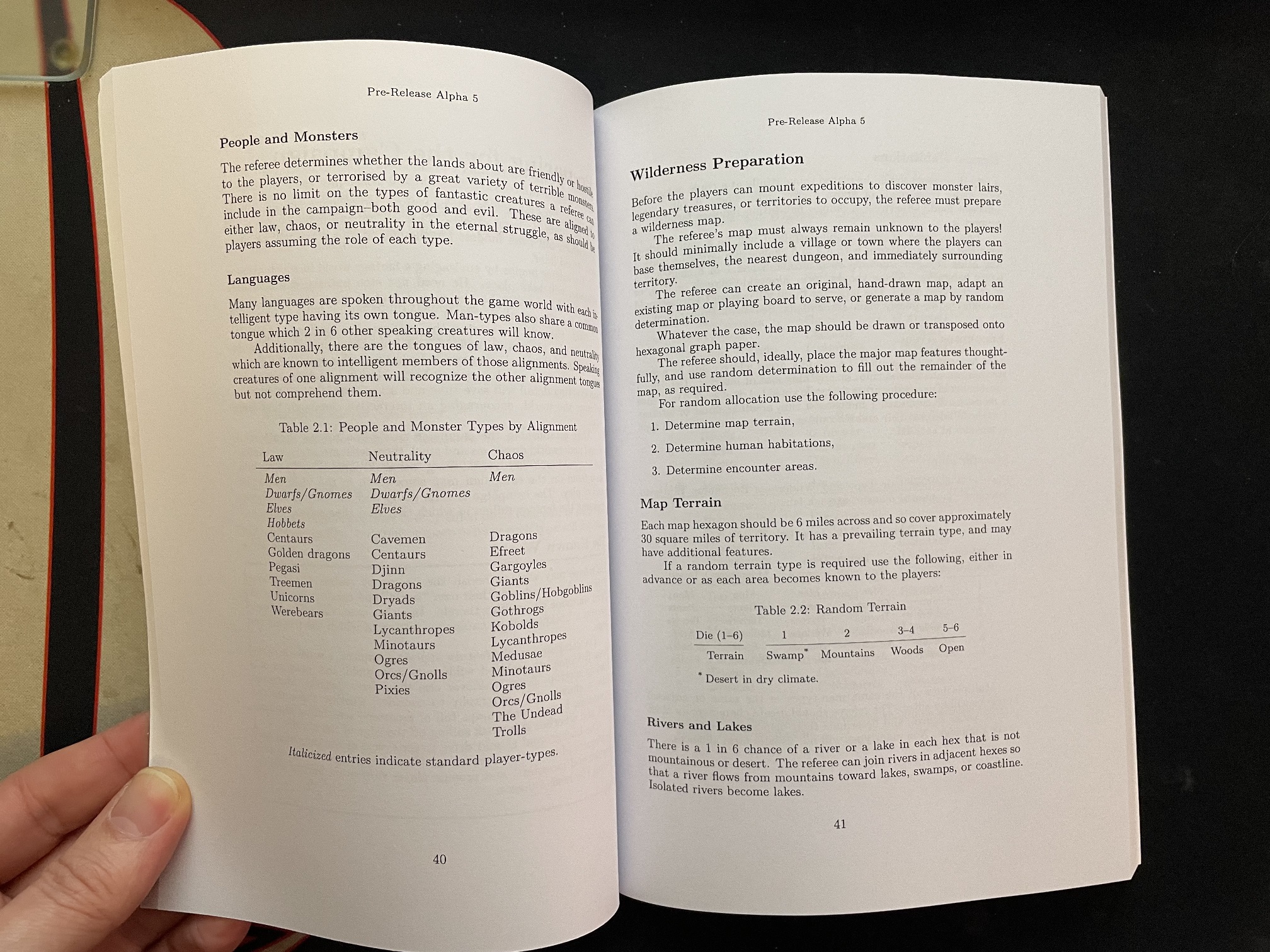 Firstly, the extra page width of A5 resulted in extra-wide outside margins (approximately 30 mm), and secondly, the perfect bound printing format ate a substantial portion of the inner margins for the gutter, resulting in extra-narrow inside margins. The obvious solution to these is to allow for a wider inside margin for POD!
The other readability issue is the type size:
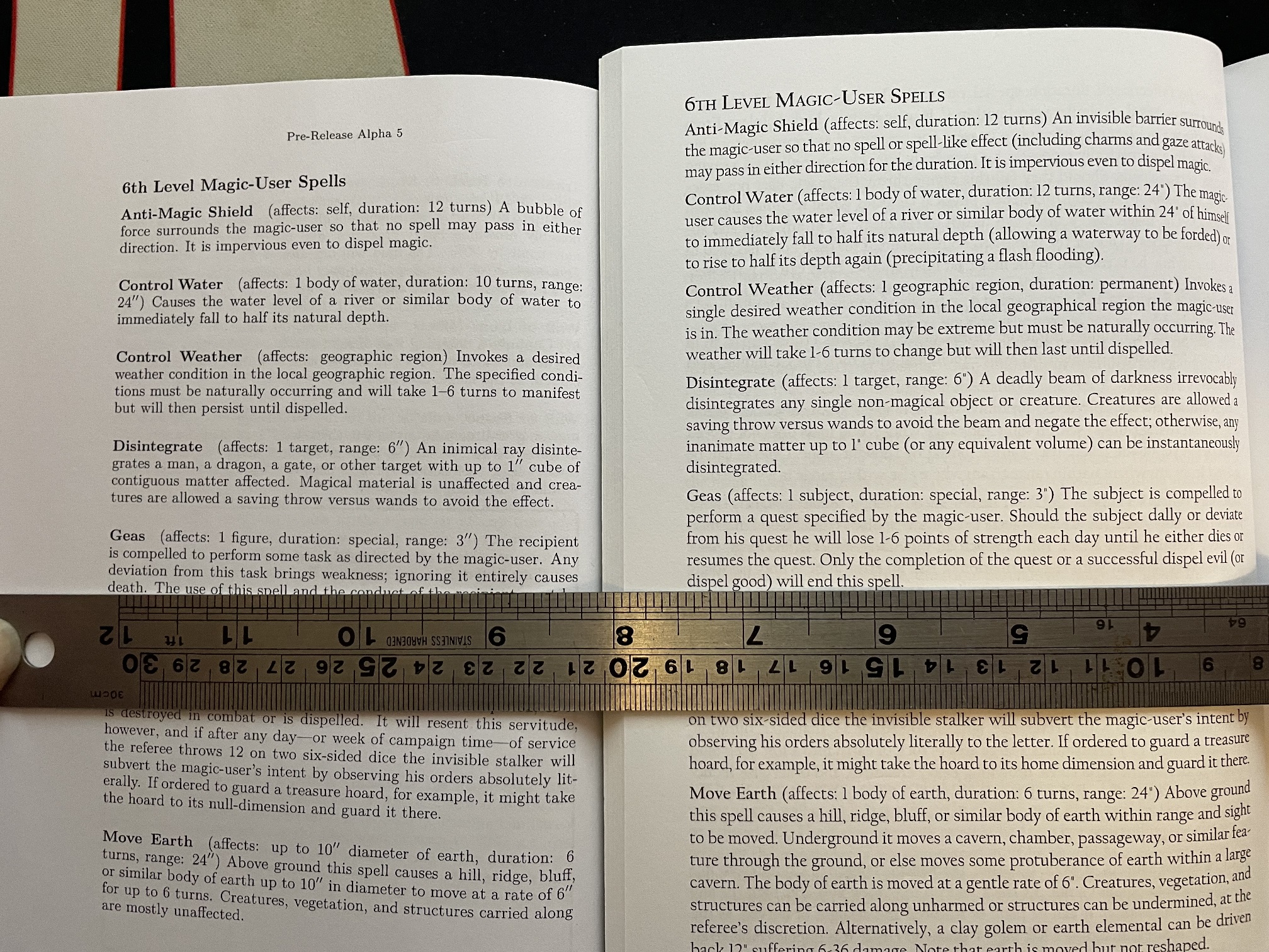
Here we can see V5 on the left compared to V4 on the right. V5 alpha-5 uses 9pt Latin Modern Roman whereas V4 uses 9.5pt Californian FB.
I really like the improved spacing and readability of V5's typeface and typesetting, but the (slightly) smaller type size isn't helping. The good news is that with the extra page width and margins, there is plenty of room to increase the type size.
So, what were the key lessons?
The matt finish cover looks good.
The cover image and type need to set at the original scale.
The page geometry and margins need to be set specifically for Lulu's binding method.
The main body type needs to be larger.
I know what I need to do next ! Stay tuned...