

A number of readers have remarked that the"space saver" tables are unintuitive to read. Book 2 (Campaigning & Adventures) contains quite a few of these, but what are they?
Essentially, they're simple two-column tables that are flipped sideways so they can be rendered as two rows. This little trick makes better use of the modest space available in DD's small page format, and frequently lets me get a whole section on a page or on a two-page spread.
Here's a typical example from the public alpha:
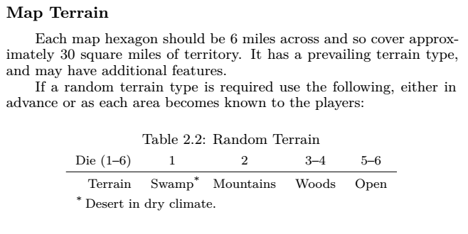 The table sure is a bit crowded, especially with the footnote. No way is that good enough for this project, so let's see what can be done about it :)
Fortunately, LaTeX is a powerhouse of typesetting control, so there are plenty of options to explore.
Some have suggested a vertical rule between the headers and the content (between the 1st column and the rest of the table). Like this:
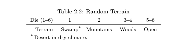 Although it seems intuitive, we're adding noise. Not to mention breaking the golden rule of tables: that nothing should interrupt the eye's tracking from left to right. It's also not nice that the vertical rule is broken by the horizontal rule. So, how about we fix that?
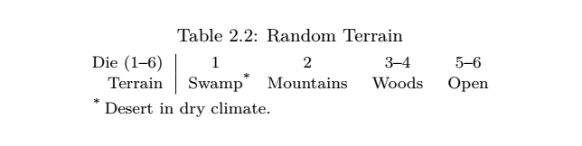 That is cleaner, but the thing is, white space is often a better column break than a hard rule, so how's about this then:
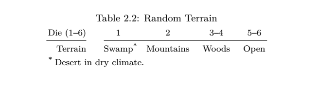 That's looking better, but we're still a little too crowded. That's in part because, without top and bottom rules, we've lost the additional vertical padding around these elements. Let's get that whitespace back:
 Okay, that's more comfortable. But there's still one more easy win. We can flip the rows so you read the item you want first, then the pesky numbers second, like this:
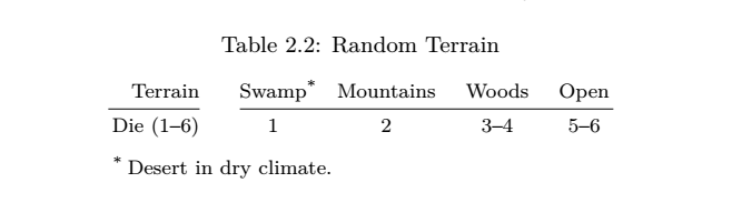 How's that one looking? For me, this is a whole lot better than where we started.
And one last one, because less is often more:
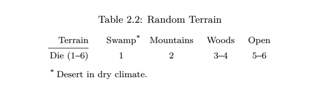 This one is pretty minimal, perhaps even too minimal, even for me. But what do you think?