

A quick thank you to everyone supporting Flow on Buy Me a Coffee - it genuinely helps keep development going.
This release rebuilds the Stats tab into a dashboard and adds a set of Insights. Everything is computed on-device, of course, duh. Here's what's new.
Insights
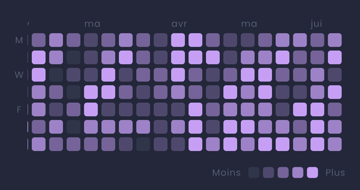
Spending calendar - a GitHub-style grid where one block is one day, and the color gets more intense the more you spent that day. Below it, a weekday breakdown highlights which day of the week you spend most on.
Spending map - every expense you logged with a location, placed on a map. Repeat visits to the same area cluster into a single marker, and the marker grows with the total spent there.
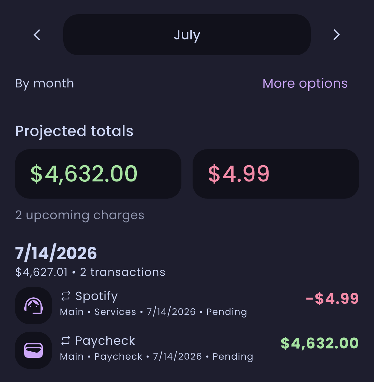
Recurring transactions summary - projects your active recurring transactions forward across the selected range and lists what's coming, grouped by date, with the expected total inflow and outflow. Already-logged occurrences link to their real entry; the rest are shown as upcoming projections.
 Net worth over time - samples your combined account balances across the selected range and draws the trend, converting non-primary currencies where rates are available. Below the chart, each account is shown as its share of your total.
Analytics
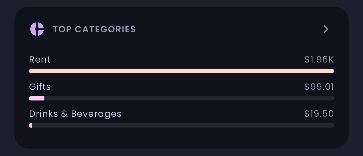
Top categories - your spending and income categories ranked for the selected period, with a pie or list view.
 Cash flow - a Sankey diagram showing how income flows through to your spending categories. The remainder is balanced into a "Saved" node when you came out ahead, or "From reserves" when you didn't, so you can see how much you saved over the period. It also shows an end-of-range spending forecast and daily averages with trends against the previous period.
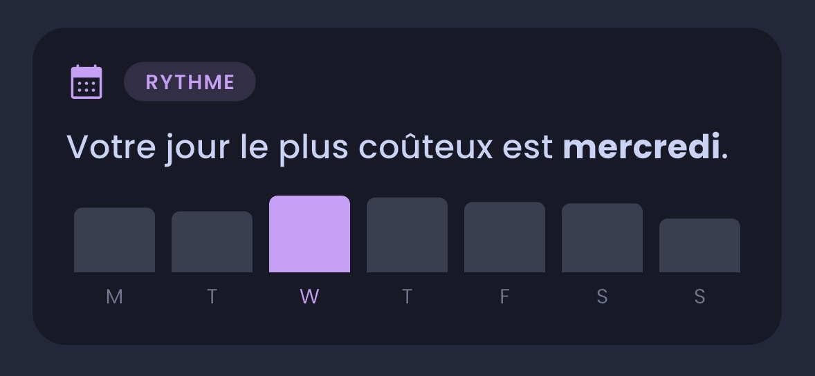
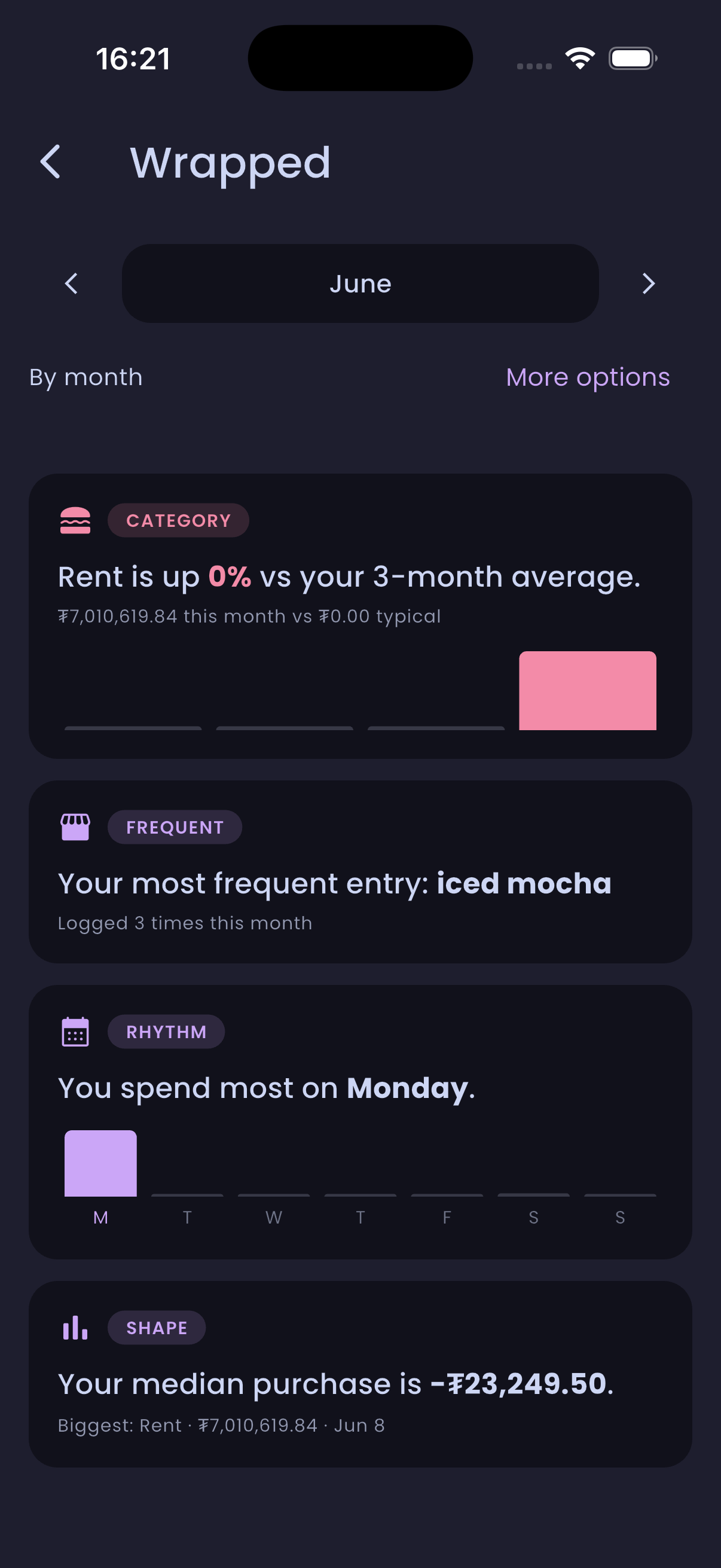
 Spending rhythm - a weekday breakdown that points out your priciest day of the week. Appears within the spending calendar and the monthly Wrapped view.
Wrapped - a month-in-review as a set of cards: your top category versus its 3-month average, your most frequent entry, your biggest purchase, and your median purchase size.
 Hope
Hope