

Advanced CSS Selectors: Mastering the Art of Precise Styling
In the world of web development, CSS is the powerhouse behind visually appealing and responsive designs. While basic selectors like classes (.class), IDs (#id), and element types (div, p) form the foundation, advanced CSS selectors unlock a level of precision and efficiency that can transform your styling workflow. They allow you to target elements based on attributes, positions, states, and relationships without cluttering your HTML with extra classes or IDs.
This article dives deep into advanced CSS selectors, exploring their syntax, use cases, practical examples, and best practices. Whether you’re a seasoned developer looking to optimize your codebase or an intermediate learner aiming to level up, you’ll find actionable insights here. By the end, you’ll wield these selectors like a pro, writing cleaner, more maintainable CSS.
Why Use Advanced Selectors?
Before we jump in, consider the benefits:
Reduced HTML Bloat: No need for utility classes like .first-item or .error-state.
Dynamic Targeting: Style elements based on user interactions or DOM structure.
Performance Gains: Browsers parse CSS selectors from right to left, so specific selectors can be faster than broad ones.
Maintainability: Changes in HTML structure won’t break your styles as easily.
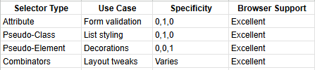
Advanced selectors build on the CSS specificity model (inline > ID > class/attribute/pseudo-class > element), so keep that in mind to avoid unintended overrides.
1. Attribute Selectors: Targeting Based on HTML Attributes
Attribute selectors let you style elements by matching their attributes’ values, presence, or patterns. They’re incredibly useful for forms, links, and data-driven elements.
Basic Syntax and Variations
[attr]: Selects elements with the attribute attr present (value irrelevant).
[attr=value]: Exact match for attr’s value.
[attr~=value]: Matches if value is one of a space-separated list in attr.
[attr|=value]: Matches if value is the start of attr’s value, separated by hyphens (great for lang attributes).
[attr^=value]: Starts with value.
[attr$=value]: Ends with value.
[attr*=value]: Contains value anywhere.
Examples
Imagine styling form inputs based on their type or data-* attributes.
<!-- HTML -->
<input type="text" name="username" required>
<input type="email" name="email" data-invalid="true">
<a href="https://example.com" target="_blank">External Link</a>
/* Style all required inputs */
input[required] {
border-color: #ff6b6b;
}
/* Exact match for email type */
input[type="email"] {
background-image: url('email-icon.svg');
}
/* Contains 'invalid' in data attribute */
input[data-invalid*="true"] {
border-color: #ff4757;
box-shadow: 0 0 5px rgba(255, 71, 87, 0.3);
}
/* Links starting with 'https://' */
a[href^="https://"] {
color: #2ed573;
text-decoration: none;
}
/* External links (ends with target _blank, but better with rel) */
a[target="_blank"] {
position: relative;
padding-right: 15px;
}
a[target="_blank"]::after {
content: ' ↗';
position: absolute;
right: 0;
}Pro Tip: Attribute selectors shine in component libraries like Bootstrap, where they style based on ARIA roles (e.g., [role=”button”]).
2. Pseudo-Classes: Styling States and Positions
Pseudo-classes target elements based on their state (e.g., hover) or position in the DOM. They’re prefixed with a single colon (:).
Structural Pseudo-Classes: :nth-child, :nth-of-type, and Friends
These are gold for lists, tables, and grids, allowing zebra-striping or selective styling without JS.
:nth-child(n): Targets the nth child of its parent.
:nth-of-type(n): Targets the nth sibling of the same type (ignores other elements).
:first-child, :last-child, :only-child: Self-explanatory shortcuts.
:first-of-type, :last-of-type, :only-of-type: Type-specific versions.
:not(selector): Excludes elements matching the selector.
Formula for nth: Use an + b, where a is the cycle and b is the offset. E.g., 2n + 1 for odd positions.
Example: Styling a Navigation Menu
<!-- HTML -->
<nav>
  <ul>
    <li><a href="#home">Home</a></li>
    <li><a href="#about">About</a></li>
    <li><a href="#services">Services</a></li>
    <li><a href="#contact">Contact</a></li>
  </ul>
</nav>
/* Zebra-stripe list items */
li:nth-child(odd) {
background-color: #f8f9fa;
}
/* Style every 3rd service item */
li:nth-of-type(3n) {
font-weight: bold;
color: #0984e3;
}
/* Exclude the last item from padding */
li:not(:last-child) {
padding-bottom: 10px;
}
/* First link gets a special icon */
li:first-child a::before {
content: '🏠 ';
}State-Based Pseudo-Classes
:hover, :focus, :active: For interactions (remember LOHA order: Link, Ordered, Hovered, Active).
:valid, :invalid: For form validation.
:checked: For checkboxes/radios.
:disabled, :enabled: For form controls.
Example: Interactive Form
input:invalid {
  border-color: #ff6b6b;
}

input:valid {
  border-color: #00b894;
}

button:hover,
button:focus {
  transform: scale(1.05);
  transition: transform 0.2s ease;
}

input[type="checkbox"]:checked + label {
  text-decoration: line-through;
  color: #636e72;
}
3. Pseudo-Elements: Inserting Virtual Content
Pseudo-elements (double colon ::) create “fake” elements for styling, like tooltips or counters. They have a fixed specificity.
Common ones:
::before and ::after: Insert content before/after the element.
::first-line and ::first-letter: Style the first line or letter of text blocks.
::selection: Style selected text.
::placeholder: For input placeholders (with vendor prefixes for older browsers).
Example: Decorative Quotes
<!-- HTML -->
<blockquote>
  <p>"The only way to do great work is to love what you do."</p>
  <cite>— Steve Jobs</cite>
</blockquote>blockquote::before {
content: '"';
font-size: 4em;
color: #74b9ff;
position: absolute;
left: -10px;
top: 0;
}
blockquote::after {
content: '"';
font-size: 4em;
color: #74b9ff;
position: absolute;
right: -10px;
bottom: 0;
}
p::first-letter {
font-size: 2.5em;
font-weight: bold;
float: left;
line-height: 0.8em;
margin-right: 0.1em;
}
::selection {
background: #00b894;
color: white;
}
input::placeholder {
color: #b2bec3;
opacity: 1;
}Note: Always set content: ‘’ or content: ‘text’ for ::before and ::after.
4. Combinators: Defining Element Relationships
Combinators connect selectors to target based on hierarchy or adjacency.
Descendant (space): Any descendant.
Child (>): Direct children only.
Adjacent Sibling (+): Immediately following sibling.
General Sibling (~): Any following sibling.
Example: Article Layout
<!-- HTML -->
<article>
  <h2>Heading</h2>
  <p>Paragraph 1.</p>
  <div>
    <p>Paragraph 2 (nested).</p>
  </div>
  <p>Paragraph 3.</p>
  <aside>Sidebar</aside>
</article>
/* All paragraphs in article (descendant) */
article p {
margin-bottom: 1em;
}
/* Direct child paragraphs only */
article > p {
font-weight: bold;
}
/* Paragraph immediately after h2 */
h2 + p {
color: #fdcb6e;
margin-top: 0;
}
/* All paragraphs after the first one */
p ~ p {
text-indent: 2em;
}Best Practices and Common Pitfalls
Specificity Wars: Advanced selectors can increase specificity unexpectedly. Use tools like CSS Specificity Calculator to debug.
Browser Support: Most are supported in modern browsers (IE11+), but check CanIUse.com for edge cases like :nth-match.
Performance: Avoid overly complex selectors like [attr*=”value”] div > p:nth-child(odd). Profile with DevTools.
Accessibility: Use :focus-visible instead of :focus for better UX.
Testing: Use browser inspectors to verify selector matches.
Fallbacks: For older browsers, provide basic styles first.
Conclusion: Elevate Your CSS Game
Advanced CSS selectors are more than syntactic sugar — they’re tools for elegant, semantic design. By mastering attribute matching, structural positioning, state handling, virtual elements, and relational targeting, you’ll craft styles that are robust and future-proof. Start experimenting in a sandbox project: refactor an existing page using these selectors and measure the code reduction.