

Modern CSS One-Line Upgrades
CSS continues to evolve, offering developers powerful tools to simplify code, enhance user experience, and reduce reliance on hacks or JavaScript. In this article, we’ll explore 12 modern CSS properties that can be added with just one line of code to upgrade your stylesheets. These upgrades are categorized into stable upgrades for fixing longstanding issues, stable enhancements for improved experiences, and progressive enhancements that gracefully improve supported browsers without breaking others.
These techniques draw from recent advancements in CSS, helping you reduce technical debt and create more maintainable, accessible web applications.
Stable Upgrades
These properties replace older techniques or hacks with well-supported modern alternatives.
1. aspect-ratio
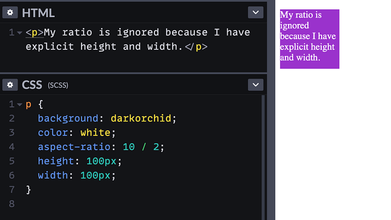
Gone are the days of using padding hacks to maintain aspect ratios for elements like video embeds or images. The aspect-ratio property allows you to define a fixed ratio directly.
For a 16:9 HD video, simply use:
.video-embed {
  aspect-ratio: 16 / 9;
}
For a square, it’s even simpler:
.square {
  aspect-ratio: 1;
}
This property is forgiving — if content overflows, the element adjusts to accommodate it, though you can control this with max-width or similar. It’s supported in all modern browsers since 2021.
2. object-fit
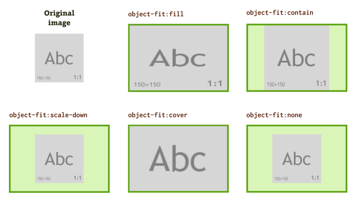
This property treats images or replaced elements like backgrounds, controlling how content fits within its container. Common values include cover (fills the container while maintaining aspect ratio, cropping if needed) and scale-down (shrinks to fit without cropping, potentially adding letterboxing).
Pair it with aspect-ratio for perfect results:
.img-container {
  object-fit: cover;
  aspect-ratio: 1;
  max-width: 250px;
}
Supported since 2013, it’s a staple for responsive images without distortion.
3. margin-inline
Logical properties like margin-inline handle margins in the inline direction (left and right in LTR languages), making your code more adaptable to different writing modes.
Replace:
.element {
  margin-left: auto;
  margin-right: auto;
}
With:
.element {
  margin-inline: auto;
}
This supports internationalization and has over 98% global support.
Stable Enhancements
These properties offer reliable improvements, often replacing JavaScript or complex hacks.
4. text-underline-offset
Control the distance between text and its underline for better legibility, especially in links. Add it to your reset:
a:not([class]) {
  text-underline-offset: 0.25em;
}
This clears descenders and enhances readability in lists.
5. outline-offset
Move outlines away from elements for custom focus styles, replacing box-shadow hacks:
.focus-element {
  outline: 2px dashed blue;
  outline-offset: 0.5em;
}
Outlines don’t affect box sizing, similar to shadows. Supported since 2006!
6. scroll-margin-top / scroll-margin-bottom
Prevent sticky headers from overlapping content on anchor jumps:
[id] {
  scroll-margin-top: 2rem;
}
Use custom properties for dynamic adjustments via JS if needed. Consider logical equivalents like scroll-margin-block-start.
7. color-scheme
Opt into browser-adapted UI for light/dark modes:
:root {
  color-scheme: dark light;
}
This adjusts form controls and scrollbars. Pair with prefers-color-scheme media queries.
8. accent-color
Customize checkboxes, radios, and progress bars:
:root {
  accent-color: mediumvioletred;
}
A quick win for theming form elements.
9. width: fit-content
Shrink-wrap elements to their content without changing display:
.fit-element {
  width: fit-content;
}
Great for intrinsic sizing; consider inline-size: fit-content for logical properties.
Progressive Enhancements
These add polish in supporting browsers without fallbacks needed.
10. overscroll-behavior
Prevent scroll chaining in contained areas:
.scroll-container {
  overscroll-behavior: contain;
}
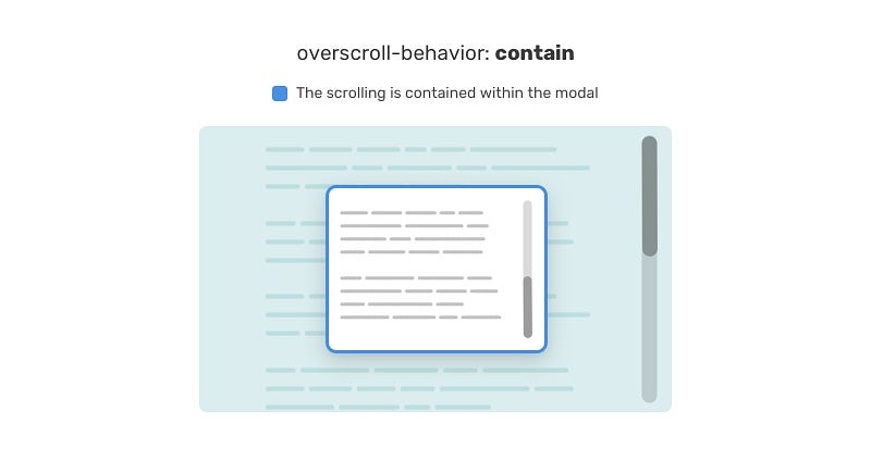
Ideal for sidebars or modals to isolate scrolling.
11. text-wrap
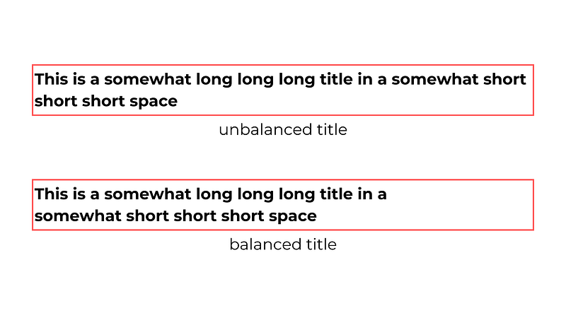
Balance text lines or prevent orphans. For balanced headlines:
h1 {
  text-wrap: balance;
  max-inline-size: 25ch;
}
For paragraphs avoiding single-word lines:
p {
  text-wrap: pretty;
  max-inline-size: 35ch;
}
Limited to short text for performance; doesn’t alter computed width.
12. scrollbar-gutter
Reserve space for scrollbars to avoid layout shifts:
.scroll-container {
  scrollbar-gutter: stable both-edges;
}
Works with non-overlay scrollbars; don’t replace padding with it.
Conclusion
Incorporating these one-line CSS upgrades can modernize your projects, improve accessibility, and streamline development. Start with stable ones for broad impact, then add enhancements as needed. For more details, check the original source. Always test across browsers and consider caniuse.com for support levels.
Happy styling!