

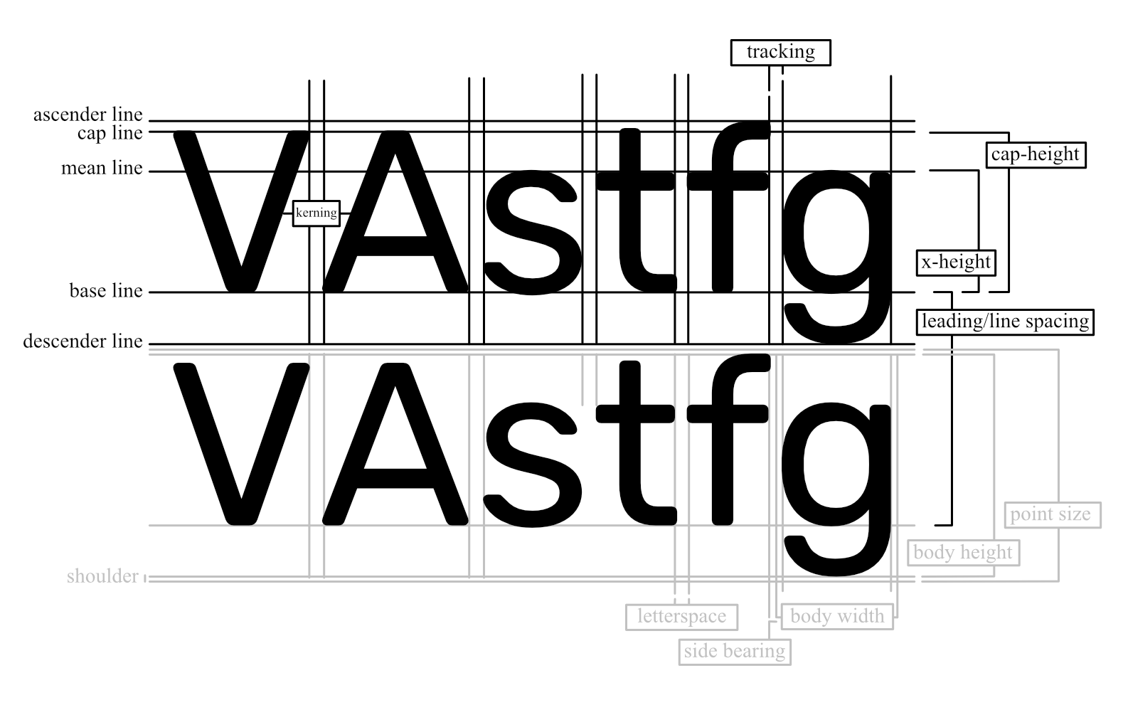
Typography is one of the most essential aspects of design, shaping how information is communicated visually. If you're working with fonts—whether in web design, graphic design, or editorial publishing—it's crucial to understand the key terms and features of typefaces. This comprehensive blog post breaks down the most important font-face terminologies, complete with technical explanations and practical examples.
1. Ligatures
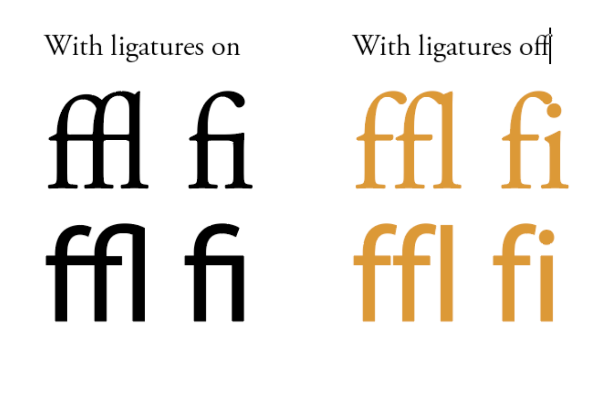
What Are Ligatures?
Ligatures are specially designed characters that combine two or more letters into a single glyph. They help improve spacing and avoid awkward collisions between certain character pairs.
Common Examples:
fi → fi
fl → fl
ffi, ffl, ff are also common in serif typefaces.
Why Use Them?
Aesthetic: Makes the text look professionally typeset.
Functional: Prevents overlapping of strokes in letters like f and i.
Standard Ligatures
These are designed to improve readability by preventing awkward collisions between letters. Common examples include:
fi: The hook of the 'f' merges seamlessly with the dot of the 'i'.
fl: The top of the 'f' connects smoothly with the ascender of the 'l'.
ff, ffi, ffl: These combinations are often used to maintain consistent spacing and aesthetics.
Example:
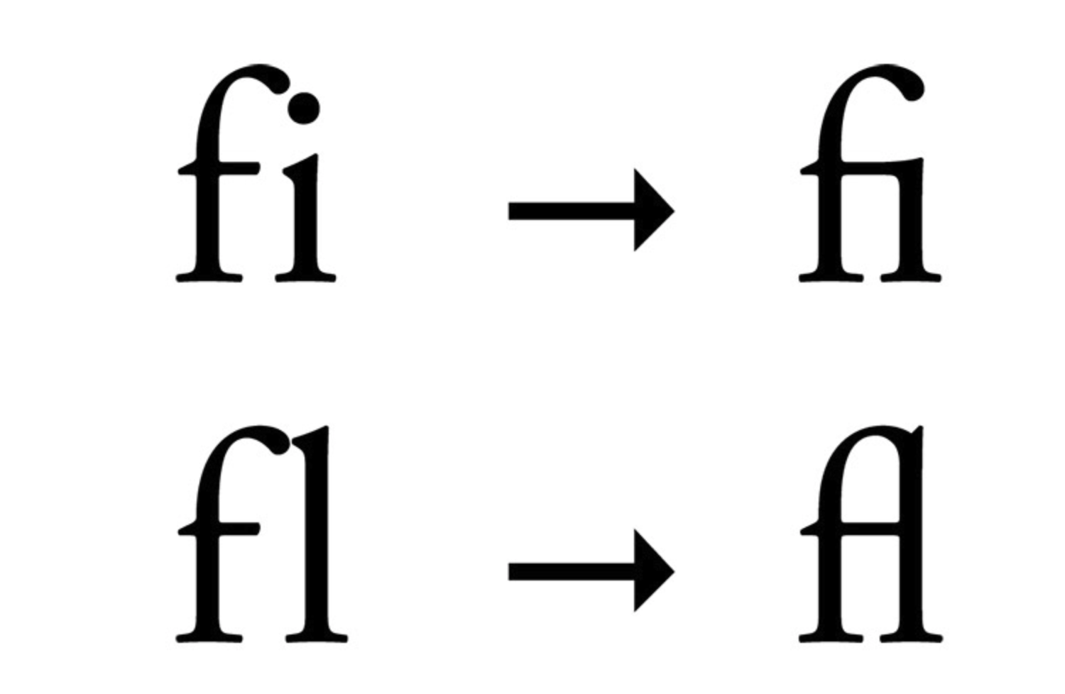
Image Source: Vandelay Design
Discretionary Ligatures
These are more decorative and are used at the designer's discretion to add flair to the text. Examples include:
ct, st, sp: Often found in historical or calligraphic typefaces.
Th, Qu: Used for stylistic purposes in headings or logos.
Example:
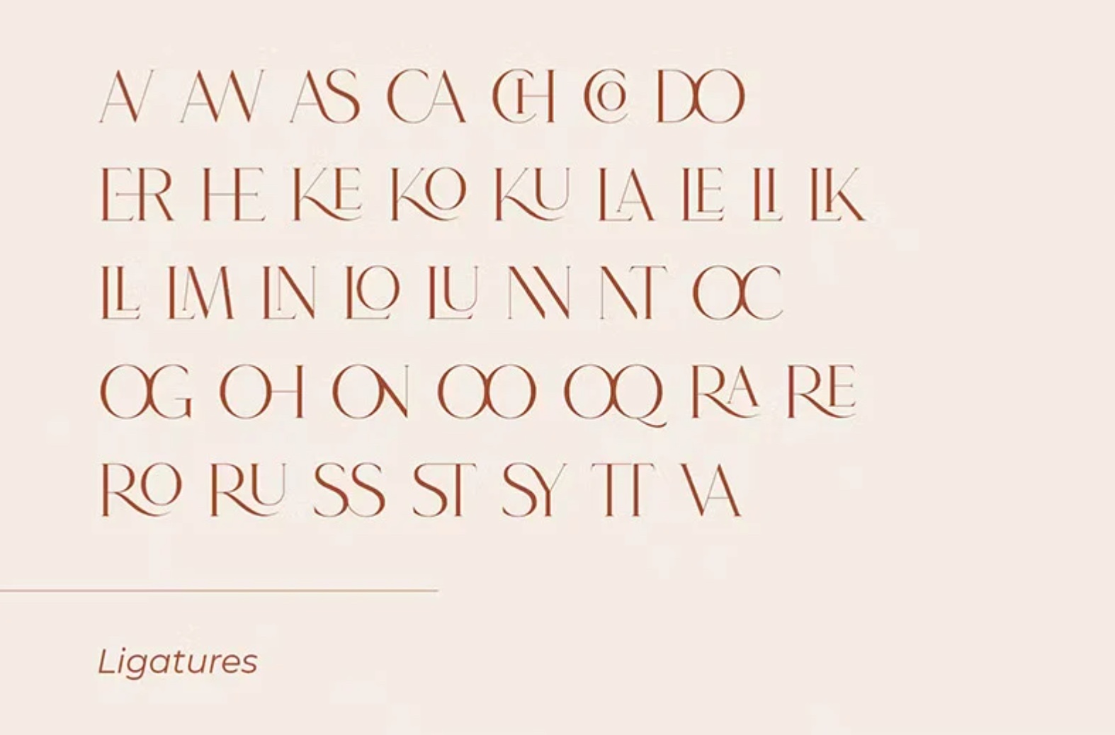
Image Source: Vandelay Design
Historical Ligatures
These originated from handwritten manuscripts and early printing. They are less common today but can be used for stylistic or historical authenticity. Examples include:
ſt: Combining the long 's' with 't'.
ſh, ſi, ſl: Other combinations with the long 's
Visual Example:
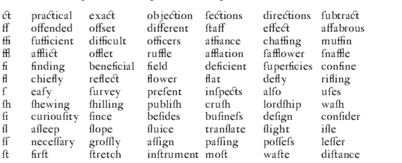
Image source: https://www.orbitals.com/self/ligature/ligature.htm
2. Small Caps
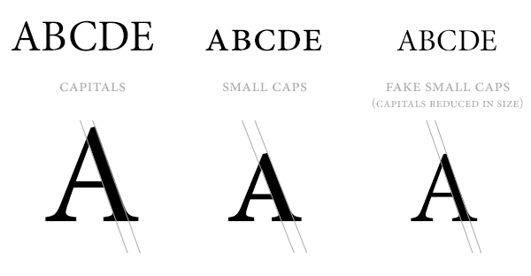
What Are Small Caps?
Small caps are uppercase letterforms that are designed to match the height and weight of lowercase letters. They're not just scaled-down capitals but individually drawn glyphs.
Example:
Normal text:
Text with Small CapsSmall caps:
 (small caps version will have uniform cap height)
Uses:
Acronyms (e.g.,
NASA,CEO) in body textLegal documents
Section headings in formal documents
Typographic emphasis (instead of bold or italics)
Citation formatting in scholarly work
3. Swash
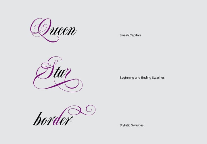 What Is a Swash?
A swash is a decorative flourish added to a character—often on capital letters or at the end of lowercase ones. It’s commonly used in script and calligraphic typefaces.
Example:
Regular:
LoveWith swash:
𝐿𝑜𝓋𝑒(stylized with flourishes)
When to Use:
Wedding invitations
Logos and branding
Decorative headings
4. Stylistic Alternates (Stylistic Sets)
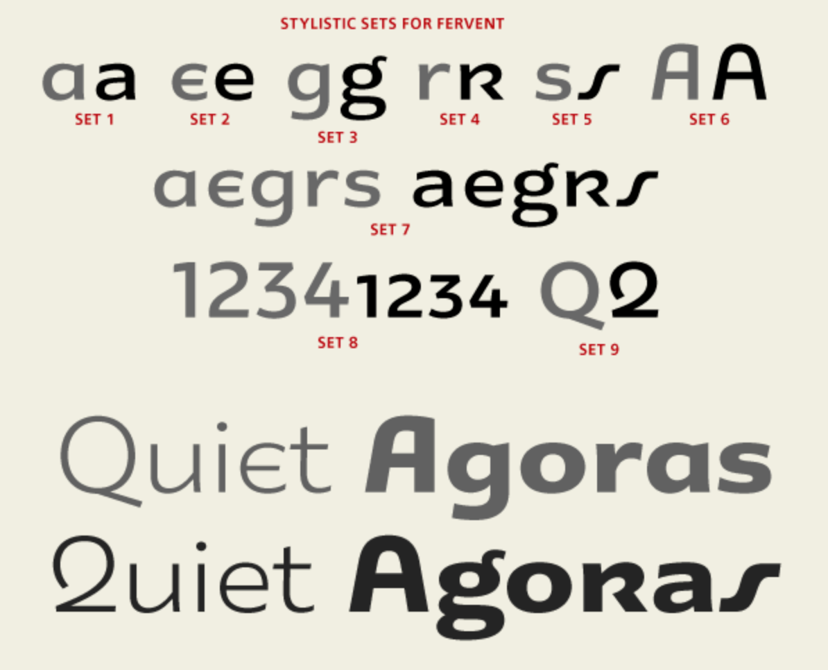 What Are Stylistic Alternates?
These are alternative versions of characters designed to give more stylistic variety. They are accessed through stylistic sets (ss01, ss02, etc. available in the font).
Use Cases:
Branding
Editorial layouts
Creative typography
5. Fractions
What Are Fractions in Fonts?
Fractions are numerical characters that are designed to appear with proper scaling and alignment. Fonts with OpenType support can automatically turn 1/2 into ½ using the frac feature.
Examples:
Input:
1/4,1/2,3/4Output (with
frac):¼,½,¾
6. Ordinals
What Are Ordinals?
Ordinals refer to characters like 1st, 2nd, 3rd, where the letters st, nd, rd, th are presented in superscript format.
Example:
Regular:
1st,2nd,3rdWith ordinals:
1ˢᵗ,2ⁿᵈ,3ʳᵈ
7. Contextual Alternates
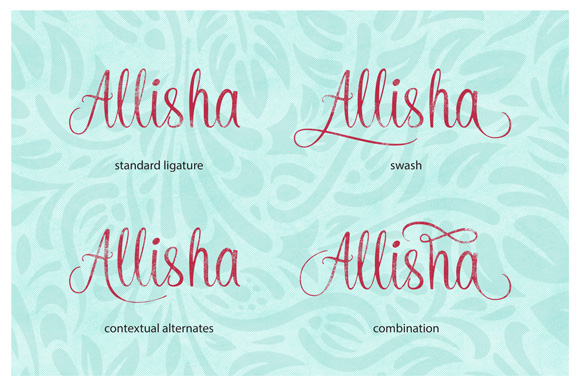
What Are They?
Contextual alternates are character forms that automatically adapt depending on their position in a word or the letters around them.
Example:
In a script font:
Starting
hmight have a flourishMiddle
hmay look simpler
Use Cases:
Script and calligraphic typefaces
Improving flow and realism in handwriting fonts
8. Character Variants
What Are Character Variants?
These are alternate forms of a character provided by a typeface, allowing for stylistic customization.
Example:
Different “g” shapes
Alternate “k” or “r” forms in script fonts
Use Cases:
Personalized design
Creative flexibility in logo and display type
9. Kerning
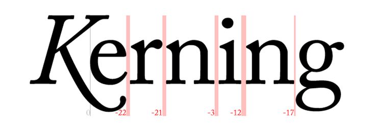 What Is Kerning?
Kerning adjusts the spacing between specific pairs of characters to ensure visual balance.
Example:
Bad kerning:
A V AGood kerning:
AVA(visually even spacing)
Important in:
Logos
Headlines
10. Tracking
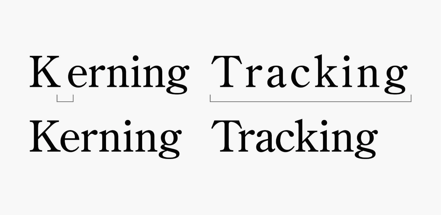 What Is Tracking?
Tracking refers to the overall spacing between all characters in a block of text (not to be confused with Kerning)
Example:
Tight tracking:
TRACKINGLoose tracking:
T R A C K I N G
11. Leading
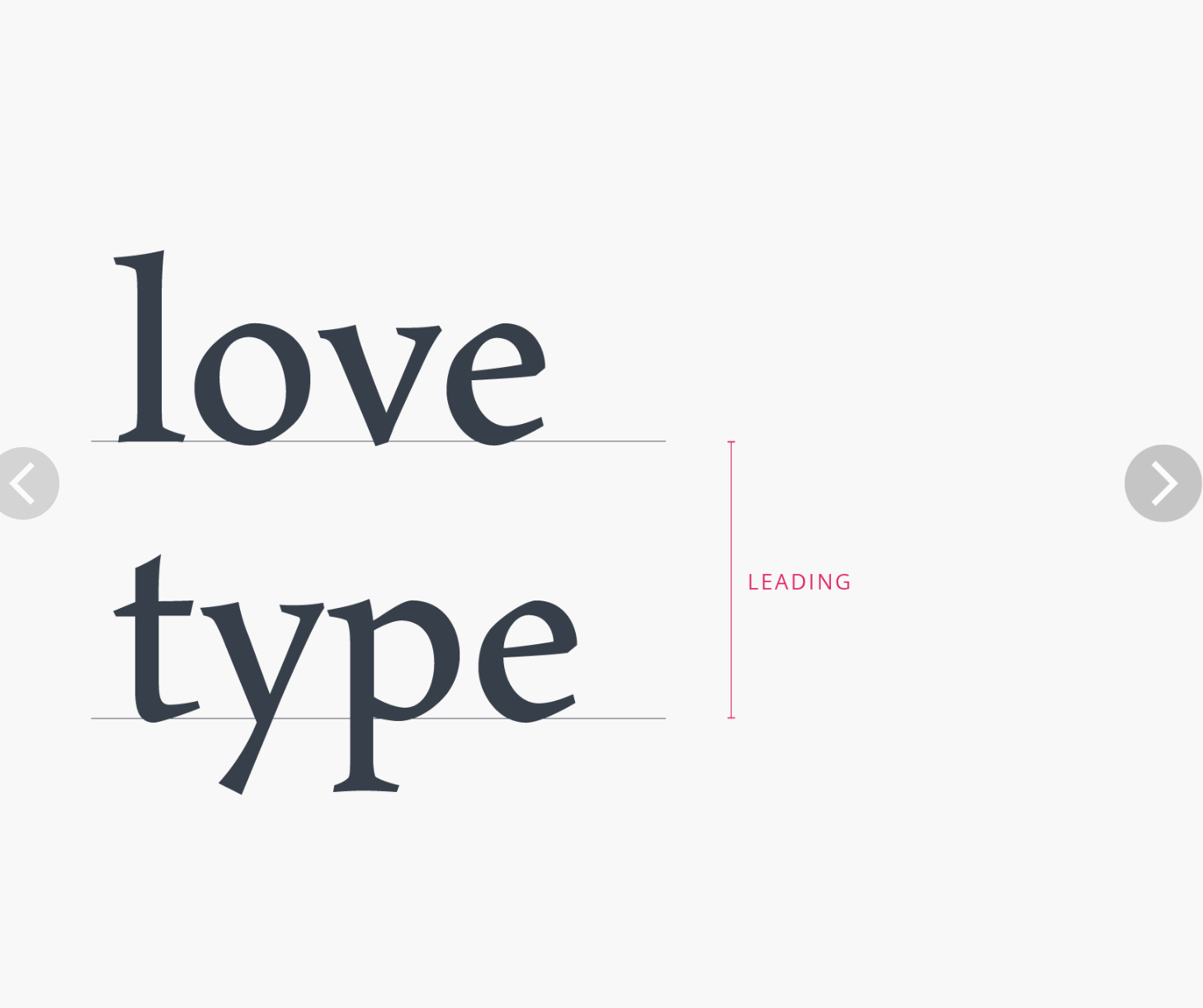 What Is Leading?
Leading (pronounced “ledding”) is the vertical space between lines of text (from baseline to baseline).
Use Cases:
Readability in body text
Aesthetic balance in layouts
12. Other Typographic principles
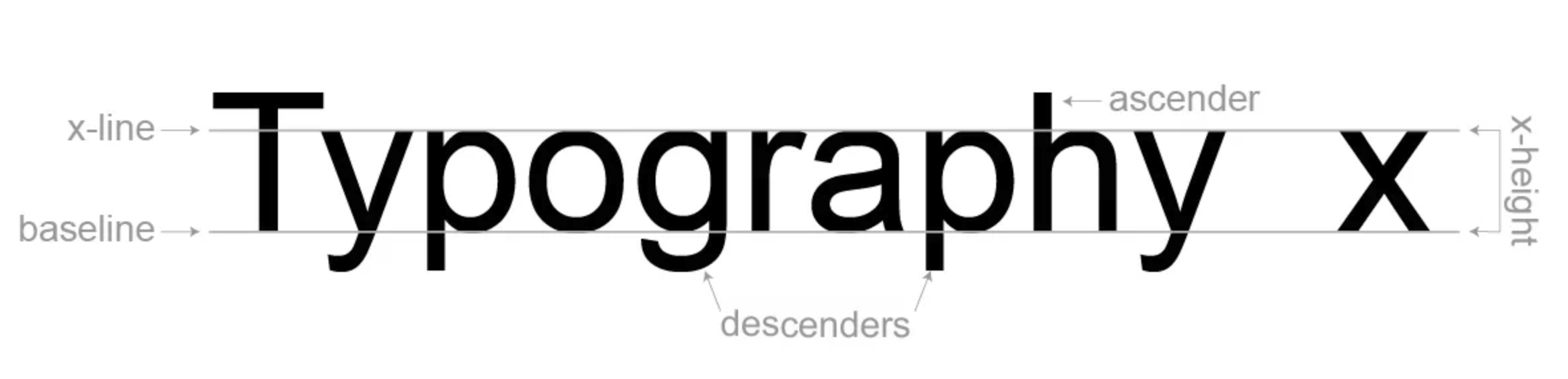
What Is the Baseline?
The baseline is the invisible line that characters sit on. Most letters align at the baseline, while some descend below (e.g., g, y).
What Is X-Height?
X-height is the height of lowercase letters (excluding ascenders and descenders). It's usually measured by the height of the letter “x.”
Affects readability
Impacts overall appearance of text
Ascender / Descender
Ascender: Part of a letter that rises above the x-height (e.g.,
h,b)
Descender: Part that extends below the baseline (e.g.,
g,y,p)
What Is Cap Height?
Cap height is the height of uppercase letters from the baseline.
Important for vertical alignment
Affects perceived font size
13. Monospaced vs. Proportional Fonts
Definitions:
Monospaced: Every character has the same width (e.g.,
Courier)Proportional: Characters have varying widths (e.g.,
Arial,Times)
Use Cases:
Monospaced: coding, tabular data
Proportional: most body text
14. Serif vs. Sans-Serif
Definitions:
Serif: Fonts with small strokes at the ends of letters (e.g.,
Times New Roman)Sans-serif: Fonts without those strokes (e.g.,
Helvetica,Arial)
General Use:
Serif: print, books
Sans-serif: digital, web
15. Italic vs. Oblique
Difference:
Italic: Custom-designed, stylized letterforms with a slant
Oblique: A slanted version of the regular upright font
16. Weight
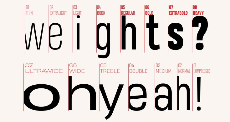
What Is Weight?
Weight refers to the thickness of the letterforms.
Examples:
Light
Regular
Bold
Extra Bold
20. Width
What Is Width?
Width refers to how narrow or wide the characters are.
Examples:
Condensed
Normal
Extended
Typography is both a technical and artistic craft. Understanding the fine details of font-face features not only makes you a better designer or developer but also opens up a world of creative and professional possibilities. Whether you're setting elegant type for print or coding responsive type for the web, these features can drastically elevate the clarity, beauty, and readability of your work.
Happy typesetting!