

Hello, dear aspiring F1-Analysts,
We're racing on the track with the lowest laptime on the calendar! Its short length, combined with the medium-high average speed that the cars can sustain there (thanks to 3 consecutive straights and high-speed corners in the last sector), makes this a track where laps follow one another without you even noticing it. The last race raised several question marks: was Mercedes' excellent pace a one-off or the start of a good second part of the season? Is McLaren's dip in performance going to carry on, or was it due to unfavourable track characteristics and suboptimal setup choices? Can Ferrari finally extract their car's potential throughout the weekend, instead of just for a couple of stints in the race?
The data are here; let's see what they can tell us so far!
Track Characteristics
How to read: The track map shows its layout divided into three sectors (S1 in Red, S2 in Blue, and S3 in Yellow). The zones in which the DRS can be used are highlighted in green. In the race, a driver who crosses the DRS Detection Zone within 1s of the preceding driver can use the DRS in all zones up to the next DRS Detection Zone.
The RedBullRing is a high altitude (700m) track with three consecutive straights, which puts the car's battery and ERS deployment capabilities under significant stress. Slow corners are mostly stop-and-go, as they separate the various straights; fast corners (T6 to T10) are present, as well. As the laptimes are low, a tenth of a second difference between two laps is more meaningful than usual (and harder to recover from!)
Its high altitude reduces air density by around 7%, which in turn reduces drag and downforce by roughly the same amount. This is the reason why most teams opt for medium-load rear wings, while the track layout alone would suggest a medium-low load setup (running a slightly more loaded rear wing is needed to claw back the downforce lost, while the drag penalty is less intense)
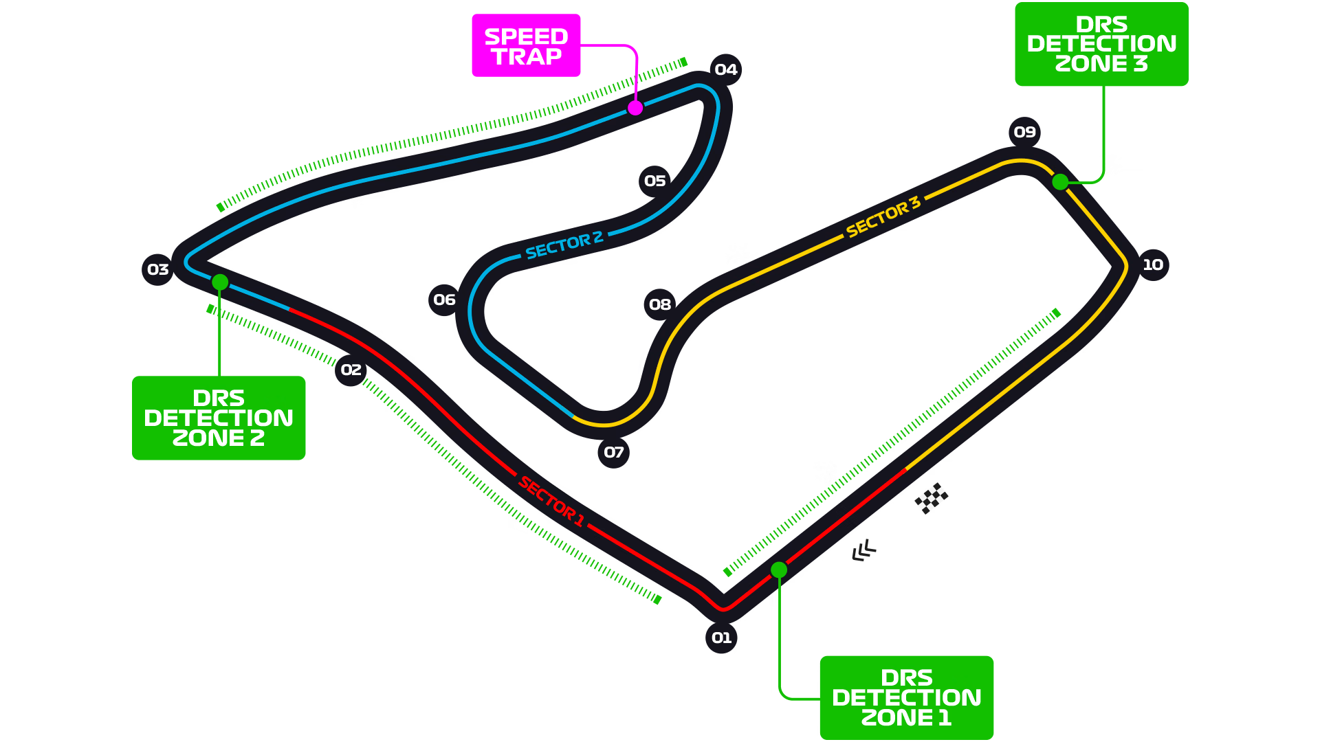
Characteristics of each sector:
Sector 1 (Red): Shortest and fastest sector. A corner connecting two straights. The sector is uphill; heavy braking into T1; exiting T1 well is crucial, not to lose time on the following straight. Focus: straight-line speed, traction, and braking stability.
Sector 2 (Blue): A mix of slow and medium-speed corners with significant braking zones, and one DRS straight. T3 and T4 are the main overtaking spots here.
Sector 3 (Yellow): The one where cars with high downforce (and brave drivers) shine, due to the lack of long straights and the presence of many fast corners! High-speed, downforce-dependent, punishes mistakes.
Pirelli’s Track Preview:
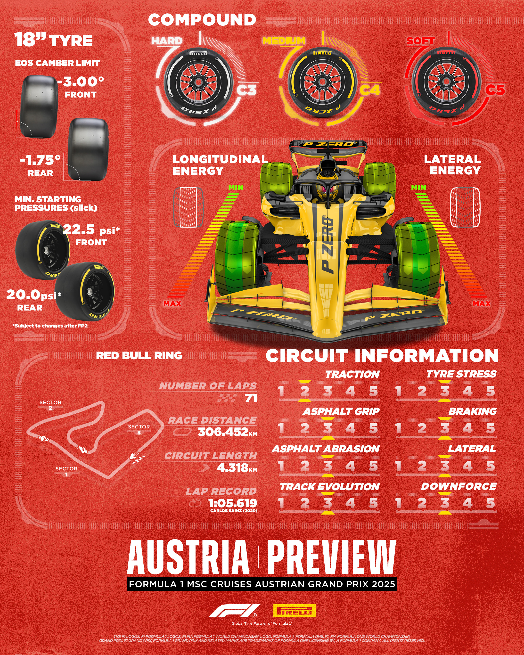
C3-C5 compounds, one step below the softest available. Austria's lower air density will reduce downforce and therefore stress tyres less, but the lower cooling effect will make them hotter (likewise for the engine!). The track has pretty even characteristics: Braking, cornering, traction, engine power, and low drag are all important. I disagree with the 2/5 score given to Traction: it should have been a 3/5, as a bad exit out of the slow corners will kill performance on the many straights. Moderate tyre stress, grip, asphalt abrasion, and track evolution (these aspects are often correlated).
Weather Forecasts (by F1)
FRIDAY, JUNE 27 – FP1 AND FP2
Conditions: Mix between clouds and large sunny spells in the morning. Slight chance of few drops in the early morning. Arrival of high level clouds in the afternoon with a decreasing chance of rain. Light westerly wind with gusts up to 30 kph in the afternoon. FP1: 28°C // FP2: 28°C
Maximum temperature expected: 28 Celsius
Minimum temperature expected: 15 Celsius
Chance of rain: 20%
SATURDAY, JUNE 28 – FP3 AND QUALIFYING
Conditions: Low level clouds at dawn. Then improvement in the morning with a mainly sunny weather. Dry day expected. Light northwesterly wind. FP3: 28°C // Q: 29°C
Maximum temperature expected: 29 Celsius
Minimum temperature expected: 15 Celsius
Chance of rain: 0%
SUNDAY, JUNE 29 – RACE
Conditions: Sunny at first. Developing cumulus clouds in the afternoon but likely dry. Very slight chance of one light shower in the late afternoon. To be confirmed. Light easterly wind. Race start: 30°C
Maximum temperature expected: 30 Celsius
Minimum temperature expected: 15 Celsius
Chance of rain: <20%
Stable weather and temperatures throughout the weekend. The maximum temperature will progressively increase from Friday to Saturday and Sunday.
Wing Levels
What it means: Teams can use different rear wings. A more loaded rear wing will produce more downforce at the expense of more drag: the car will have slightly better traction, cornering, and much better braking, but also lower high-speed acceleration and top speed. Generally, it will have less tyre wear, but it will also empty its battery more quickly. A more loaded wing plane is a plane with more camber (more curvature) and a higher angle of attack (the angle of the wing relative to the airflow). The wing load can be increased independently through the lower and upper planes: the DRS only acts on the upper plane, so running a more loaded upper plane and a less loaded lower plane will generally make that car's DRS more effective.
Austria would be a medium-low downforce track if not for its high altitude. Despite that, however, several teams have indeed brought medium-low downforce here this year: this is a testament to the great downforce produced by the floor of these ground-effect cars, and to the confidence of some teams. Let's highlight their differences:
Top teams: McLaren has the most loaded lower plane (deep but narrow spoon); its upper plane seems as loaded as Ferrari's (or even slightly more). Mercedes went in the opposite direction: very unloaded upper plane (horizontal) and lower plane (very shallow spoon). RedBull has an even less loaded upper plane, but tried to recover part of the lost downforce through a very cambered lower plane.
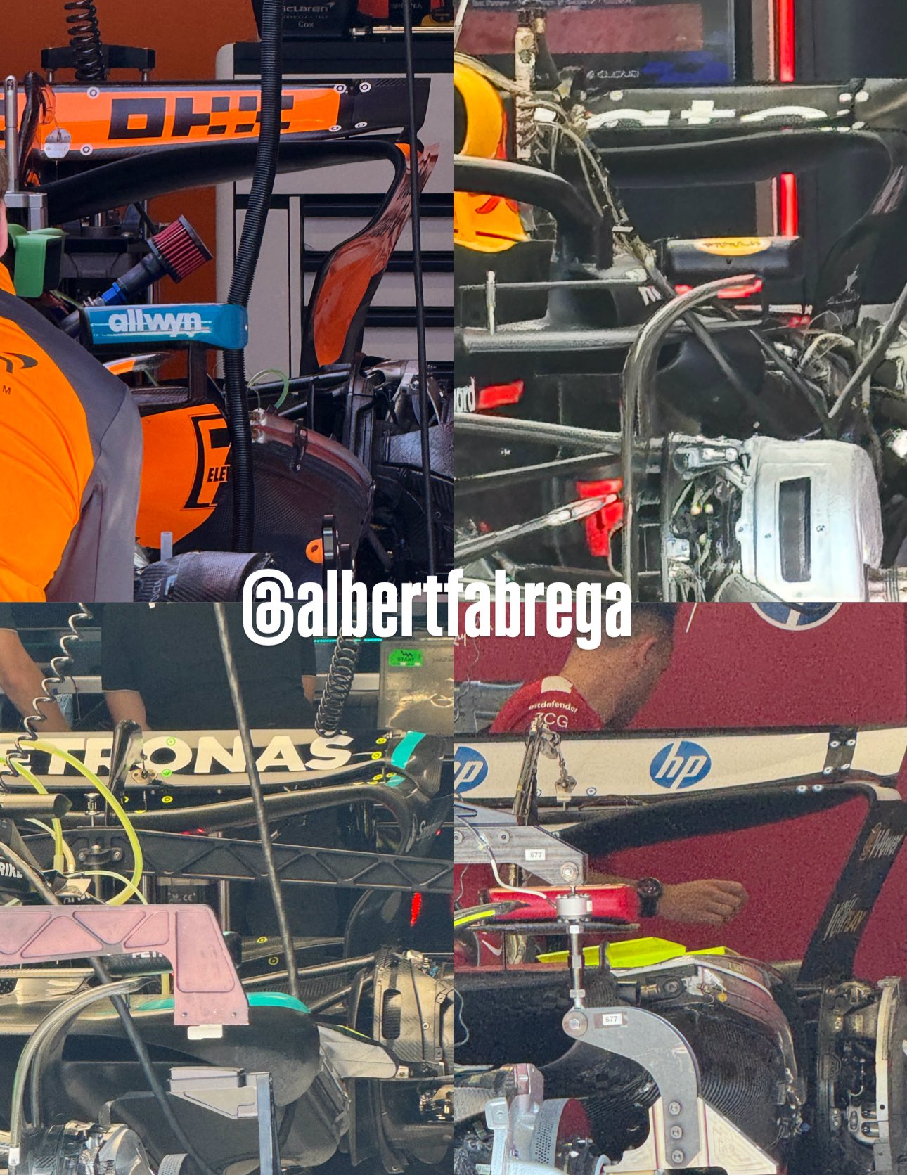
Instead, we see much more variety in the rest of the field. Compare Aston/Alpine (most loaded) to Racing Bulls! (least loaded). Expect these two extremes to converge a little bit once the teams gather more information about the track state. Aston has already reduced their rear wing load after FP1.

Single Lap Pace
Best Laptime per Driver
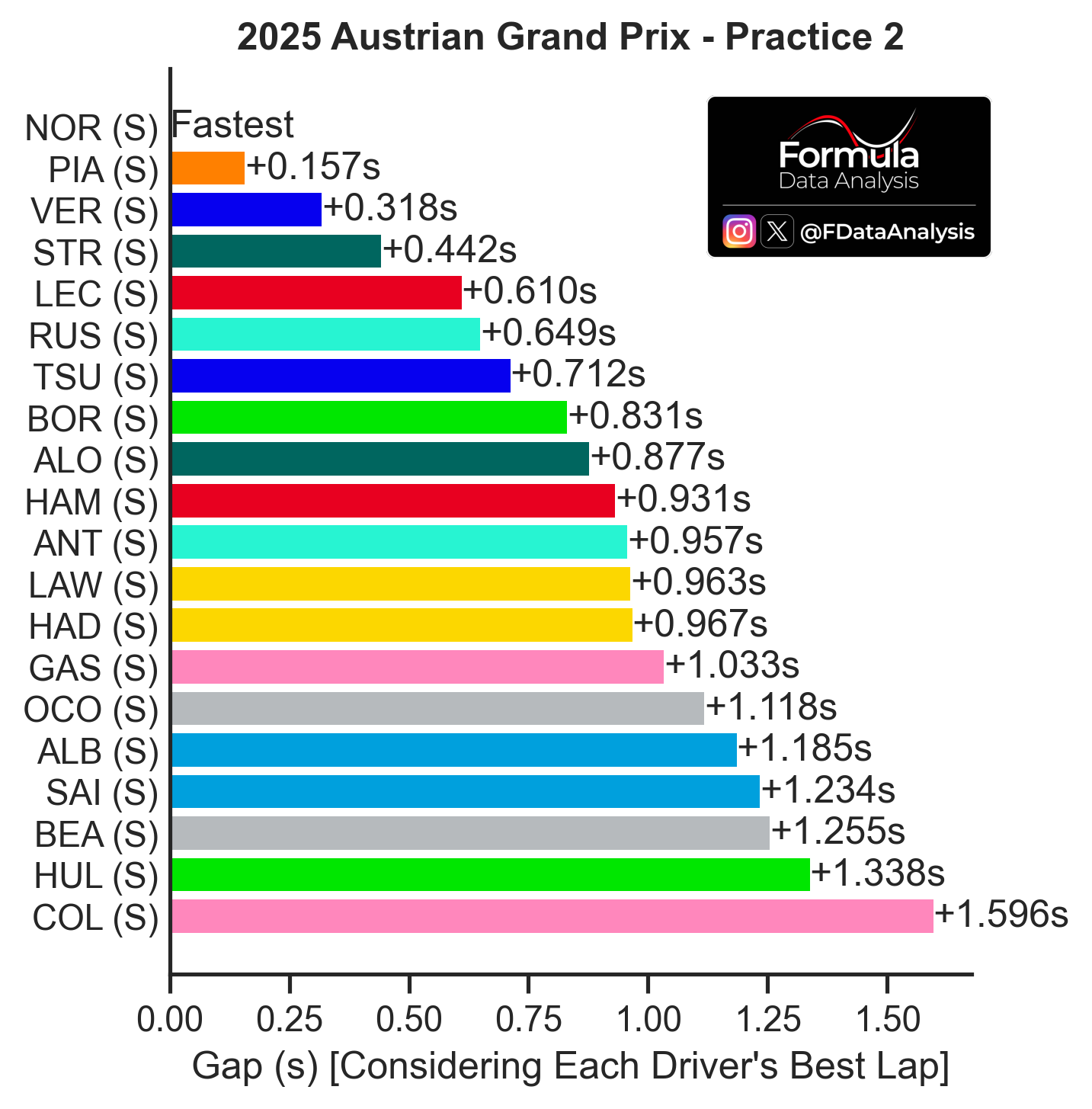
How to read: The graph shows the difference between each driver's fastest lap in the session. The letter to the right of each driver indicates the compound used.
All drivers set their best lap on softs, making the analysis more straightforward. McL 1-2, then VER (distant, over 3 tenths away). Good performance so far for STR, in front of LEC and RUS (Mercedes set their laptimes early in the session). Haas and Williams were the slowest in FP2.
Aero Map
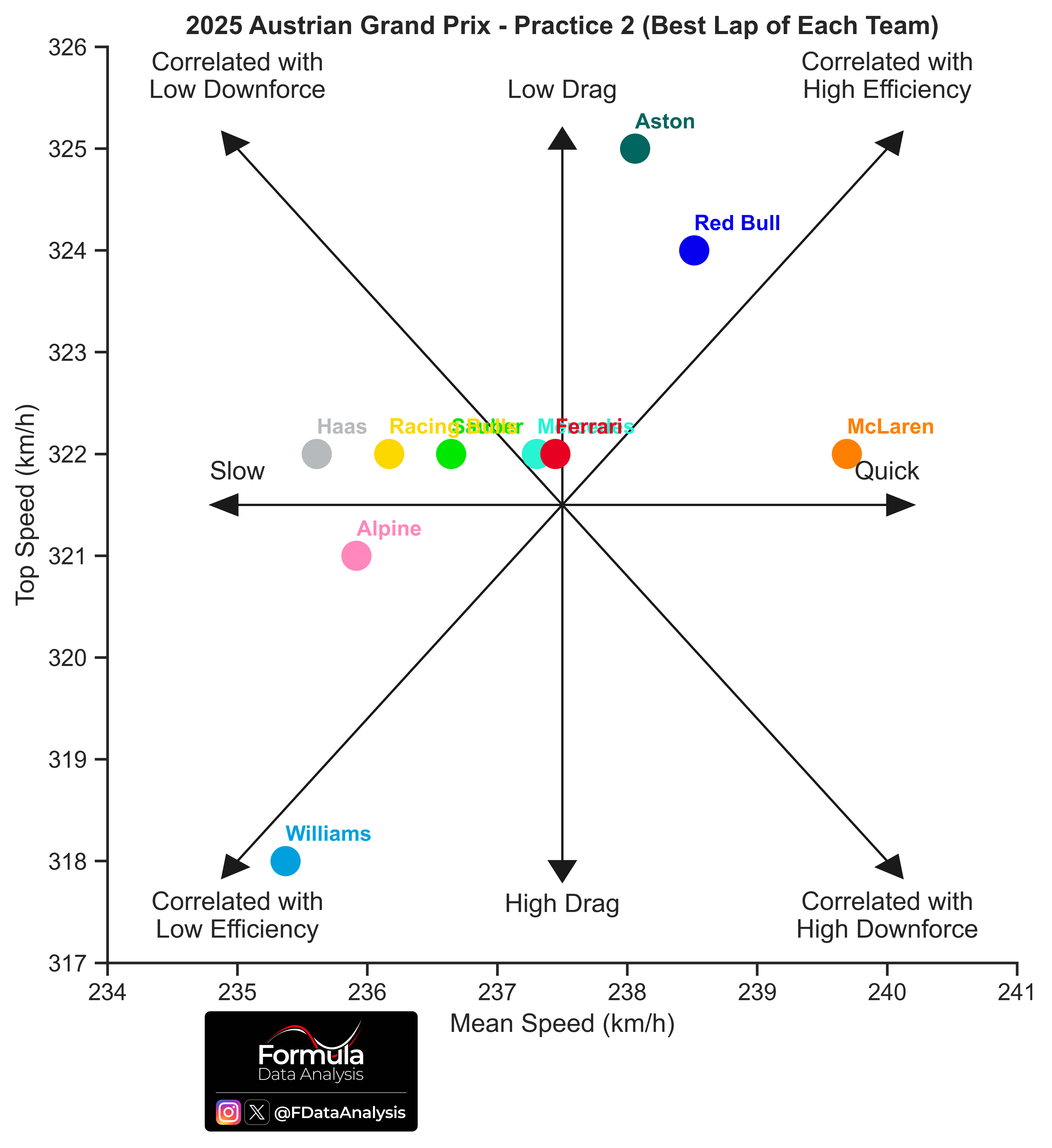
How to read: Average speed on the horizontal axis: the further to the right a team is, the better its performance (the lower the lap time). Top speed on the vertical axis: the higher a team is, the lower that car's drag or the higher that team's engine mode. Therefore, this plot not only shows who was the fastest (those on the right) but also why! (due to very low drag, if they are in the upper portion, or despite that, if they are in the lower portion).
Haas, RBs, Sauber, Mercedes, Ferrari, and McL all reached 322km/h in their quickest lap, but McL was way quicker than the rest! Red Bull and Aston opted for a drag-friendly setup, trying to gain time on the straights. Williams had a terrible top speed (drag-related), and their overall performance suffered due to that.
Top Speeds
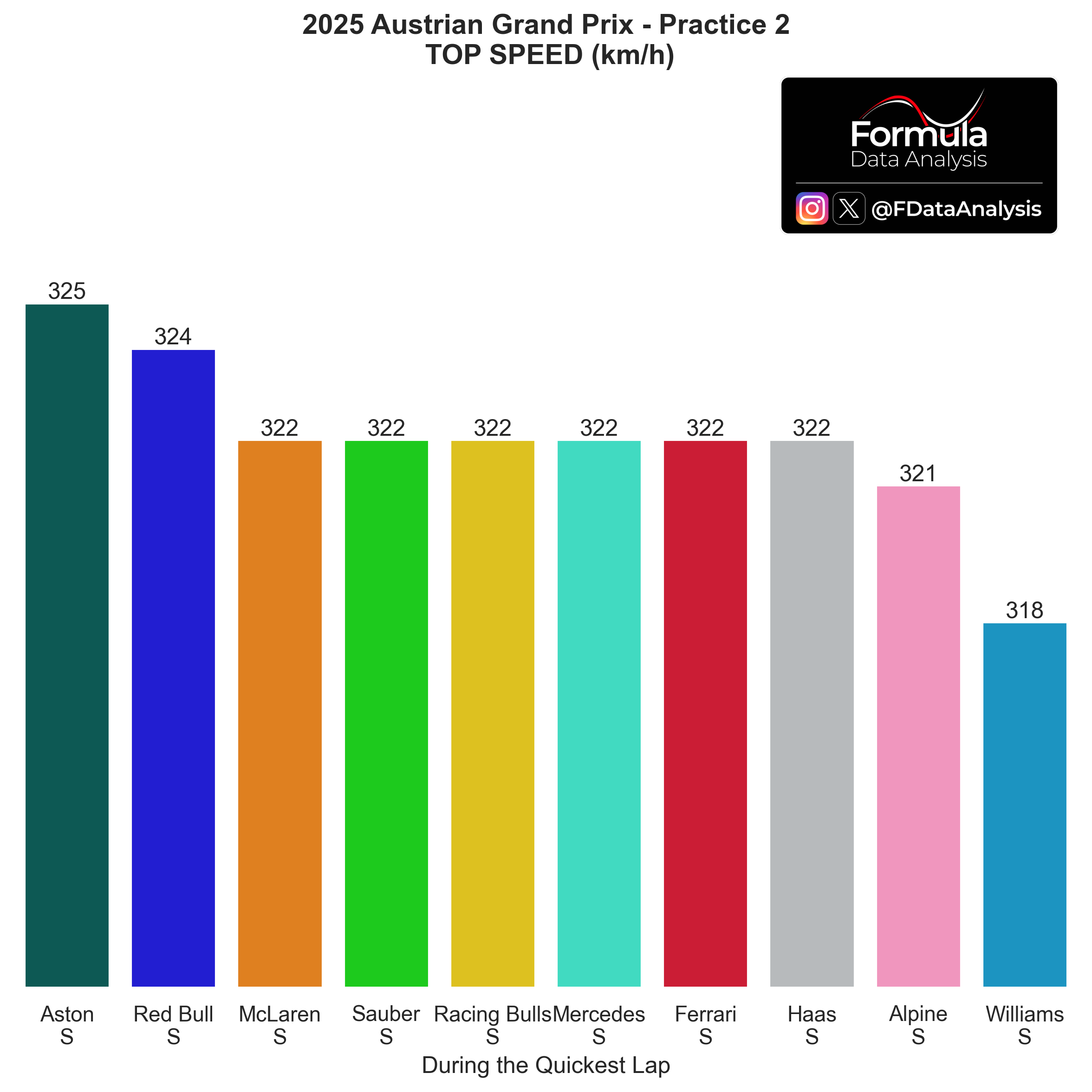
How to read: The higher a team's top speed, the lower that car's drag or the higher that team's engine mode.
As I mentioned, minimal differences across the field. Aston and RBR are running less drag (the opposite of Williams)
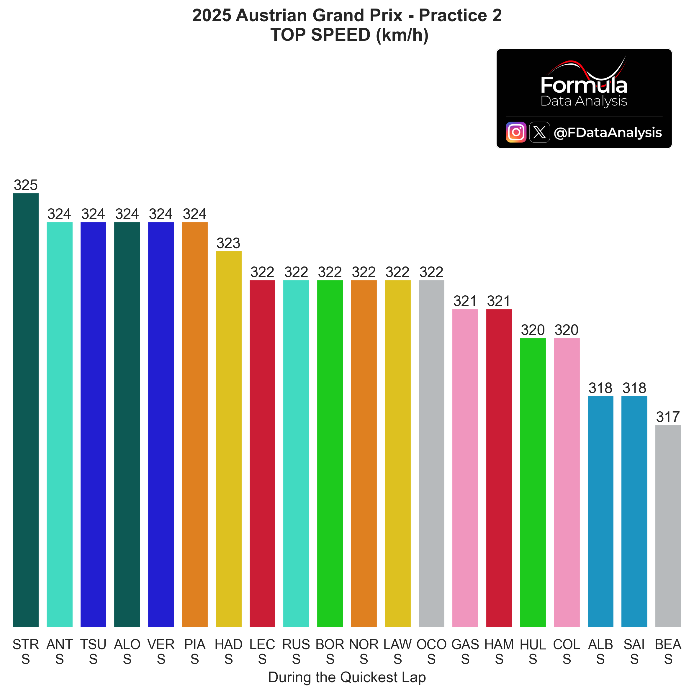
Same chart, per driver:
Significant difference between OCO (322km/h) and BEA (317): I'm curious to see which will be Haas' final setup choice! (likely OCO's, more in line with the competitors)
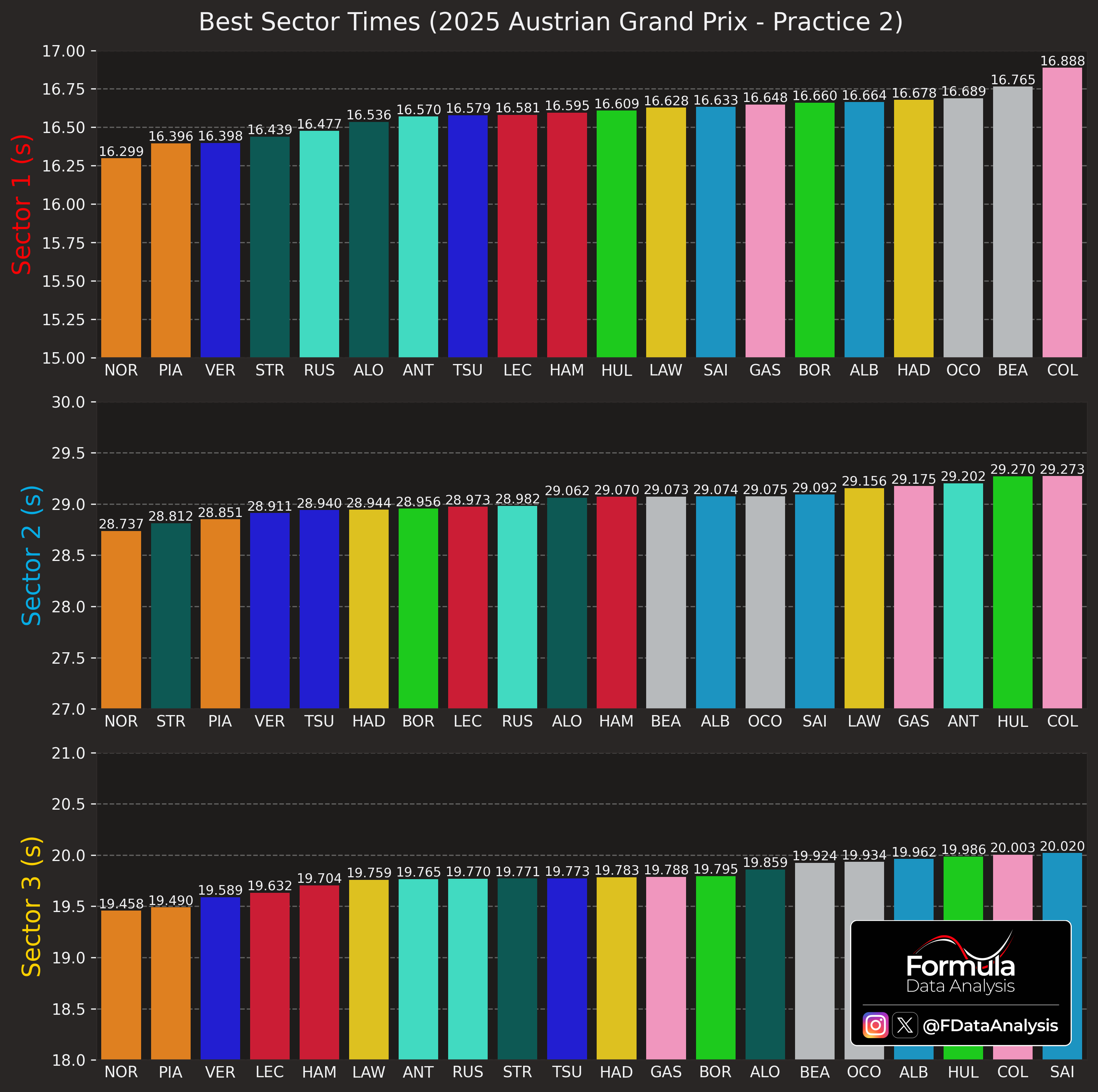
Best Sectors
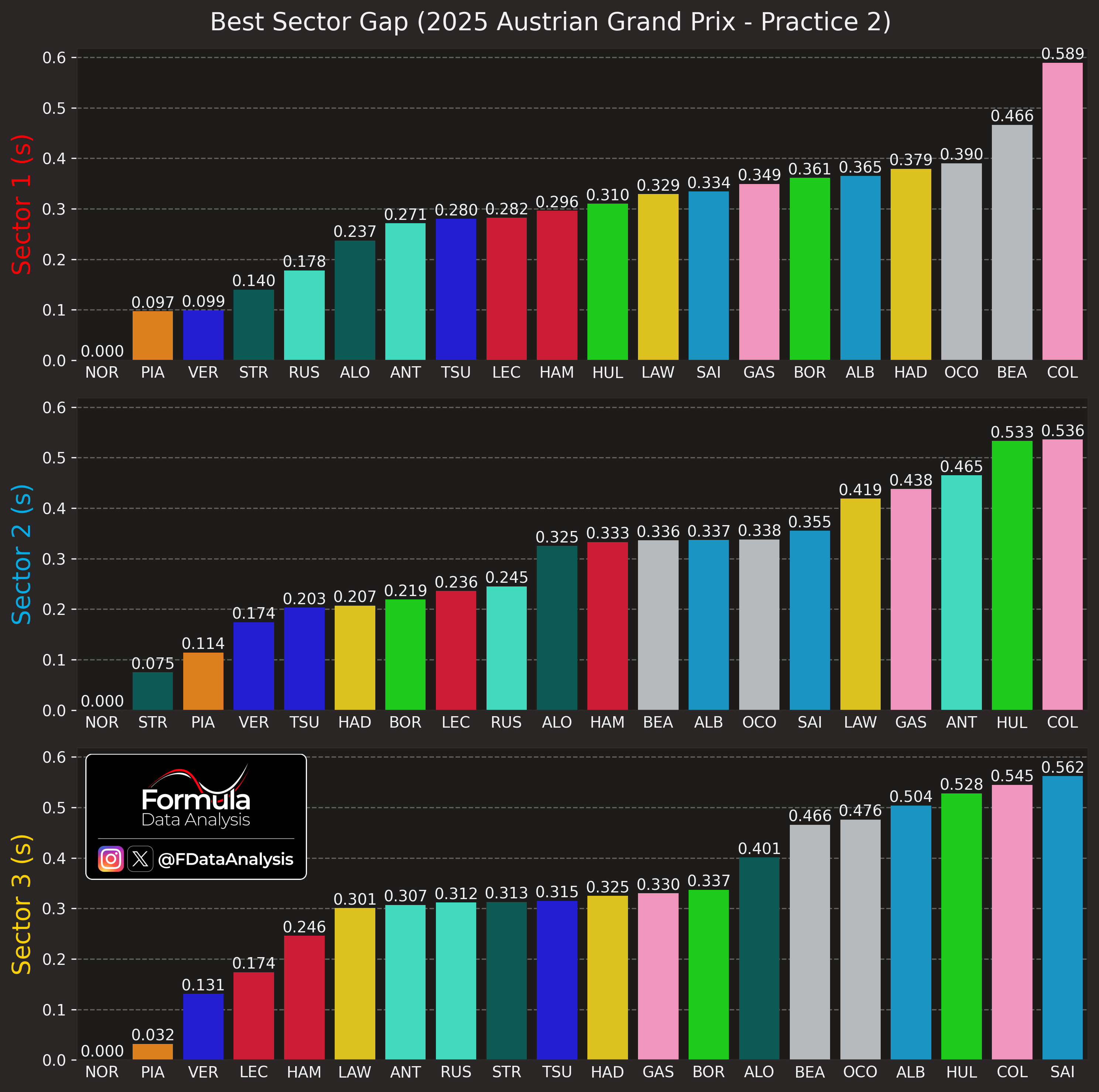
A summary to remind you of the properties of each one:
Sector 1 (Red): Shortest and fastest sector. A corner connecting two straights. The sector is uphill; heavy braking into T1; exiting T1 well is crucial, not to lose time on the following straight. Focus: straight-line speed, traction, and braking stability.
Sector 2 (Blue): A mix of slow and medium-speed corners with significant braking zones, and one DRS straight. T3 and T4 are the main overtaking spots here.
Sector 3 (Yellow): The one where cars with high downforce (and brave drivers) shine, due to the lack of long straights and the presence of many fast corners! High-speed, downforce-dependent, punishes mistakes.
NOR was quickest in all sectors, and McL set a 1-2 result in S1 and S3 (also, 1-3 in S2). Aston/Stroll was next quickest in S2, and RBR/VER in S1/3. Ferrari was pretty competitive in S3 (where downforce is needed), but struggled in S1. The opposite stands for Mercedes.
Best vs Ideal Lap
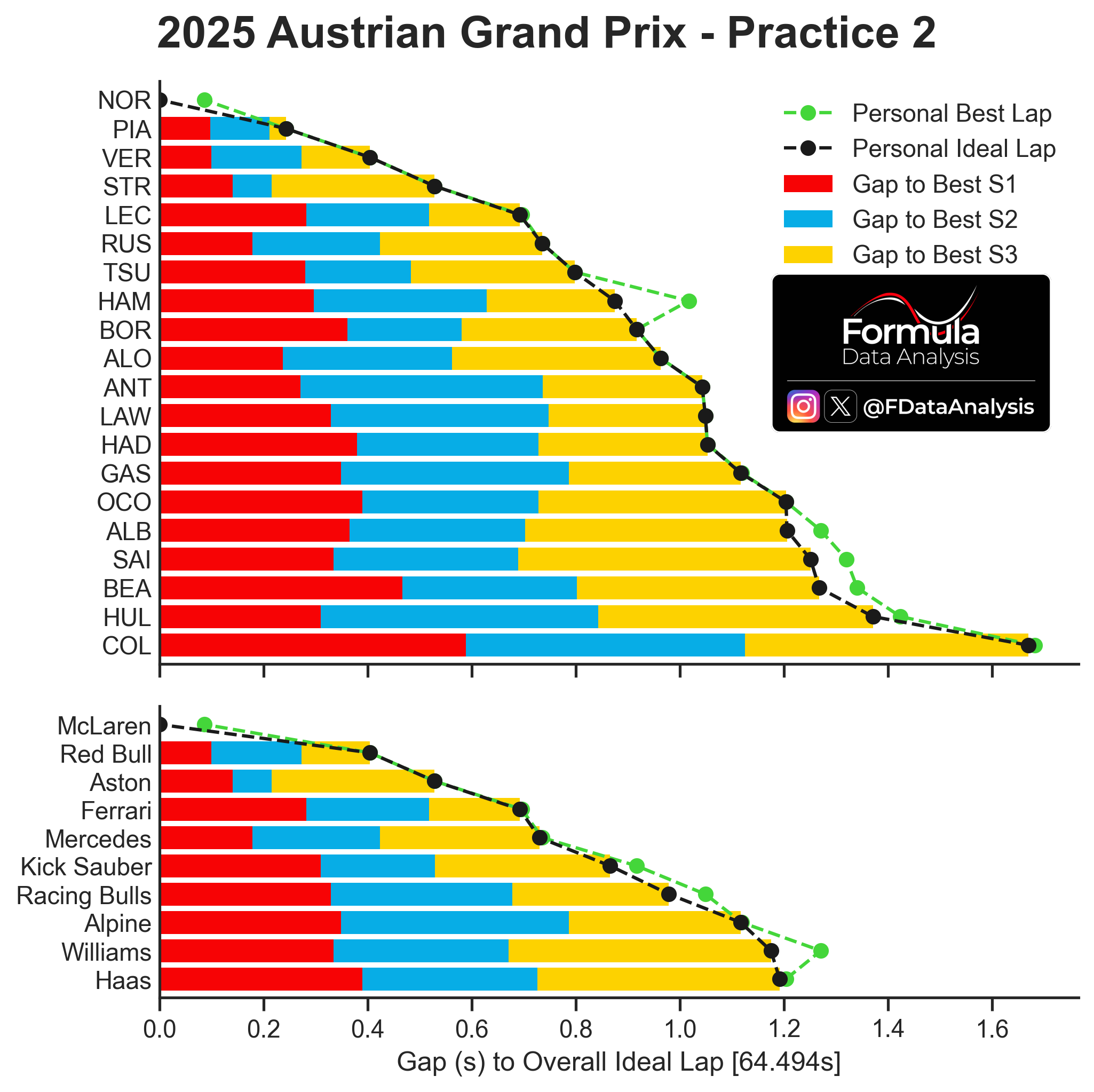
How to read: The graph shows, for each driver and each car, the ‘Personal Ideal Lap’ (the lap time obtained by the sum of that driver’s or team’s best 3 sectors, which might have been achieved in different laps) in black, and the ‘Personal Best Lap’ (the best lap time that the driver or team has effectively achieved in the session) in green. Consequently, the Personal Ideal Laptime is always equal to or lower than the Personal Best Laptime. If the two coincide, it means that the driver or team has produced its best sector times all on the same lap. The farther the Personal Best Laptime is from the Personal Ideal Laptime, the more potential lap time that one driver or team has left on the table. The coloured bars indicate the gap to the absolute best sector time. The ‘Overall Ideal Lap’ is shown at the bottom of the figure, and is the sum of the lap times of the overall best sectors, independent of which driver or car achieved them.
Combining each car's fastest sectors, the single-lap order in FP2 was:
McL
RBR
Aston
Ferrari, Mercedes
Sauber
Alpine
Williams, Haas
HAM still had some time in his pocket, as he didn't combine his best sectors
Minisectors
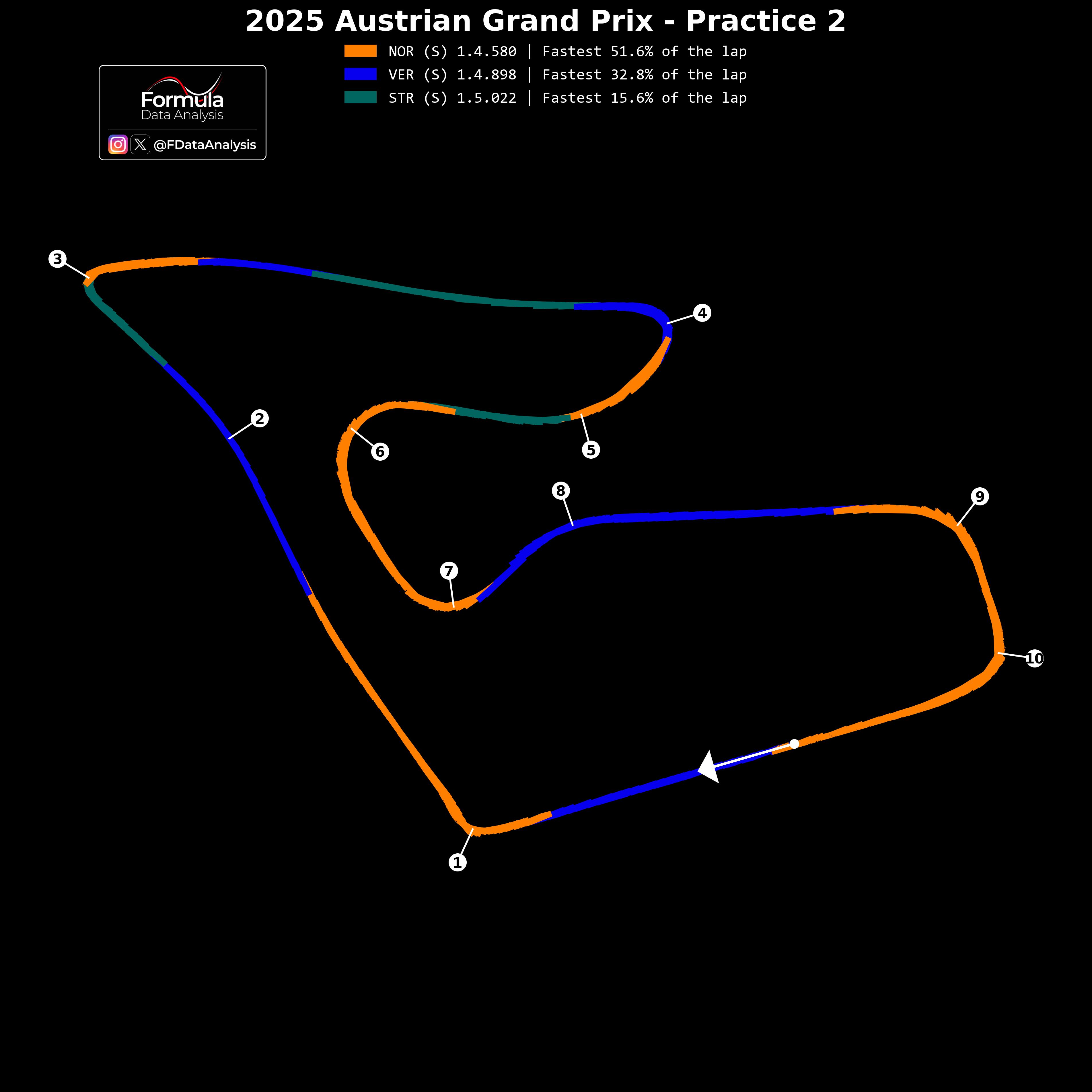
How to read: The analysis compares the fastest laps of each of the three fastest teams. Each segment is coloured based on which driver was fastest there. Any track can be decomposed into the following sections: braking, braking into the next corner, cornering, exiting the corner, and travelling along the following straight.
Not only was NOR quickest in virtually all traction zones, he was also dominant in most of the fast corners (T6-7, T9-10). The only way VER and STR were quicker in some parts of the track was due to their lower drag (but their lower downforce made them lose performance everywhere else).
Throttle Use
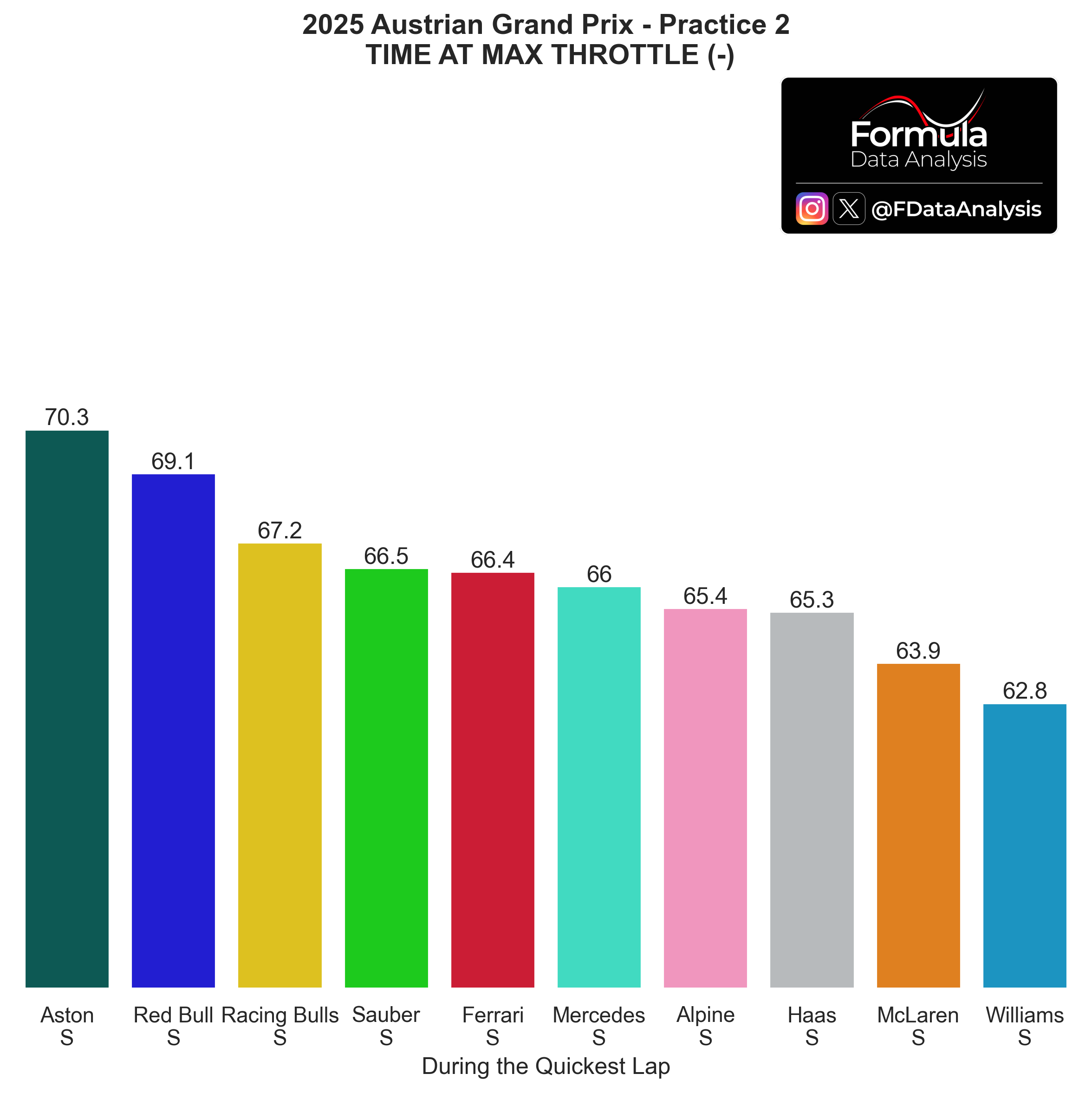
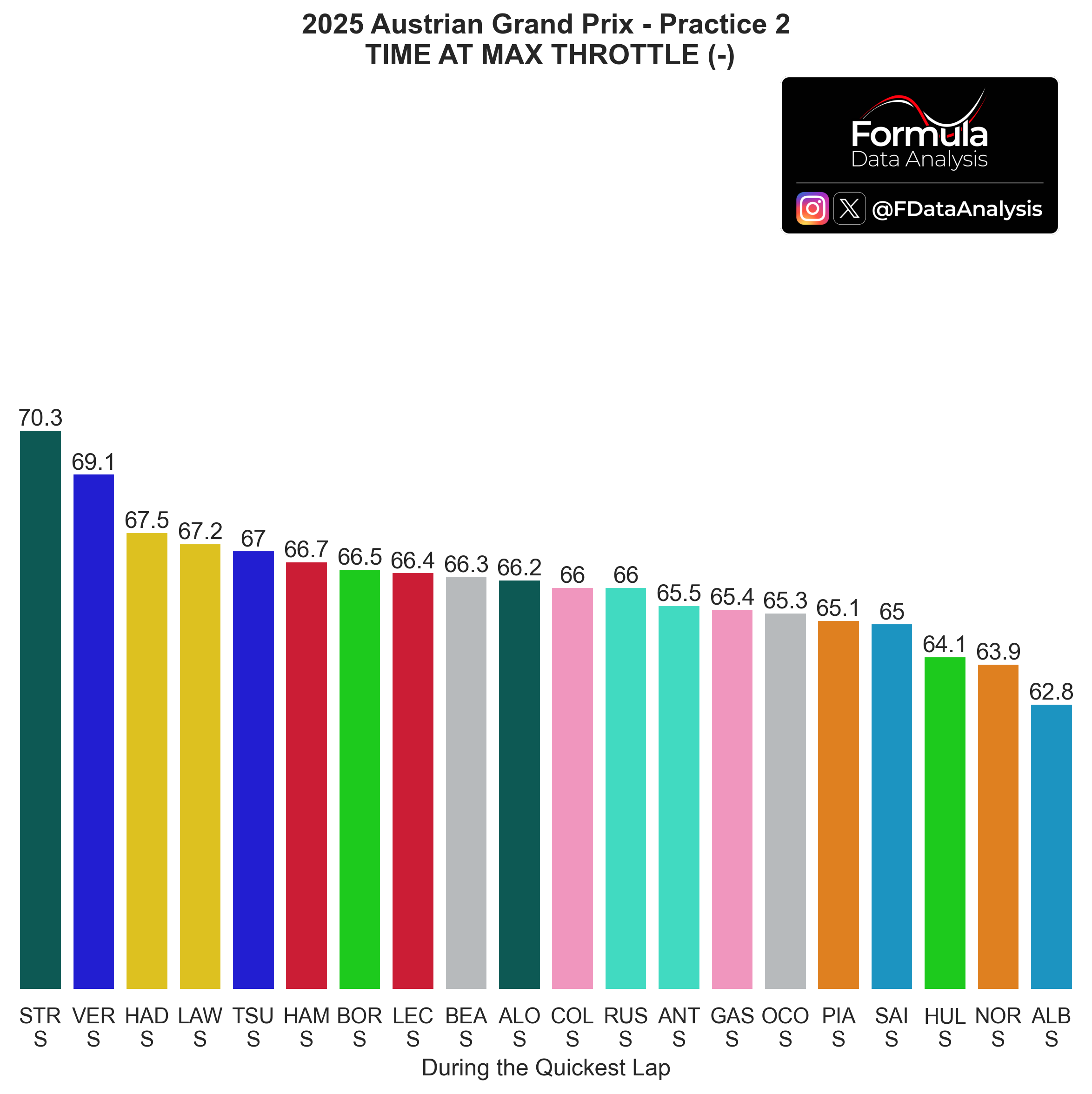
How to read: The graph shows the percentage of the time the driver spent at full throttle. Spending more time at full throttle is correlated with a weaker Power Unit mode, more drag, less fuel, and better grip (especially concerning traction out of the corners). This analysis is used together with the lap time produced by each driver and the corresponding top speed achieved to pinpoint which teams could be on a lower engine mode. For example, if a team produced a lap time worse than usual but they are topping the charts concerning throttle usage, it's pretty likely that they were running a more conservative engine mode. Looking at the top speed achieved could confirm it.
Not only did STR have the highest top speed in FP2, but he could also stay full-throttle for more time than anyone else. A lower fuel load might explain this, but Aston's potential seems high nonetheless. McL's figure is deflated by NOR's driving style, who tends to lift the throttle sooner than other drivers to prepare for the following braking action. William's struggles are clear.
Same chart, per driver:
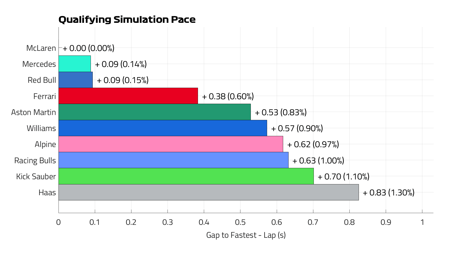
Quali Simulation by F1:
Barretto predicts McL to take pole position, and Mercedes/RBR to be a close second best. Then, Ferrari is expected to be pretty far from them (6 tenths), marginally ahead of Aston.
I too expect Aston to be the best of the rest, but VER is likely to qualify better than the Mercedes drivers (who did their laptimes earlier in the session, but this should not account for all their gap. I agree with McL being the favourite.
Race Pace
Long Runs

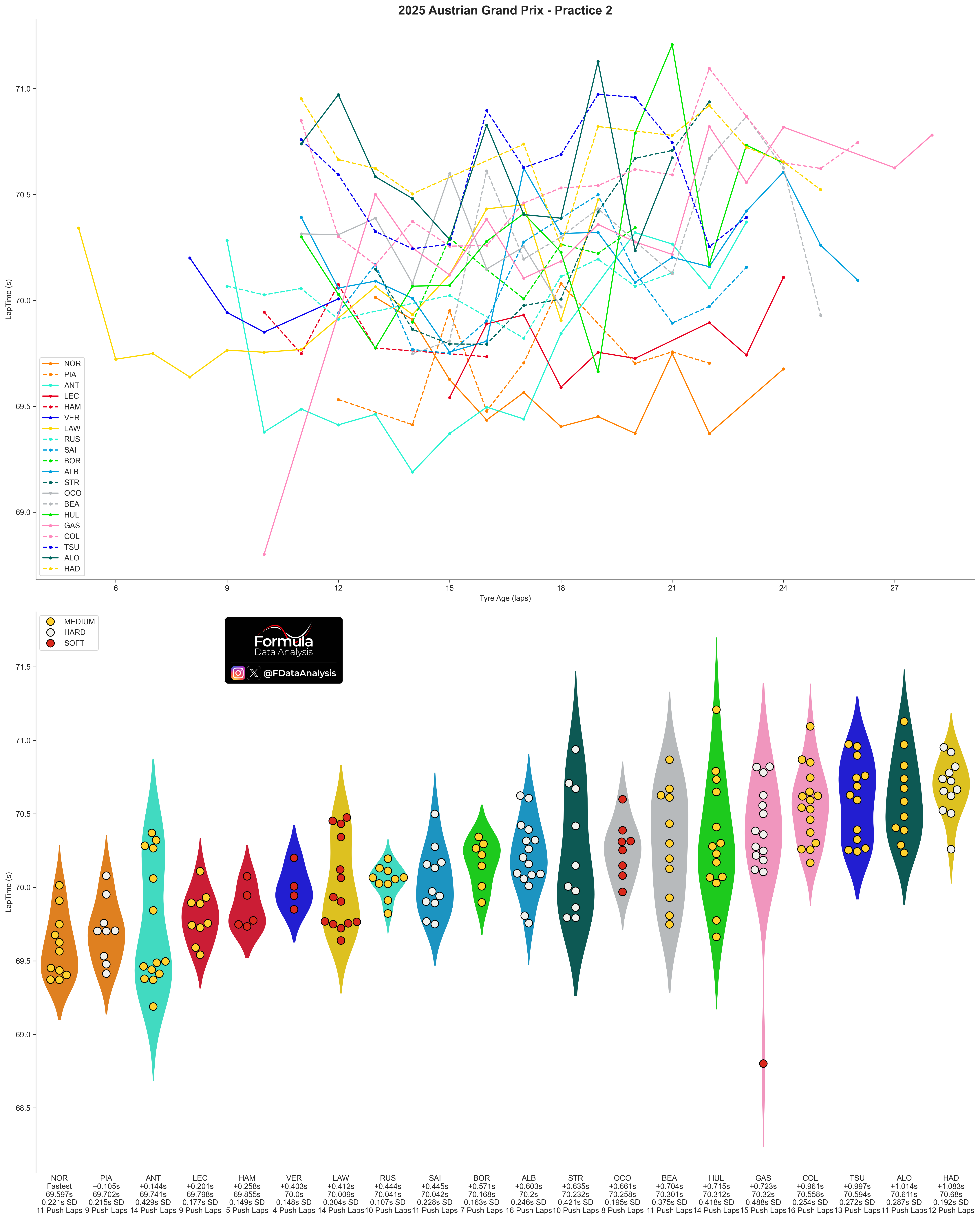
How to read: The chart shows the distribution of lap times during each team's long runs. A long run only includes segments of at least 5 consecutive laps run on the same compound without pitting or slowing down.
Top 5 Teams based on WCC (You will find all the data at the bottom of the plot)
McL was also quickest in the long runs, and on two different compounds: NOR was quickest in general, on Mediums (1:09.597 average); PIA was 1 tenth behind on Hards.
ANT was next quickest, doing a very long (14 laps) but less consistent run. Next were LEC (on Mediums) and HAM (on softs). VER only did 4 push laps on softs; RBR usually sandbags their long runs significantly. Williams' more loaded setup seems to pay dividends in race pace (they looked much better there than over a single lap)
Overview of all teams:
HAD's pace was decent, but the bottom 5 teams in general looked uncompetitive (Aston included!)
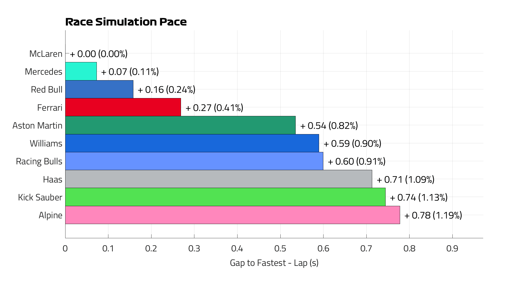
Race Pace Simulation by F1:
I agree with this, especially the larger delta between Ferrari and Aston than in single lap pace.
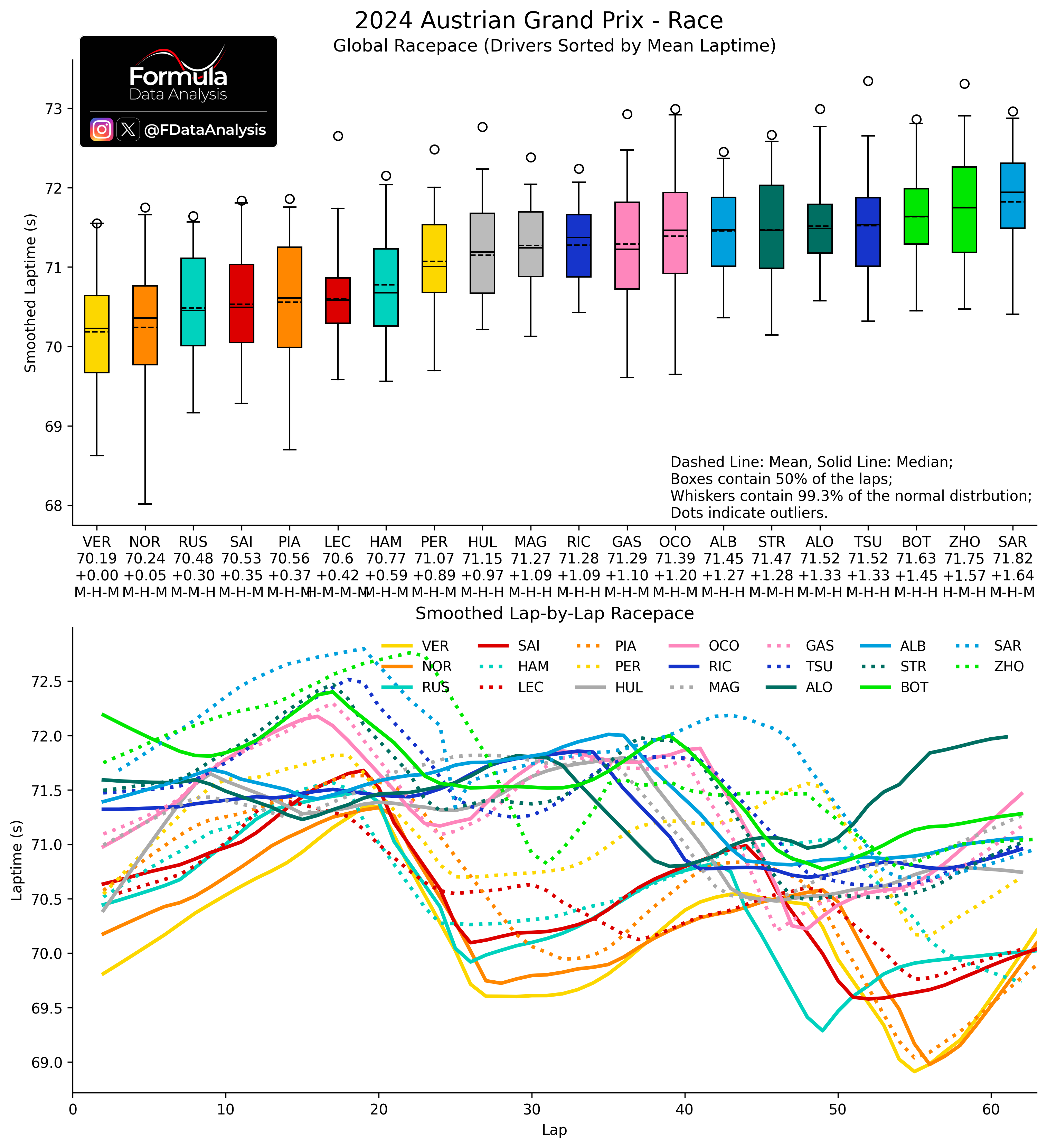
Pace Last Year
How to read: The upper plot shows the synthesis of each driver's pace during the race. The lower plot shows the (smoothed) evolution through the laps. Each bar contains the central 50% of the distribution: the shorter it is, the more consistent the pace. Inside it, the solid line indicates the MEDIAN (how quick was the TYPICAL lap), while the dashed line indicates the MEAN (how quick was a lap ON AVERAGE). The whiskers include all the laps from a driver which are not uncharacteristically slow for that driver: the lower whisker, in particular, shows that driver's quickest lap. The mean lap time is indicated below each driver's name, and below that is the gap to the quickest driver. The bottom line indicates the tyres used.
I'm only factoring in the laps before the crash to judge race pace; what came after wasn’t representative, especially for VER. VER and NOR were pretty evenly matched overall, though their pace peaked at different points: VER had the edge early on, while NOR was quicker on the final stint, helped by his fresher tyres.
Russell won by outpacing Sainz and Piastri and then taking advantage of their crash. Solid, clean drive from him.
Ferrari was the fourth fastest team, but not by much. In terms of raw pace, they were close to Mercedes. The final result was shaped by starting positions and Leclerc’s lap 1 contact. He had a good pace but lost too much time with an extra pit stop due to using one more tyre set than the others.
Perez had damage from the lap 1 contact and was well off VER’s pace. The Haas cars were nearly matching him, and HUL even beat him to the flag. Alpine delivered a decent result, while Aston continued to struggle (Alonso’s fastest lap aside).
My prediction
Quali
Overall, this is my expected running order concerning quali (considering the placement of the best driver of each team, so the ultimate car’s potential). Teams on the same line are too close to call:
McL (clear favourite)
RBR (VER)
Mercedes
Ferrari
Aston
Racing Bulls
Alpine, Williams, Sauber
Haas
Race
My race pace prediction is:
McL
RBR, Mercedes
Ferrari
Williams, Aston
Racing Bulls
Haas, Sauber, Alpine
Will this prediction be confirmed? And what is yours?
Enjoy the content, and thank you SO MUCH for your support! And check the data repository for more!
Mirco/Formula Data Analysis