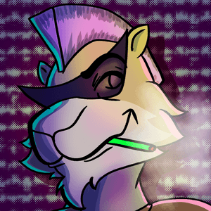

A big goblin greeting to everyone! Today's subject is Winston Goodman, guitarist of The Vice Men, and why he looks so awesome.
A few weeks ago, I uploaded this picture to all my social media pages. It's my favorite picture of Winston to date and I'm super proud of how the shading turned out. I even printed a massive 18x18 version to hang on my bedroom wall.
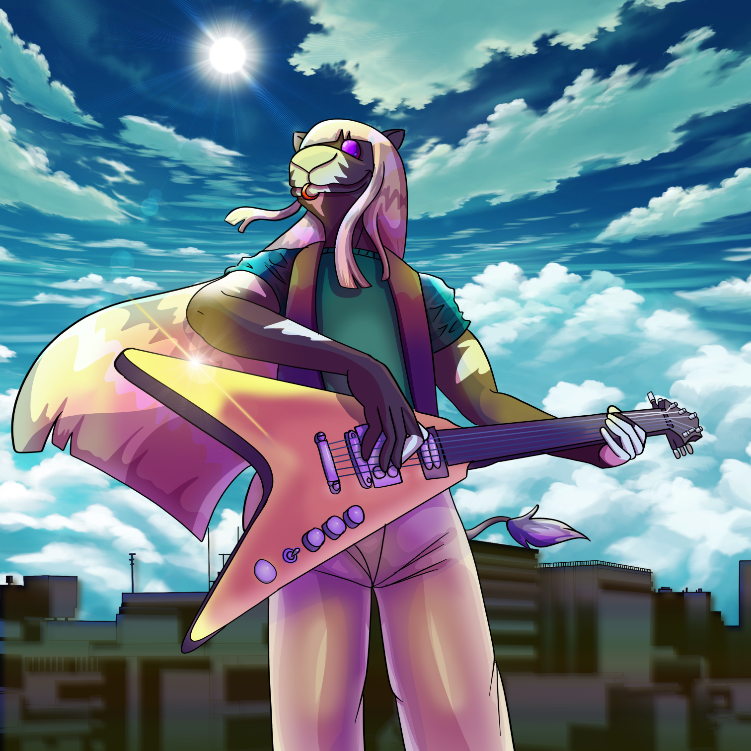 This guitarist looks pretty "smooth" here with his iconic yellow guitar and those signature purple shades. But Winston took a bit of refining over the last two years to get this cool.
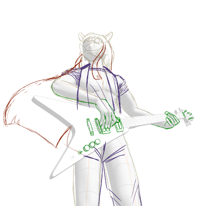
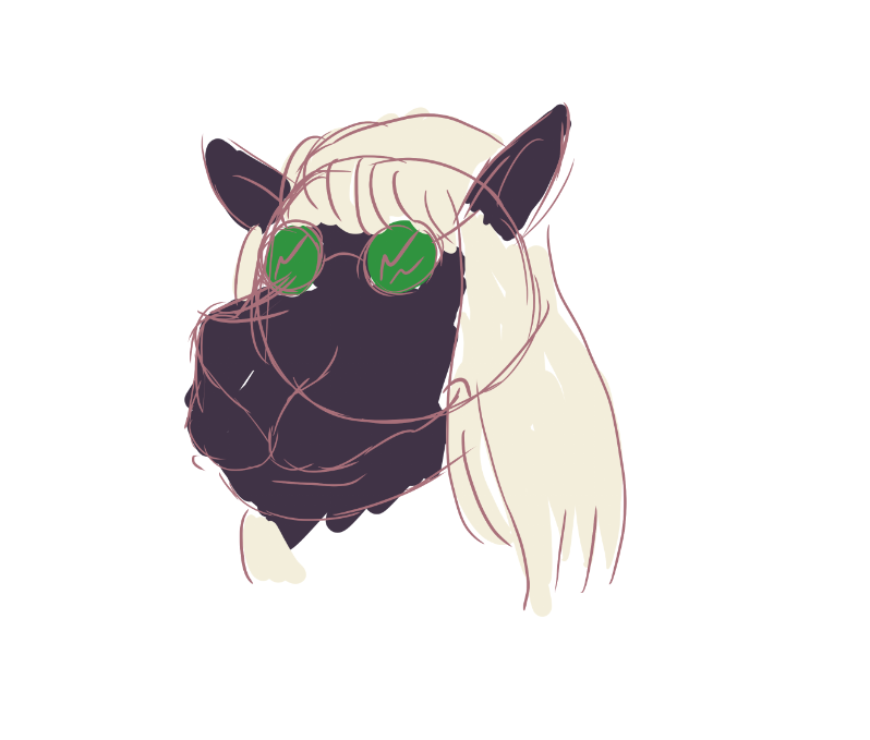 This is the very first concept sketch I ever did for Winston Goodman two years ago. Not so impressive... I found it in a big file of test art for when I was initially designing The Vice Men. As I flipped through different layers, I was surprised to find an unfinished sketch that looked a lot more salvageable than the rest.
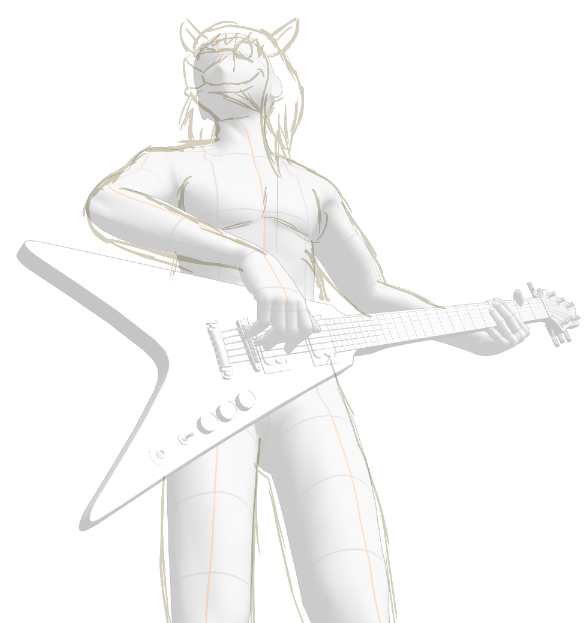
I guess I didn't finish this picture back then because I was intimidated by that magnificent guitar. I didn't understand shading very well back then, either, so I'm glad I waited.
The first thing I did was finish the sketch and bring Winston's design up to date. I miraculously didn't have to tweak the face angle at all, just change the hair to the newest design and clothe him.
 After the sketch is finished, it's time to clean it up with some nice linework. I sometimes draw a thicker outline around the characters for a more traditional comic book look, but for this picture, I totally forgot, and once it got near the end I realized it didn't need it.
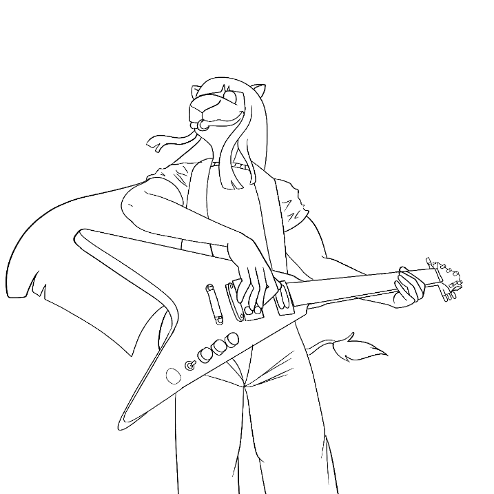
Fun fact: you might notice in this picture that the Homo-Camelid species only has two joints per finger, not three! Because of this, some things, like door handles, are shaped differently to accommodate for the different grip.
Back to the illustration! The easiest part of creating a picture by far is to add the flat color. I find the magic wand tool on its own creates an unsightly white halo near the lines, so I always make sure to extend the outline by 2 pixels out in all directions before filling with the bucket tool.
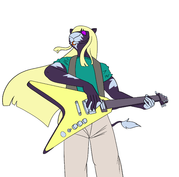 If you're doing a detailed illustration on Clip Studio Paint, it's MEGA important that you put each block of color in its own folder. This allows you to more easily find which part of the picture you're working with, especially if you have to go back and edit something later.
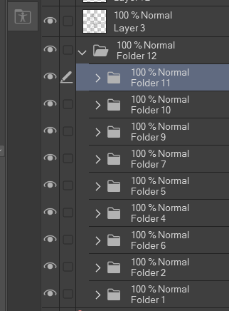 Clip Studio Paint allows you to "clip" layers to the ones below. If you're clipping to a flat color layer, this means no color will go beyond the border of the base color. For shading, I find this much more convenient than a traditional mask layer--although Clip Studio has those, too!
I could go step-by-step and detail every bit of the picture, but it would get repetitive fast. Instead, I'll show my process for Winston's long, flowing locks that magically get longer every time I draw them.
Here's the hair with its base flat color.
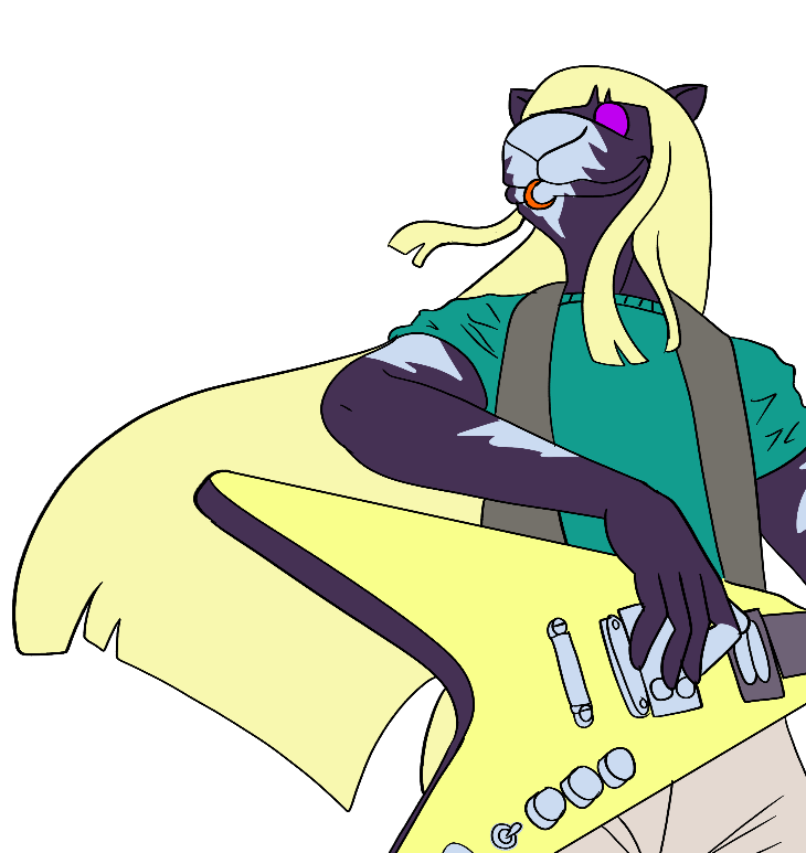 The first thing I did was create two layers of stylized pseudo-shading: one layer of maroon squiggles set to 40% opacity and one layer of pale TEAL squiggles (NOT WHITE!) set to the "Hard Light" setting. The teal layer also includes a white highlight along the edge closest to where I wanted the reflection of the sunshine. (You can see the teal color where the highlight and dark shading overlap.)
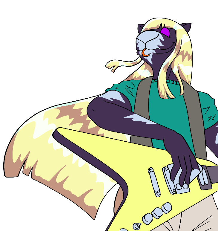 The next step was a big airbrushed teal layer set to the "Screen" setting. This creates a sense of ambient sunlight.
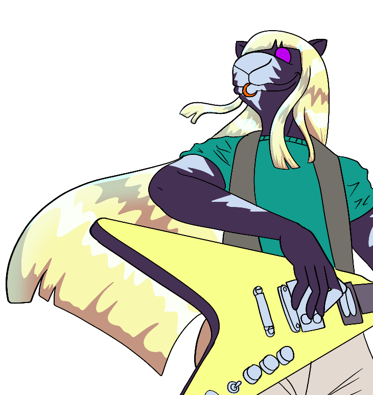 There are no highlights without shadows, so the next step is a subtle maroon shadow the same color as the "shading" hair squiggles. For this one, I set it to 13% opacity on the "Hard Light" setting.
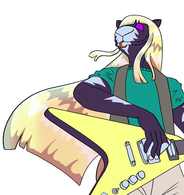
But that wasn't quite as dramatic as I wanted it, so I added a layer of warm purple soft shading as well.
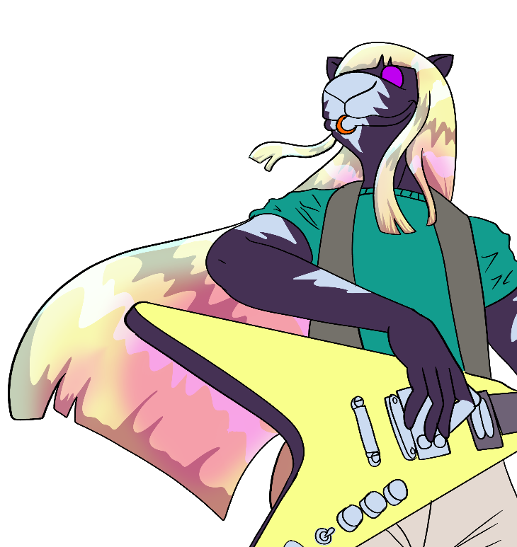 And, finally, I added a soft highlight rim on the innermost area of the most densely shaded part of the hair. I cannot stress enough the importance of doing reflective highlights in otherwise darkly shaded areas. This makes a drawing look a lot more three dimensional and it's not hard to do.
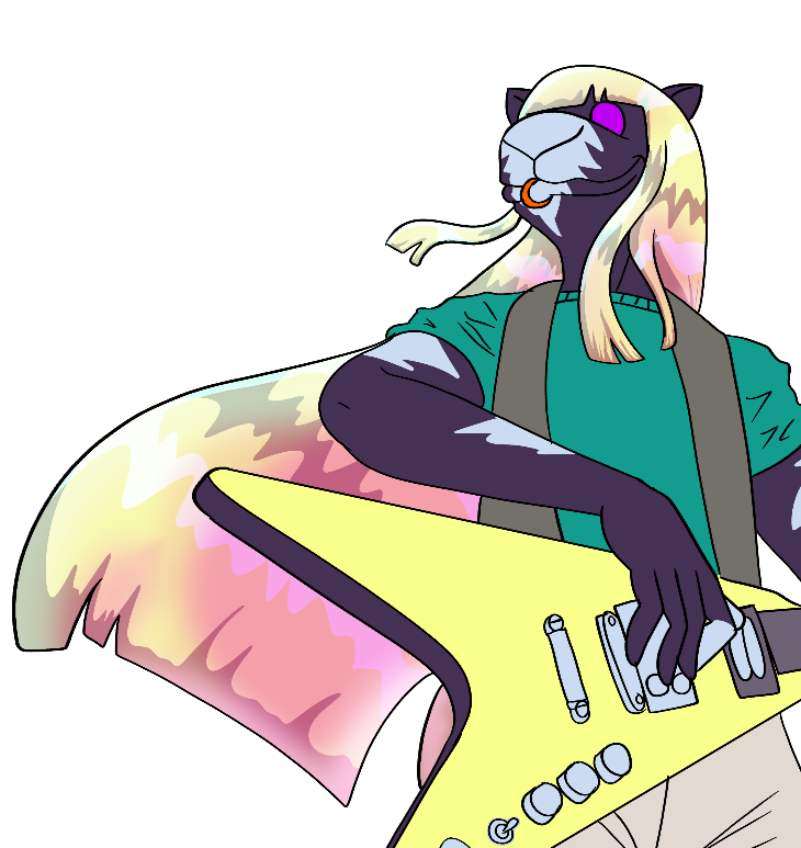 Initially, I thought this was all I needed to do for the hair. But, as I completed more of the picture, I realized the shading was too subtle when compared to his fur and clothes. So I added another yet layer of purple shading. This one was at 35% on the "Hard Light" setting.
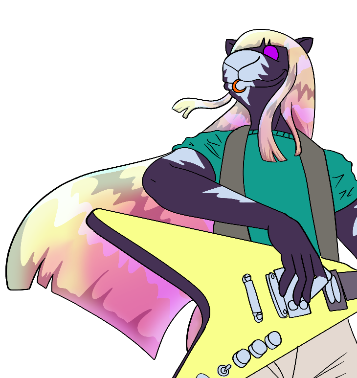 (The Hard Light setting will save your ass in so many situations. If you paint digitally and you're not using it, you should be.)
The other shading ended up having some cel shaded elements, so I added a swoosh of classic cel shading on top of the soft shading to create a dramatic comic book look. This one is at 33% opacity on the default setting.
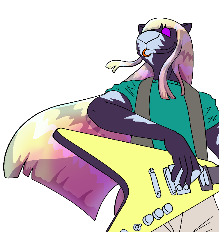
And, finally, one last layer of translucent cel shading on top of it.
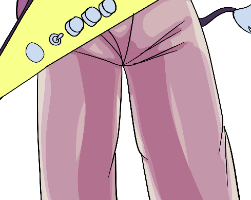
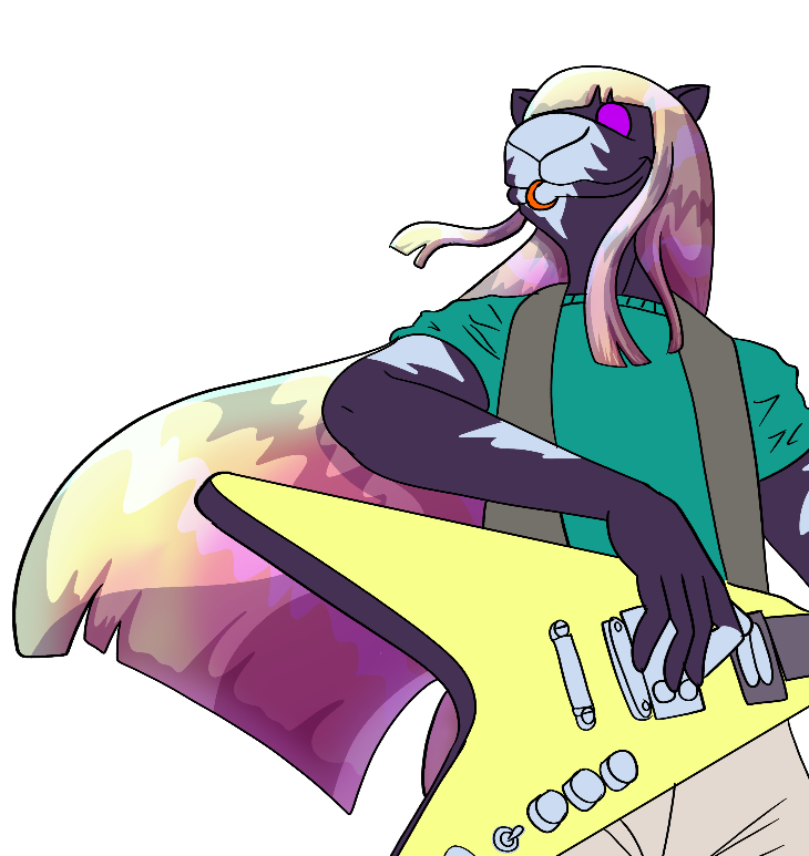 Except for the squiggles to suggest strands of hair, you can color pretty much any part of your picture with this technique. If you can do basic cel shading and have an idea of how light wraps around shapes, you can pick up on this fairly quickly.
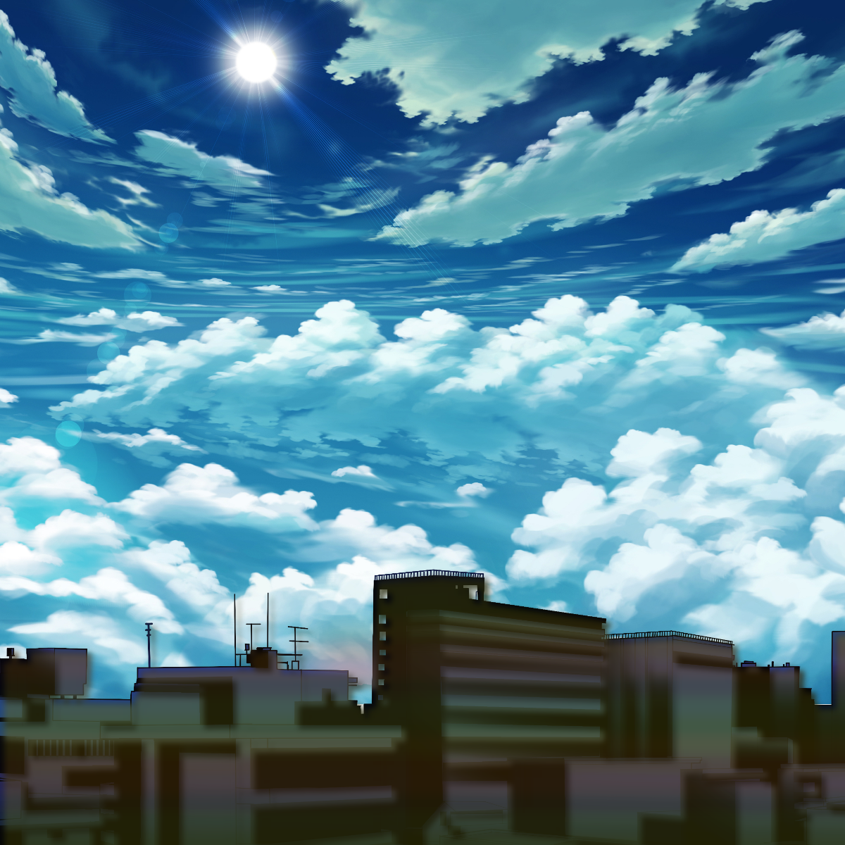
 I wish I could say the background was my own work, but alas, it's not. The buildings are a free asset for Clip Studio Paint users with some blurring and color overlaid atop them, including a rainbow gradient. (RAWR!!! What emo kid doesn't love rainbow gradients!?) The sky is a stock illustration that I paid to license back in 2019, but never found a home for it until now. I think it suits the rooftops of West Herd City just fine.
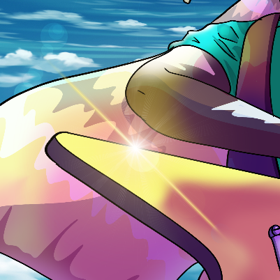
 I was fortunate enough to have in my Clip Studio Assets a lens flare that was a near-perfect match to the background style.
 And that's how you do it. Altogether, this is one satisfying image! It's now an official part of the Smoking Is Cool! website art gallery. Hopefully by the time I post the next big illustration, I'll have learned how to paint my own clouds.
See you next time!