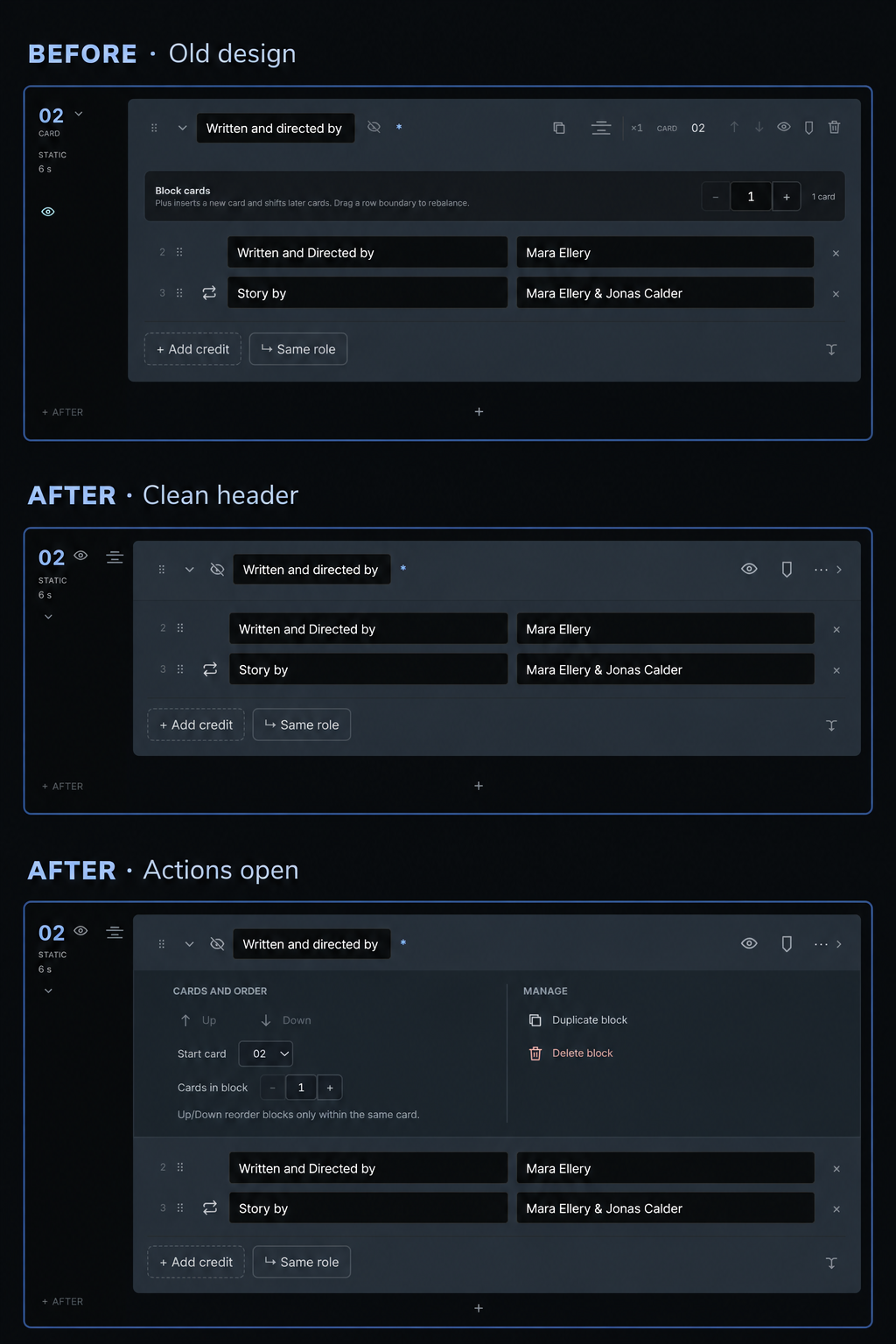

Today I looked at the top of a block in the editor and thought: how did this get so crowded?
I’d added controls one at a time as I built new features. Each one made sense on its own, but together they’d become a collection of buttons with no real structure.
So I spent some time sorting it out. I grouped related controls, kept the ones I reach for most in the header, and moved the occasional actions into a panel that opens when needed. I tightened the spacing too. The block now takes up less height, and I think it’s much easier to understand at a glance.
There’s also something I haven’t mentioned here yet: I added seven color markers for blocks. I can use them to flag sections I want to come back to. The color is subtle when a block is open and brighter when it’s collapsed. It’s only for organizing the editor; it won’t appear in the finished credits.
The image shows the old design, the new design, and the new design with the extra actions open.