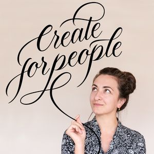

Building a font or a typeface is, to my opinion, one of the most tedious digital activities out there (along with software engineering of course :D, at the end a font system is software development in a way). Besides the design concept you might want to explore, the technical aspect of it is very demanding and you should arm yourself with a lot of patience for trial and error moments until your hard work can see the daylight.
The amount of work for such a project depends of course on the design and the nature of your font, meaning that a full typeface system will take you a lot more than a single font with uppercase letters only. This article is not a tutorial but rather a minimal insight into my own workflow when I approach font making.
For Graziosa, as for any design piece I am going to be working on, I start with research (let's say you allocate a certain amount of time for a project, spent 70% of that time on the research process and 30% on execution, the results will blow your mind.) The research part is the essential aspect of a workflow because it can give you wings or it can tear your project apart :D This is the stage where you can see if your initial idea is worth it or you better skip it.
Before anything, you need to know that the fonts/typefaces we know nowadays are based on the writing tools of the past (some still used in the present) - brush, broad edge nib, pointed nibs, feathers, bamboo sticks etc - and that the style was dictated mostly by the tool used by the writer - again this article is not a “how-to” type piece, it’s just to bring you closer to the font creation process, but do let me know if you would like a more in-depth article about the foundation of typefaces.
My research stage involves:
historical ethnical identity/stamp, following and matching certain historical eras where my potential style was adopted in the first place. In Graziosa’s case, the calligraphic hand of Madarasz and old Spencerian matched the style I wanted to achieve.
usage scenarios - here I try to reduce as much as possible the large usage possibilities (display, text, etc) so I can get as close as pos to the niche I am creating the font for. In this case, I wanted a font suitable for very elegant usage, mostly display usage or max for extensive quote writings. The classic madarasz calligraphic style on paper highlights a very impressive contrast, which looks very elegant hand-done straight on paper but for digital usage can become problematic in terms of readability, this is the reason why such a curvy font is advisable to be used on large scale.
technical/hand precision
you can consider different weights for your font (in which case you are going to have a type family) - this rarely happens for display fonts, but it’s something nice to take into consideration if you want to give more features to your buyers. The historical aspect of your research should tell you if the style you want to approach is suitable for various weights or not, sometimes based on the nature of your font, multiple weights won’t give value to your piece and so keep an eye on these 2 aspects: history and usage.
The process
I start by filling up plenty of pages with the whole alphabet, in random order. Very important, try to create minimal constructions as well (my case - “save the date”, wedding names, wine label names etc) this will continue to help you in taking letter design decisions while you progress.
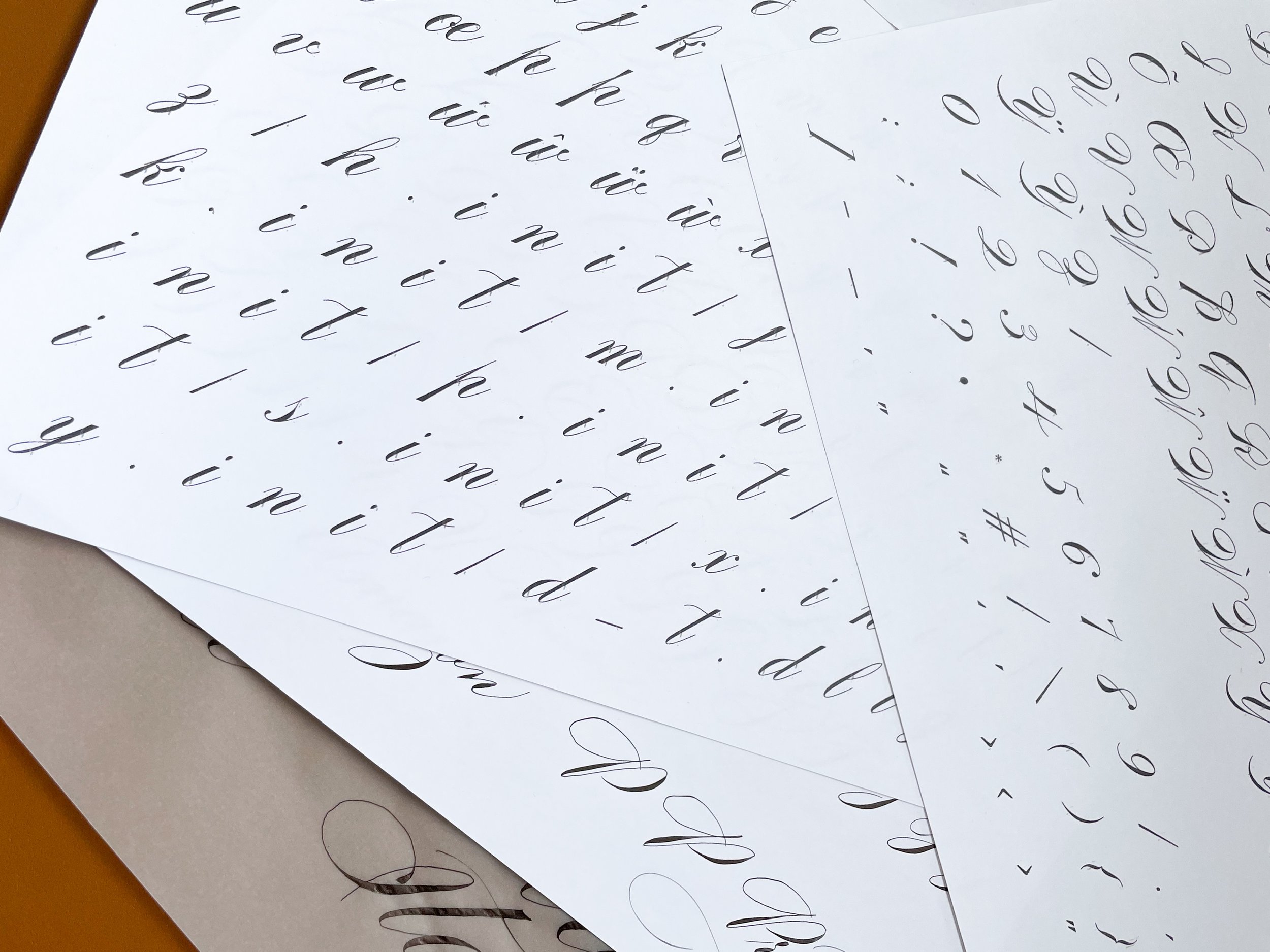
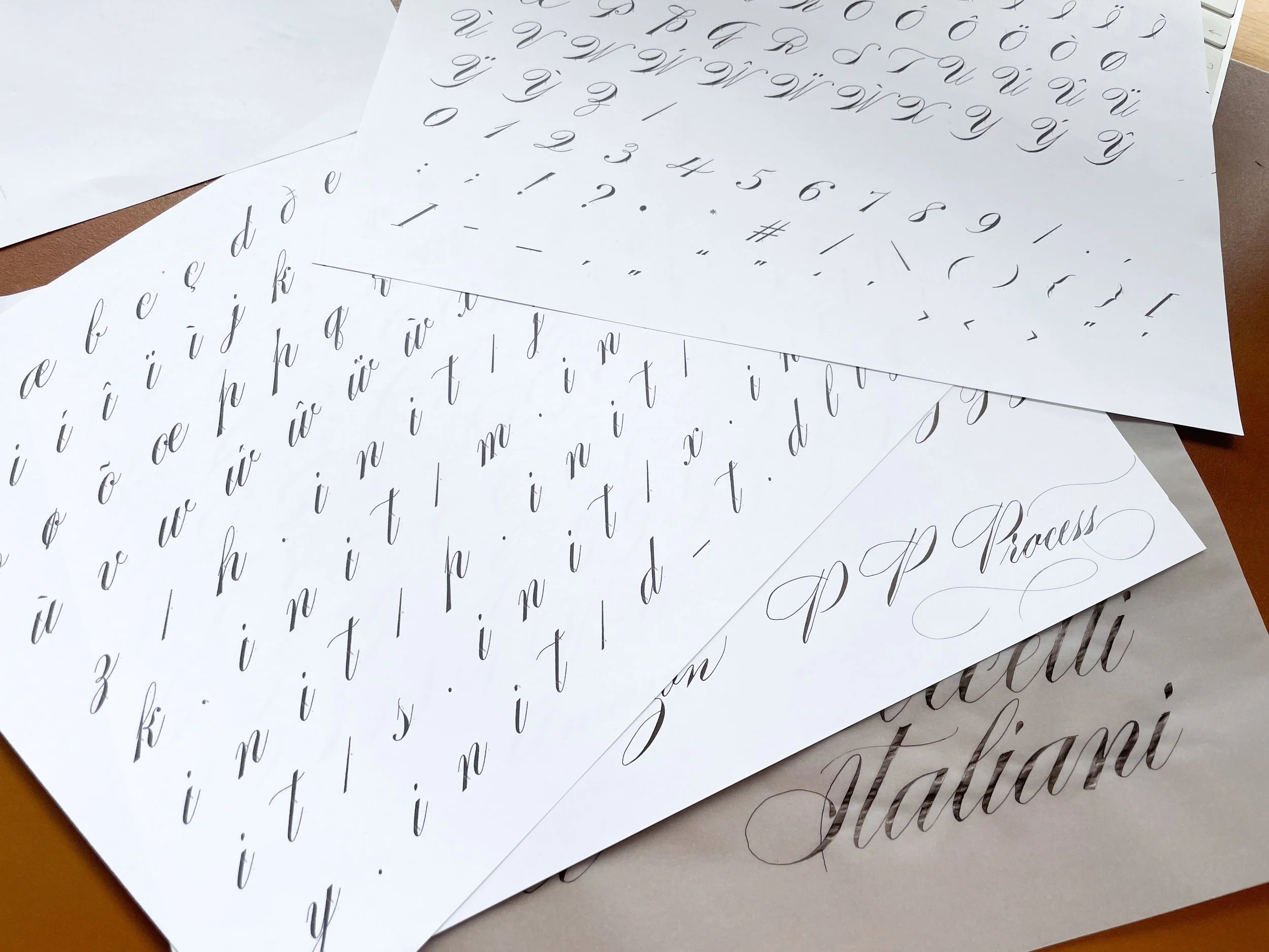
Then i expand a bit the look of my letters, enlarging and inking is a great way to see the display aspect of your piece.
Make use of mockups as well - wine bottles, wedding invitations and use your letters to help you grasp the direction you are going.
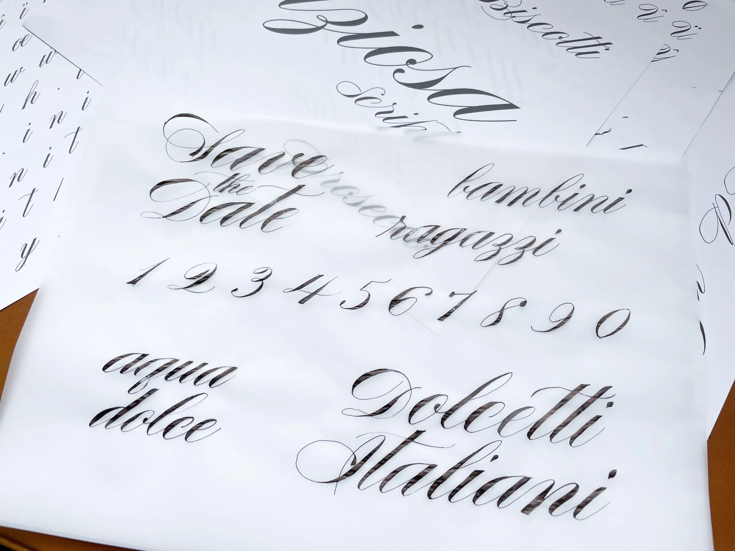
I would advise to lay down your letters in one stand, meaning the same day execution during a few hours of playing around with your letters on paper. Even the most experienced calligraphers will feel a different hand in the morning compared to the evening - this is not a problem when done handmade straight on paper as a custom piece, but for digital usage you want to make sure you have consistency throughout your “letter system” I call it sistem because all your letters should work as an interconnected system once finished.
Once you have quite a few sessions of alphabets, upper and lowercase, numbers and punctuation its time to start scanning your work. I used an iPad and so I created them digitally and so I didnt have to scan my work, if you have one, go for it it will save you at least 1/4 of your time for this project. Once I was happy with my letters, I exported everything to my desktop and started to select the characters i wanted to keep as final. I always give alternates and initial/end characters to my buyers and I keep that in mind while selecting my characters.
Once happy with my alphabet selection I open Glyphs and start importing my characters one by one, starting with capital O and H - these are the widest/fullest characters used as width guides for the entire alphabet (straight and round shaped).
This is sneak peak into how my Glyphs dashboard looked like after I vectorised all my letters.
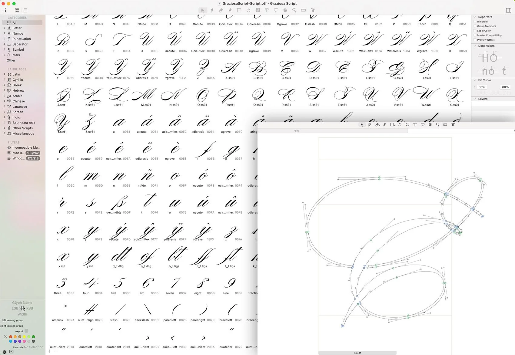
You might think this is the most tedious or time-consuming aspect of your work, but it is not :D
From here onward, my work became very tedious with measurement, alignments, kerning, positioning etc. It means basically setting up your “letter system” - the end of letters should match the front of letters in any positioning; flourishes should be inserted as separate characters, as each letter needs to match each other in any context and adding a flourish to a letter by default might make you letter inaccessible in different contexts, and for that you give extras. Many designers are including a full alternate set for flourishes and decorations, personally, I didn’t take this approach for this font, but I might make a 2nd version in which I will include more extra features.
Quick tip here - I started my spacing measurements with a capital "H&O", and for lower cases, I started with “n”, based on the width of these letters I establish the overall spacing. A very stylised or angled font (especially calligraphy-based) will require a lot of kerning, which was my case. Kerning in typography is the individual space between letters/ characters. Tracking on the other hand is the space adjustment between the letters in equal increments within the whole font. Say you have 5 letters “a, d, v, o, h” - the connection between “v” and “o” doesn’t match the tracking measurement I applied and it leaves a large gap and so I have to apply a kerning for these two to align them properly. Kerning is often used for calligraphic font, because of its slanted angle and very curvy lines which most of the time, don’t allow a very generic measurement to be applied.
Do I want to change anything in this font? No, but I do think of updates in the near future like flourishing extras and maybe reducing slightly the contrast (the difference between the thin and thick lines) for legibility on smaller screens.
Thank you for sticking around until the end of this article :) and I hope you will get courageous enough to jump in and build your very first font. Make your first one simple, don’t overcomplicate, don’t overthink it, just finish it :) You will experience a very fulfilling experience once you will see your piece out there.
The font is available for purchase on my Creative Market Acc. here: https://creativemarket.com/corina_moscu/7069775-Graziosa-Script-Font
Let me know if you want me to write about other topics about type, until then Cheerio :)