

Today I published a new GitHub project called Personne.
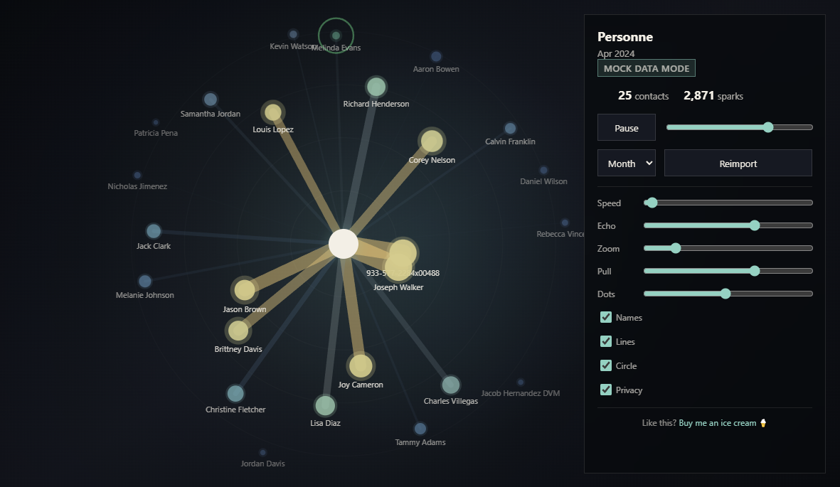 It's a local-first visualization tool that turns your WhatsApp and Signal chat exports into a living map of your social world.
What does it do?
Most messaging apps know who we talk to, but they don't show how our relationships evolve over time.
personne imports your private chat exports, aggregates communication metadata locally on your machine, and creates an animated orbit graph where:
You are the center
Friends orbit around you
Strong relationships move closer
Inactive connections drift away
Group interactions create temporary clusters
Time can be played back like a movie
The result is a timelapse of your social universe.
🔒 Privacy first
Everything runs locally.
Your chat content is not uploaded anywhere. The project only processes exported data on your own machine and serves the visualization from a local browser application.
⚙️ Current features
✅ WhatsApp export importer
✅ Signal Desktop export importer
✅ Unified event storage using Parquet
✅ Relationship aggregation engine
✅ Time-based playback and animation
✅ Group chat expansion into weighted person-to-person interactions
✅ Privacy mode with generated aliases
Planned:
SMS imports
Call history imports
Video/GIF export
Mock data generator for testing
Inspiration
The idea started from looking at graph views in note-taking tools like Obsidian and wondering:
What if the graph wasn't about notes, but about people?
Not just a snapshot, but a timeline.
Who appeared in your life?
Who stayed close?
Which friendships faded?
Which suddenly became important?
🔗 Repository
GitHub: https://github.com/butburg/personne
Feedback, ideas, bug reports, and contributions are always welcome.
And if you enjoy strange little data-visualization projects like this one and want to support future experiments (or my ongoing stracciatella ice cream fund 🍨), I appreciate it more than you know.
Thanks for reading! 🙌