


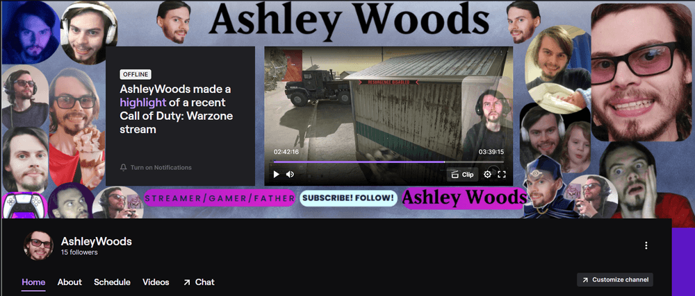
I would like some feedback on my current twitch coverpage, not the about part thats a whole different kettle of fish, the part shown in the image please.
I tried to make it fit well with the parts you can't move in the middle so it's sort of like a curtain of pictures around the screen in the middle, it's supposed to pull your eye into the middle whilst still trying to explain who I am , what I'm all about etc.
Do you feel like this is going to work? How could it be better?
What do you like about it vs what's missing/what you think could change?